Cloudron 9.0 (beta) bug reports
-
Tapping the notifications button with lots of notifications there is no "clear all" button visible.
One has to scroll all the way to the bottom to see it. Doesn't work well on mobile especially.
@robi I agree this isn't Ideal, especially when you have lots of notifications.
-
Two UI things:
- If a server requires a reboot, would be nice to be able to do that directly from the notification popup (in 8 you had the dedicated notifications page where you you push the button)
- After deleting a mailbox, I got back to the
/#/mailboxesview but all accounts just show "Loading..." and nothing happens. Would be cool if it remembered the mailbox size or at least start collecting the data again.
@msbt said in Cloudron 9.0 (beta) bug reports:
- If a server requires a reboot, would be nice to be able to do that directly from the notification popup (in 8 you had the dedicated notifications page where you you push the button)
In passing, I have also looked for a notification page anywhere, but could not find this - this means that once the notifications are acknowledged, there is not traces of them anywhere, anymore. I sometimes used the notifications page in v8.x.x to go back and see for example, for how long a notification had been going on, to inform of a situation (e.g. problem with backup etc..). I found it useful.
-
Another UI thing:
- on the users page (https://my.demo.cloudron.io/#/users), if any user belongs to a lot of groups, then you need to scroll horizontally to access the "
..." edit menu for any user:
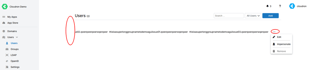
However, in doing so, you loose sight of the user/username and thus it becomes challenging to edit the right user.
Additionally, the horizontal scroll bar indication, only appears at the bottom of the user list, not the bottom of the page.
Hence, if you have a good number of users:- you first need to realize that the edit menu is hidden because of horizontal scrolling.
- Then you need to get to the bottom of the list to access the horizontal scroll bar
- Scroll horizontally
- Then you need to scroll back up to the user that you wish to edit, but then can but sure anymore since the username is hidden.
Currently, your best best in this situation is to search for the specific user hopping that you have enough information to do so.
Potentially, the "
..." edit menu should "float" at the end of the line and be accessible at all time, without horizontal scrolling necessary.Hopefully this makes sense.
- on the users page (https://my.demo.cloudron.io/#/users), if any user belongs to a lot of groups, then you need to scroll horizontally to access the "
-
For me I miss 2 things on the UX part:
- the history of notifications
- a way to reload the main view on mobile. By default I end up on https://my.domain.tld/#/apps and I guess because of the URL pattern (
#/appsis not an URL but a client side routing pattern) the only way to refresh the UI is to manually edit the URL to remove the client side routing part. - There are other small glitches I encounter on mobile, like the Cron part is more difficult to reach by default as the button to configure apps it not visible by defaults in the main view also we need to do extra clicks to see where the "Cron" config is.
Other than this, it works great!
-
Another UI thing:
- on the users page (https://my.demo.cloudron.io/#/users), if any user belongs to a lot of groups, then you need to scroll horizontally to access the "
..." edit menu for any user:
However, in doing so, you loose sight of the user/username and thus it becomes challenging to edit the right user.
Additionally, the horizontal scroll bar indication, only appears at the bottom of the user list, not the bottom of the page.
Hence, if you have a good number of users:- you first need to realize that the edit menu is hidden because of horizontal scrolling.
- Then you need to get to the bottom of the list to access the horizontal scroll bar
- Scroll horizontally
- Then you need to scroll back up to the user that you wish to edit, but then can but sure anymore since the username is hidden.
Currently, your best best in this situation is to search for the specific user hopping that you have enough information to do so.
Potentially, the "
..." edit menu should "float" at the end of the line and be accessible at all time, without horizontal scrolling necessary.Hopefully this makes sense.
- on the users page (https://my.demo.cloudron.io/#/users), if any user belongs to a lot of groups, then you need to scroll horizontally to access the "
-
Is there a reason to set the 2FA button in the user profile to “display:none”? Cloudron v. 9.0.13

-
Two UI things:
- If a server requires a reboot, would be nice to be able to do that directly from the notification popup (in 8 you had the dedicated notifications page where you you push the button)
- After deleting a mailbox, I got back to the
/#/mailboxesview but all accounts just show "Loading..." and nothing happens. Would be cool if it remembered the mailbox size or at least start collecting the data again.
@msbt said in Cloudron 9.0 (beta) bug reports:
After deleting a mailbox, I got back to the /#/mailboxes view but all accounts just show "Loading..." and nothing happens. Would be cool if it remembered the mailbox size or at least start collecting the data again.
this is fixed in https://git.cloudron.io/platform/box/-/commit/3a760282f15259f461e0db4181883ac9d82aac06
-
@necrevistonnezr oh! a bad beast
")
-
@Teiluj thanks for reporting the group overflowing in the users view. We have changed that now to only display the group count for a start until we find some better solution to deal with the vastly varying size that column would require.
@nebulon Some UX-friendly approaches for the several table-related issues:
- Scrollable table wrappers (check)
- Consequently (tables can grow infinitely wide) limit column lengths with CSS to a readable size, e. g.
max-width: 40ch; word-wrap: break-word; - Consequently (rows can then have variable heights) top-align table cells
- Support orientation in table rows with either alternating backgrounds or subtle horizontal borders (hover bg is already helpful - but only when your device has a hover state)
- Wrap all concatenated data with markup (like group names in the users table, unlike aliases in the mailbox table) - reserving us the option to set entries inline or stacked. Ideally, use invisible list markup - commas can be added with CSS
-
@nebulon Some UX-friendly approaches for the several table-related issues:
- Scrollable table wrappers (check)
- Consequently (tables can grow infinitely wide) limit column lengths with CSS to a readable size, e. g.
max-width: 40ch; word-wrap: break-word; - Consequently (rows can then have variable heights) top-align table cells
- Support orientation in table rows with either alternating backgrounds or subtle horizontal borders (hover bg is already helpful - but only when your device has a hover state)
- Wrap all concatenated data with markup (like group names in the users table, unlike aliases in the mailbox table) - reserving us the option to set entries inline or stacked. Ideally, use invisible list markup - commas can be added with CSS
Available screen space
Still focusing on tables, but to consider in general:
- When the task focus is on working with complex tables, the space should not be limited for the sake of the design
-> Let the content width be a subject of user preference: make .content max-width (900px) class-dependent and offer a per-user or per-session toggle to swap a body class. The design looks good without the max-width, so there's really not much to change
- Sidebar consumes too much space in narrow viewports (already mentioned here in this thread)
-> Option to reduce the sidebar width to the width of the icons (see Discourse or GitLab
")
-
@hexbin thanks a lot for the detailed info. We have reworked those table columns with better widths then and also made some of the tables
table-layout: fixed;to actually be able to control that overflow behavior.For "Wrap all concatenated data with markup", is this similar to the custom option to overwrite style based on user adding custom css? We currently don't have that option to customize like that, but it was also requested for other things already.
Finally for the sidebar, we will see how to make that collapsable. It would certainly help on "nowadays" laptops around the 14" screens.
-
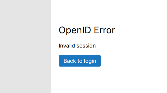
Thank you for adding a "back" button on login pages. I keep my tabs pinned and that causes the OIDC string to expire and I had to manually delete that string from the URL. Now, I can simply click on back and then sign in. Less hassle now.