Cloudron makes it easy to run web apps like WordPress, Nextcloud, GitLab on your server. Find out more or install now.


    Cloudron Forum

    • Register
    • Login
    • Search
    • Categories
    • Recent
    • Tags
    • Popular

    Solved IMHO: Cloudron 6.0.1 Button Coloring for Console, Logs is Odd

    Feature Requests
    filemanager userinterface
    2
    3
    189
    Loading More Posts
    • Oldest to Newest
    • Newest to Oldest
    • Most Votes
    Reply
    • Reply as topic
    Log in to reply
    This topic has been deleted. Only users with topic management privileges can see it.
    • BrutalBirdie
      BrutalBirdie Staff last edited by girish

      7f7410ca-1680-4615-849b-27fd1978b0dd-image.png

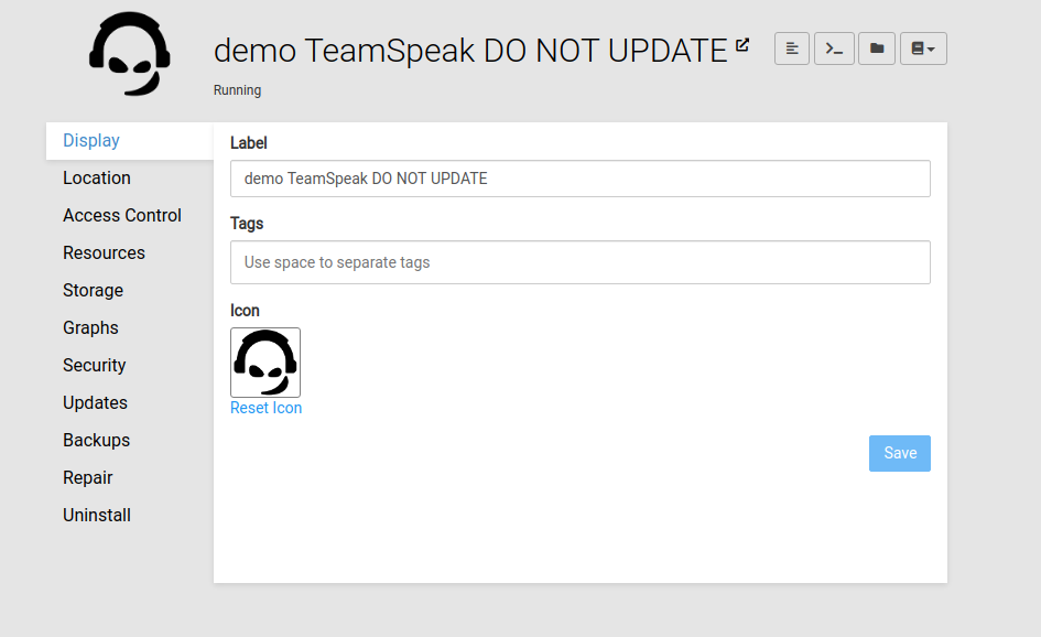
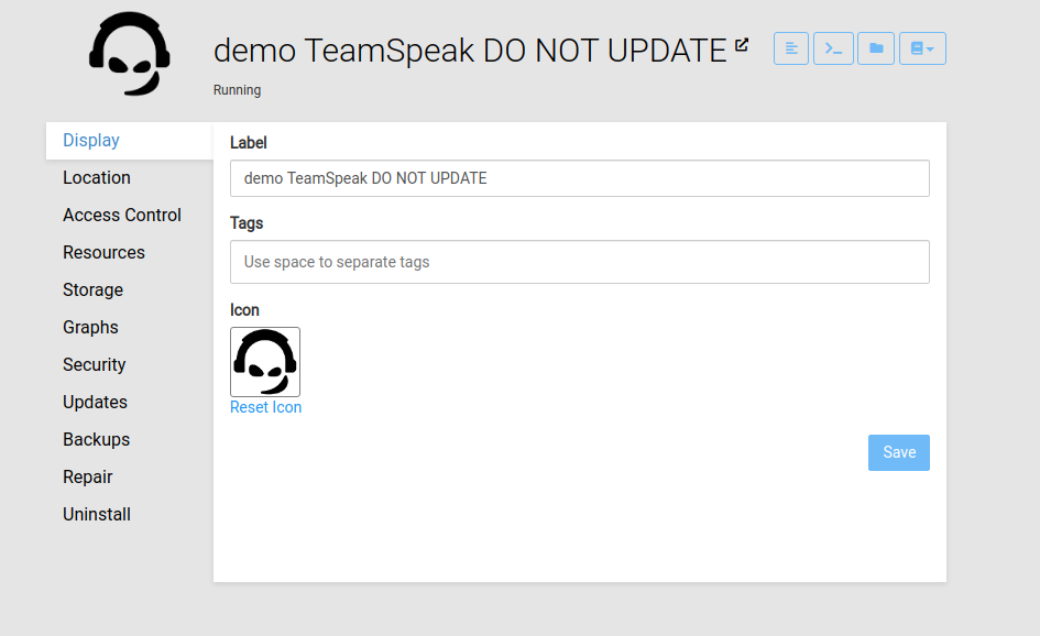
      The new Buttons top right next to the App Label replaced the "Console" Tab on left.
      Which is nice, but I think the coloring is odd.
      Everything else funktional (which does something) in Cloudron has the Blue color, like the "Save" Button or "Reset Icon" aka. #2196f3

      Would look like this.

      4cd046eb-05d2-4967-abe3-226e67f3c5a9-image.png

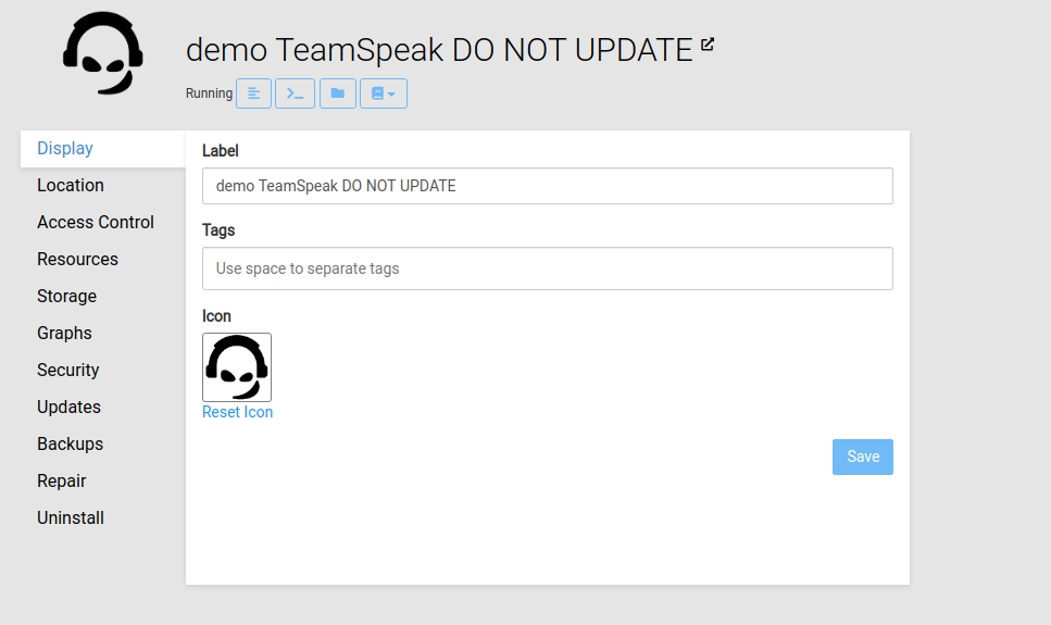
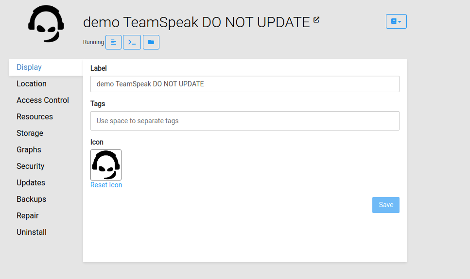
      Another Idea is to place the buttons next to the actual status of the app.
      With the mindset "Oh I see the state is Running? Where can I see whats going on?"
      Well right next to you 🙂

      (ps: I am no Web Designer nor Web Developer so please excuse the poor execution)

      ac7eb558-ab60-49a7-aef6-17d472b66d72-image.png

      961f8cd4-3ab2-4253-91eb-b58b3b624030-image.png

      Like my work? Consider donating a beer 🍻 Cheers!

      1 Reply Last reply Reply Quote 0
      • nebulon
        nebulon Staff last edited by

        So moving the buttons next to the status would break many times when there is some actual different status and even the progressbar shown. Also it would mean the buttons are not consistently at the same spot, which is not nice for muscle-memory.

        The coloring is chosen to keep consistency with other views where there are action buttons on the top right and generally we don't have blue outline buttons anywhere. We have played with making them solid buttons, but then they raise quire a lot of attention to that and might distract from the action buttons in the views below.

        BrutalBirdie 1 Reply Last reply Reply Quote 3
        • BrutalBirdie
          BrutalBirdie Staff @nebulon last edited by

          @nebulon Ahh okay that makes it clearer why this style was chosen.

          I can live with that explanation. 👍

          Like my work? Consider donating a beer 🍻 Cheers!

          1 Reply Last reply Reply Quote 1
          • First post
            Last post
          Powered by NodeBB