Dashbard UX enhancement suggestions
-
@nebulon I agree with @atrilahiji's use-case, and is the same for me in most cases too. I may make a change in an app (usually WordPress) in a file that may only get read on boot, therefore for the settings to take effect I need to restart the app so the changes are recognized. Sometimes it's also nice to just have a "clean start" of the app to at least sanity-check / rule out items when troubleshooting (such as caching and other areas depending on the app).
-
@hexbin We've used the Fontawesome badge layering to good effect before: http://alaind-.github.io/font-awesome-badge/
Good point on how to know if the app has 2FA enforced or not.
Thinking further; I think the whole world begrudgingly knows and accepts 2FA as a fact of life now, so wouldn't need to know about it in advance to find that it's necessary on login, and follow the app's own instructions for that. So maybe a moot point, but happy to see a fellow detail obsessor!
-
@atrilahiji hm regarding the config changes and subsequent required restart, both the filemanager and the webterminal have a restart button.
For the other use-case, this is essentially a stop/start not really a restart case. I can see that being useful if apps are paused frequently.
-
@nebulon said in Dashbard UX enhancement suggestions:
both the filemanager and the webterminal have a restart button.
I don't think I've noticed that!

I often find myself going into Config -> Repair -> Restart when I probably don't need to.
I do sometimes think it's strange that Restart is hidden away in Repair whereas Stop is hidden away in Uninstall. Until you know that it isn't obvious where to find them.
-
@jdaviescoates said in Dashbard UX enhancement suggestions:
Restart is hidden away in Repair whereas Stop is hidden away in Uninstall
@nebulon - It's great to know that restart is at least also found in the Terminal and File Manager, this makes it just one extra click which is decent. However, @jdaviescoates raises the main point (IMO) that I too find irritating... the Restart button and Stop buttons are not close to each other as I think most users would expect, and perhaps more frustratingly to me - they are located on tabs that are named something unrelated to the action entirely.
Restart is on a tab named Repair (admittedly a very slight relationship on this one). Stop is on a tab named Uninstall (not even closely related at all IMO).
Maybe it's just me, but I think of Repair just for that special recovery container mode when something critical happens so I don't expect to visit it for a simple task. And Uninstall, well... to be visited only to actually uninstall the app, definitely not where I'd look to simply shut it down.
Regardless of the name of the tabs they are found on though, I think most users would naturally expect action items like Stop and Restart to be found in the same area as the other, not completely separate areas. Think of how our operating systems are... shutdown and restart are right next to each other in pretty much every operating system. As a result, users expect to find these actions close together rather than completely different menus. Right now I always feel I need to "hunt" for the action buttons, even if it only takes a few seconds to locate it.
I'd recommend a fifth button added to the existing 4, which is perhaps a drop-down style button which then display both the "Stop" and "Restart" buttons... the parent button maybe named something like "Action" or similar.
Side note: I think maybe part of the problem that lead to these decisions of where they are found currently is that there is a mindset that the Restart action is that it should only ever be used if something goes wrong - in which case it explains why it's found on the Repair tab. But that's not the only reason to restart an app, not everyone restarts it just because something is "wrong".
-
@d19dotca what you guessed here was mostly our strain of thought where the buttons end up. For us the restart was mostly useful when the app does not work and it actually needs a restart. I still think this is the case from the point of view of this part of the dashboard. Having to restart an app after config file changes, is why we've put the restart action also into the filemanager and webterminal (although apparently this isn't obvious).
The stop/start action on the other side was put where the uninstall is, as we thought if the system is low on resources and one option is to purge rarely used apps, one could also stop the app instead of uninstalling altogether. I think here our thinking does not align. I will experiment to see if putting a stop/start button on the top is good (I don't think a dropdown with also a restart action is helpful here though, as I still think it is not the right fix having to restart apps frequently)
-
Since this thread contains a few suggestions by now, lets dive a bit into the other initial ones.
The usermanagement indicator does make sense and we will see how to add that.For the action icons, which currently are shown on hover on desktop, I am also not satisfied with how they are done now, but to better understand what is a good solution, we have to understand what actions are common and useful here.
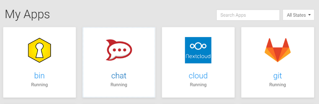
Currently they show:- app configure
- logviewer
- app info
- (optional) app admin panel
Are those actually the correct actions and are they frequently enough used to warrant a top-level button?
Would we go with one button, as suggested, I am not sure if it is good to add a dropdown menu for those, since it just adds an additional required click and might make things harder on mobile/tablet. So I am not sure if I like that suggestion more than what we currently have.
-
@nebulon If it were me I'd go:
[dot dot dot button always showing]
- Admin (when applicable)
- Info
- Settings
- Logs
Short, sweet and conventional.
Hover is always a nuisance on touch-screens. All other UIs I can think of that have a tile navigation seem to have gravitated to the convention of the 3 dots showing in the top-right.
One tap/click shows, another tap or tap/click away hides. That's the way all OS menus work. When in doubt, I always follow the same conventions that operating systems use.
50% grey is good for visual accessibility contrast.
-
-
Agree 3-dot menu >>> hover for mobile. Even on desktop I sometimes found myself confused which icon is which and misclicking (e.g. click info for logs, & vv) when I'm only half paying attention; a menu with text label would solve that nicely.
I like the update button idea.
-
@robi said in Dashbard UX enhancement suggestions:
I'd add an update action button so we don't have to do extra clicks to update apps.
+1
I'd still really like to see a filter for apps that have an update available too.
-
While you're at it, could you check why the focus on the tiles (keyboard navigation) has no visual effect?
hm at least in firefox here the a tag element does get the system default focus outline. The tabfocus order is a bit strange though, as it also cycles through the action buttons which are hidden withou hover at the moment.
-
@infogulch said
when I'm only half paying attention
Important point that makes me nervous about stop/restart buttons too easily to be (mis)clicked.
Please do also have in mind that you lovely people here are power users. We should always cross-check ideas with a persona who is a non-frequent administrator.
That is one reason why I tend to find non-disruptive changes. Mapped to the (absolutely valid) requirement to reduce searching for the fuctions (stop / restart) - would it be feasible to have redundant additional links on several tabs?
-
-
@hexbin said in Dashbard UX enhancement suggestions:
makes me nervous about stop/restart buttons too easily to be (mis)clicked
I think that's a fair concern. That's actually part of why I was suggesting earlier the option of an Actions dropdown menu... it'd do two things: 1) keep the number of buttons down and more importantly 2) prevent mis-clicks since to restart or stop you'd need to make two separate clicks because they'd be covered by a general Actions button that needs a click too.
I guess it may not hurt to also have an "Are you sure?" prompt, but I think 3 clicks (at least how I"m envisioning it) seems maybe a bit much too.
My two cents:
- If we go with a parent Actions button that covers the Stop and Restart buttons from mis-clicks, then it's good as-is at that point.
- If we keep both the Stop and Restart buttons in the top button row though where they can be easily misclicked, then I think we should have an "Are you sure" type of pop-up to prevent those misclicks.
")
-
@hexbin said in Dashbard UX enhancement suggestions:
Technically correct - but aren't we kinda hard trying to make that invisible?
Ah I see, indeed this is way to sublte here. As such our stylesheet does not configure that, so it appears to be a bad match with the current custom and system style.
-
Ideally we'd rarely have to visit troubleshooting tools and start/stop buttons as the app monitor would handle that more intelligently for us.
Until then, making things more obvious and adding additional distinguishing visual elements such as the triangle pointing right and square box for start and stop respectively.
-
Regarding the fix for the app item action items, which are currently shown on hover, we have done a few tests with the three dots icon and a dropdown. It didn't make too much sense to us and also it kindof looked strange and not very intuitive.
Now the current version is a bit simplified from this. It will show a single button in the top-right corner as suggested here. This is always shown now for admins. Clicking that will bring up the app configure/info view which has an improved toolbar on the top right, containing all the actions.
This change has the same amount of clicks required as the dropdown now and also works better on mobile/tablet.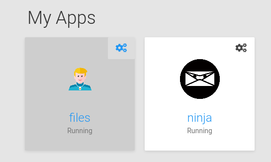
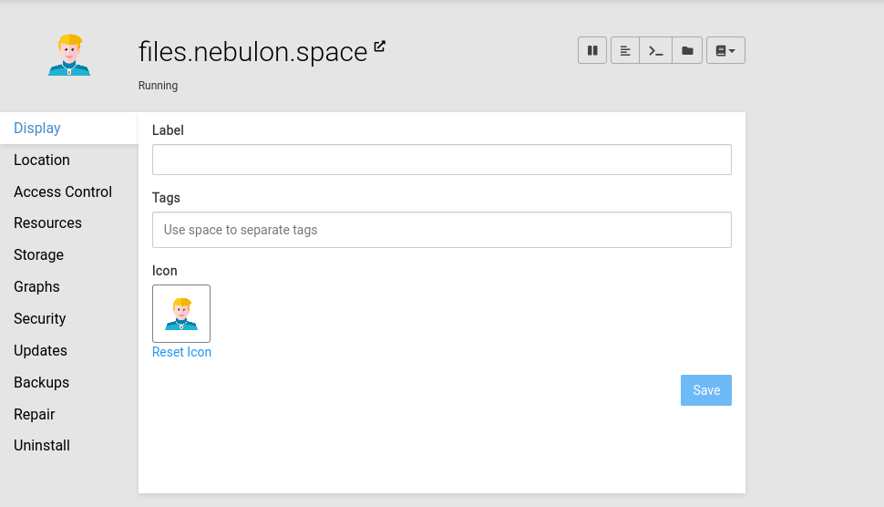
You can see the stop/pause action also being more prominent up there now.
-
Also the grid item focus is now adjusted to look like, but I am not yet sure if I keep it as such
@hexbin the actual system and browser native focus is still untouched and I think given that we haven't done any visual focus handling, you will see similar issues on other products unless you adjust your system settings for the native style. I also think that not interfering with the native one here is correct, as if I adjust my system for example to have a style with high contrast (this is on linux gnome) then the native focus rendering is also adjusted well, which I think is what we want.
")