New UI Sneak peak and review
-
@necrevistonnezr no it's been that way ever since the demo etc I showed earlier

@froodle said in New UI Sneak peak and review:
@necrevistonnezr no it's been that way ever since the demo etc I showed earlier
And there I was, trying to re-invent the wheel....
-
@froodle thanks for the work. Great application and very useful in daily use!
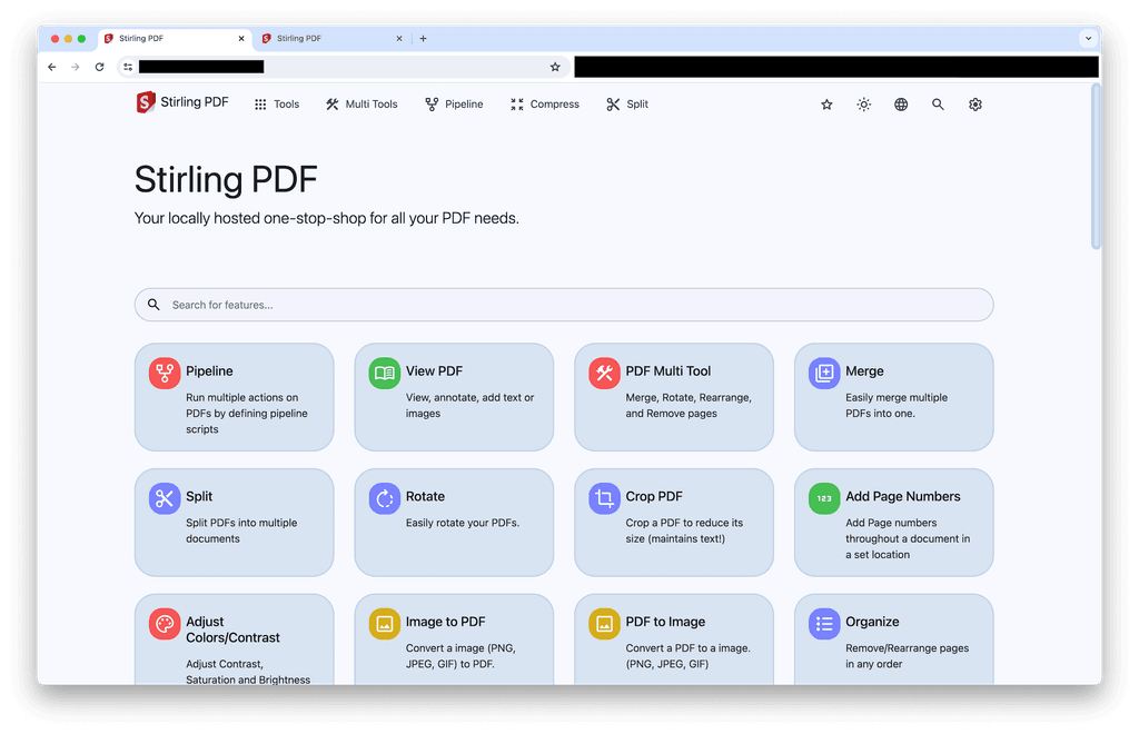
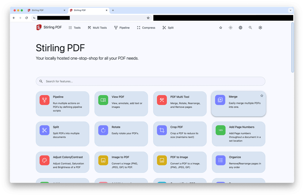
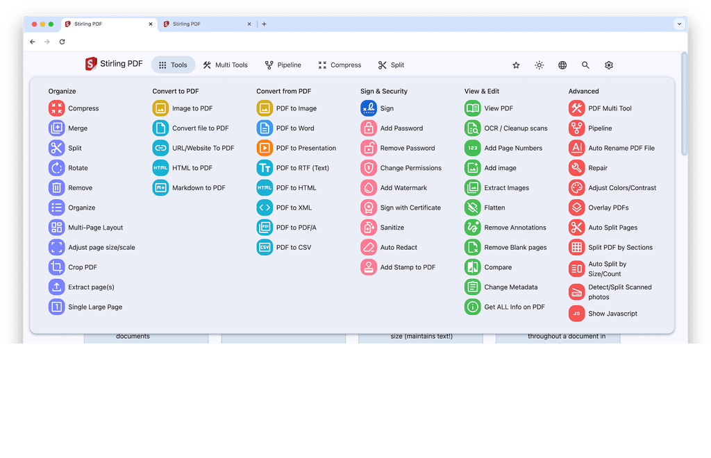
But the latest UI changes feel a bit imbalanced to me and less organized. I think the biggest driver for that feeling is the border-radius of the icon boxes and the cards. Inconsistencies in sizing and spacing of the icons as well as too less padding for the icons also add to the feeling that something’s off.
The considerably strong stroke-width of the icons in comparison to the light font-weight of the tool titles does rather separating icon and text than connecting them visually to one item.
Also the border-width of the cards is visually too strong. Reducing the border-width or lighten the border-color. By the way, also noticeable inconsistencies in the border-widths (0.1rem in the search input vs. 2px icon cards).Sounds quite harsh, meant as constructive feedback

I quickly sketched the changes in the dev inspect tool and saved the changes. Here is the comparison and the adjustments. Hope this is helping you to find the right balance!
original:
adjusted:
diff --git a/pdf/css/bootstrap.min.css b/pdf/css-edit/bootstrap.min.css index 5cfa298..d262c73 100644 --- a/pdf/css/bootstrap.min.css +++ b/pdf/css-edit/bootstrap.min.css @@ -4389,12 +4389,13 @@ fieldset:disabled .btn { } .nav-link { - display: block; + display: flex; padding: 0.5rem 1rem; color: #0d6efd; text-decoration: none; transition: color 0.15s ease-in-out, background-color 0.15s ease-in-out, border-color 0.15s ease-in-out; + align-items: center; } @media (prefers-reduced-motion: reduce) { diff --git a/pdf/css/home.css? b/pdf/css-edit/home.css? index a6f89ed..91a0204 100644 --- a/pdf/css/home.css? +++ b/pdf/css-edit/home.css? @@ -5,7 +5,7 @@ font-size: 16px; margin-bottom: 2rem; padding: 0.75rem 3.5rem; - border: 0.1rem solid var(--md-sys-color-outline-variant); + border: 1px solid var(--md-sys-color-outline-variant); border-radius: 3rem; outline-color: var(--md-sys-color-outline-variant); } @@ -19,12 +19,12 @@ .features-container { display: grid; grid-template-columns: repeat(auto-fill, minmax(15rem, 3fr)); - gap: 25px 30px; + gap: 30px 30px; } .feature-card { - border: 2px solid var(--md-sys-color-surface-5); - border-radius: 2rem; + border: 1px solid var(--md-sys-color-surface-5); + border-radius: 1.75rem; padding: 1.25rem; display: flex; flex-direction: column; @@ -47,13 +47,13 @@ } .feature-card .card-text { - flex: 1; + font-size: .875rem; } .feature-card:hover { cursor: pointer; - transform: scale(1.1); - box-shadow: var(--md-sys-elevation-3); + transform: scale(1.025); + box-shadow: var(--md-sys-elevation-2); } .card-title.text-primary { @@ -79,11 +79,12 @@ } #tool-text { - margin: 0.5rem 0.5rem 0rem; + margin: 0.0rem 0 0 1.25rem; } .card-title { margin-bottom: 1rem; + font-size: 1rem; } /* Only show the favorite icons when the parent card is being hovered over */ diff --git a/pdf/css/navbar.css? b/pdf/css-edit/navbar.css? index ddeab5a..a8845f2 100644 --- a/pdf/css/navbar.css? +++ b/pdf/css-edit/navbar.css? @@ -75,7 +75,7 @@ } .icon-text { - margin-left: 4px; + margin-left: 8px; margin-right: 4px; display: inline-flex; flex-direction: column; diff --git a/pdf/css/theme/componentes.css? b/pdf/css-edit/theme/componentes.css? index d767d59..6318212 100644 --- a/pdf/css/theme/componentes.css? +++ b/pdf/css-edit/theme/componentes.css? @@ -187,8 +187,8 @@ td { .feature-card .nav-icon { vertical-align: middle; font-size: 2rem !important; - padding: 0.5rem; - border-radius: 1.25rem; + padding: 0.75rem; + border-radius: 0.9rem; color: var(--md-sys-color-surface); } diff --git a/pdf/css/theme/font.css b/pdf/css-edit/theme/font.css index dfb1c1b..f245dd3 100644 --- a/pdf/css/theme/font.css +++ b/pdf/css-edit/theme/font.css @@ -7,7 +7,7 @@ .material-symbols-rounded { font-family: 'Material Symbols Rounded'; - font-weight: normal; + font-weight: 300; font-style: normal; font-size: 24px; line-height: 1; diff --git a/pdf/css/theme/theme.css? b/pdf/css-edit/theme/theme.css? index 3c9565d..4f7be33 100644 --- a/pdf/css/theme/theme.css? +++ b/pdf/css-edit/theme/theme.css? @@ -30,5 +30,5 @@ } .no-fill { - font-variation-settings: var(--md-sys-icon-fill-0); + /* font-variation-settings: var(--md-sys-icon-fill-0); */ } \ No newline at end of file -
@necrevistonnezr Thanks for your feedback. You're right ! I've cleared the cache and ... voila
@osobo said in New UI Sneak peak and review:
@necrevistonnezr Thanks for your feedback. You're right ! I've cleared the cache and ... voila
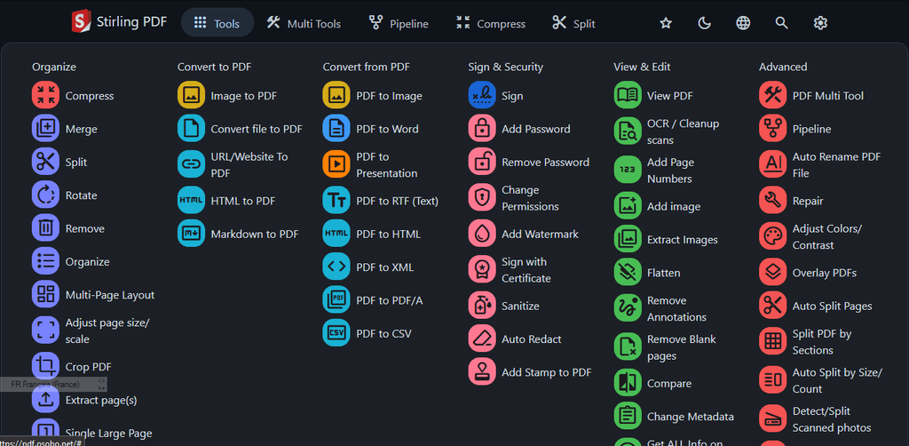
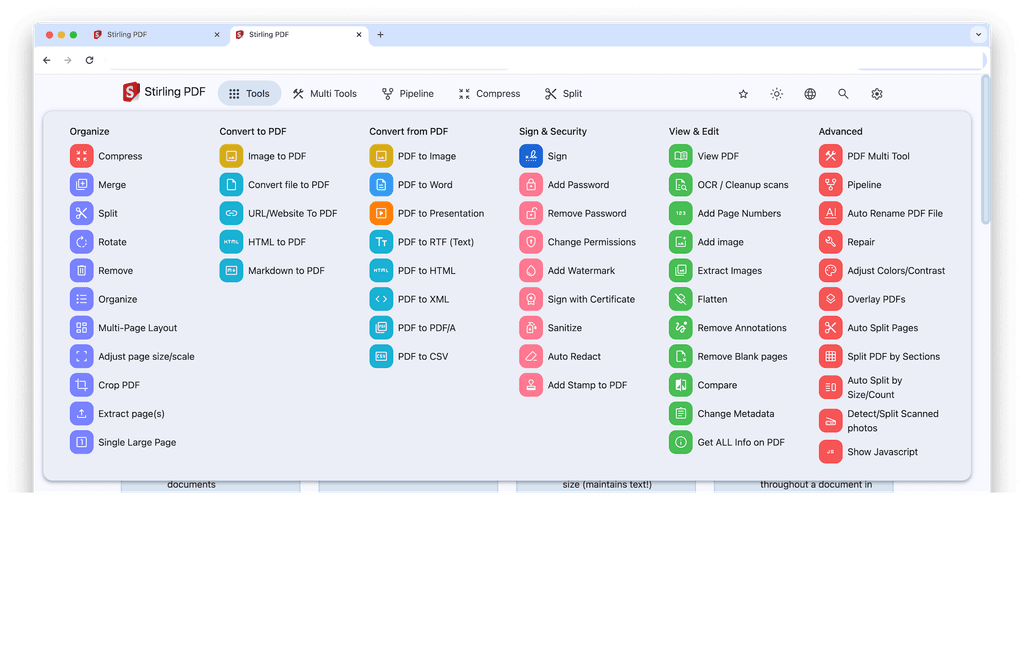
Also here in the menu noticeable: The icons and their colorful boxes show some indecisiveness in terms of the spacing, sizing and border-radius. They are almost a circle, but not yet. Or in other peoples eyes almost rounded rectangles. In design should be no doubt, always decisions
-
@froodle thanks for the work. Great application and very useful in daily use!
But the latest UI changes feel a bit imbalanced to me and less organized. I think the biggest driver for that feeling is the border-radius of the icon boxes and the cards. Inconsistencies in sizing and spacing of the icons as well as too less padding for the icons also add to the feeling that something’s off.
The considerably strong stroke-width of the icons in comparison to the light font-weight of the tool titles does rather separating icon and text than connecting them visually to one item.
Also the border-width of the cards is visually too strong. Reducing the border-width or lighten the border-color. By the way, also noticeable inconsistencies in the border-widths (0.1rem in the search input vs. 2px icon cards).Sounds quite harsh, meant as constructive feedback
I quickly sketched the changes in the dev inspect tool and saved the changes. Here is the comparison and the adjustments. Hope this is helping you to find the right balance!
original:
adjusted:
diff --git a/pdf/css/bootstrap.min.css b/pdf/css-edit/bootstrap.min.css index 5cfa298..d262c73 100644 --- a/pdf/css/bootstrap.min.css +++ b/pdf/css-edit/bootstrap.min.css @@ -4389,12 +4389,13 @@ fieldset:disabled .btn { } .nav-link { - display: block; + display: flex; padding: 0.5rem 1rem; color: #0d6efd; text-decoration: none; transition: color 0.15s ease-in-out, background-color 0.15s ease-in-out, border-color 0.15s ease-in-out; + align-items: center; } @media (prefers-reduced-motion: reduce) { diff --git a/pdf/css/home.css? b/pdf/css-edit/home.css? index a6f89ed..91a0204 100644 --- a/pdf/css/home.css? +++ b/pdf/css-edit/home.css? @@ -5,7 +5,7 @@ font-size: 16px; margin-bottom: 2rem; padding: 0.75rem 3.5rem; - border: 0.1rem solid var(--md-sys-color-outline-variant); + border: 1px solid var(--md-sys-color-outline-variant); border-radius: 3rem; outline-color: var(--md-sys-color-outline-variant); } @@ -19,12 +19,12 @@ .features-container { display: grid; grid-template-columns: repeat(auto-fill, minmax(15rem, 3fr)); - gap: 25px 30px; + gap: 30px 30px; } .feature-card { - border: 2px solid var(--md-sys-color-surface-5); - border-radius: 2rem; + border: 1px solid var(--md-sys-color-surface-5); + border-radius: 1.75rem; padding: 1.25rem; display: flex; flex-direction: column; @@ -47,13 +47,13 @@ } .feature-card .card-text { - flex: 1; + font-size: .875rem; } .feature-card:hover { cursor: pointer; - transform: scale(1.1); - box-shadow: var(--md-sys-elevation-3); + transform: scale(1.025); + box-shadow: var(--md-sys-elevation-2); } .card-title.text-primary { @@ -79,11 +79,12 @@ } #tool-text { - margin: 0.5rem 0.5rem 0rem; + margin: 0.0rem 0 0 1.25rem; } .card-title { margin-bottom: 1rem; + font-size: 1rem; } /* Only show the favorite icons when the parent card is being hovered over */ diff --git a/pdf/css/navbar.css? b/pdf/css-edit/navbar.css? index ddeab5a..a8845f2 100644 --- a/pdf/css/navbar.css? +++ b/pdf/css-edit/navbar.css? @@ -75,7 +75,7 @@ } .icon-text { - margin-left: 4px; + margin-left: 8px; margin-right: 4px; display: inline-flex; flex-direction: column; diff --git a/pdf/css/theme/componentes.css? b/pdf/css-edit/theme/componentes.css? index d767d59..6318212 100644 --- a/pdf/css/theme/componentes.css? +++ b/pdf/css-edit/theme/componentes.css? @@ -187,8 +187,8 @@ td { .feature-card .nav-icon { vertical-align: middle; font-size: 2rem !important; - padding: 0.5rem; - border-radius: 1.25rem; + padding: 0.75rem; + border-radius: 0.9rem; color: var(--md-sys-color-surface); } diff --git a/pdf/css/theme/font.css b/pdf/css-edit/theme/font.css index dfb1c1b..f245dd3 100644 --- a/pdf/css/theme/font.css +++ b/pdf/css-edit/theme/font.css @@ -7,7 +7,7 @@ .material-symbols-rounded { font-family: 'Material Symbols Rounded'; - font-weight: normal; + font-weight: 300; font-style: normal; font-size: 24px; line-height: 1; diff --git a/pdf/css/theme/theme.css? b/pdf/css-edit/theme/theme.css? index 3c9565d..4f7be33 100644 --- a/pdf/css/theme/theme.css? +++ b/pdf/css-edit/theme/theme.css? @@ -30,5 +30,5 @@ } .no-fill { - font-variation-settings: var(--md-sys-icon-fill-0); + /* font-variation-settings: var(--md-sys-icon-fill-0); */ } \ No newline at end of file -
@dev-cb I love all these changes! Please consider raising this as a PR so I can give proper credit
-
@froodle said in New UI Sneak peak and review:
@dev-cb I love all these changes! Please consider raising this as a PR so I can give proper credit
thanks, will do
-
@necrevistonnezr I dislike our grouping but I think that one doesnt make full sense either... I am not sure what the perfect order of things is at the moment.
At least we have a favouriting system and searchbar to help(Although i do think our homepage needs some grouping now that each function is coloured)
@froodle said in New UI Sneak peak and review:
I dislike our grouping but I think that one doesnt make full sense either... I am not sure what the perfect order of things is at the moment.
Hi @froodle, your question here is about information architecture - how to structure and group the information (functions) in your menu.
In order to get a better idea of what groups to put those functions into, you could do a card sort exercise with your users.
Card sorting exercises help software makes by asking the users for how they expect things to be organised. It takes the stress of you, the software maker.
https://www.nngroup.com/articles/card-sorting-definition/
This won't give you 100% the right answer, but it will help you organise it better than you could do one your own.
I hope that helps.
If you'd like to talk about card sorting, let me know and I'd be happy to help you.
Hello! It looks like you're interested in this conversation, but you don't have an account yet.
Getting fed up of having to scroll through the same posts each visit? When you register for an account, you'll always come back to exactly where you were before, and choose to be notified of new replies (either via email, or push notification). You'll also be able to save bookmarks and upvote posts to show your appreciation to other community members.
With your input, this post could be even better 💗
Register Login