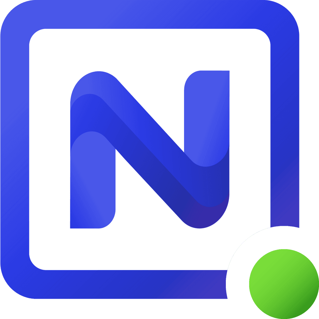
alternative app icon
-
Noco's "droid" logo seems a bit overused so I modified their "N" logo and added that to my dashboard and thought about sharing it if anyone else likes it. I added a white background so it's more visible when dark mode is active, lightened the blue/purple area, and replaced the red circle with a green one.

-
@humptydumpty Thanks for sharing, you should post this suggestion in the upstream forum too (if you like)!
Hello! It looks like you're interested in this conversation, but you don't have an account yet.
Getting fed up of having to scroll through the same posts each visit? When you register for an account, you'll always come back to exactly where you were before, and choose to be notified of new replies (either via email, or push notification). You'll also be able to save bookmarks and upvote posts to show your appreciation to other community members.
With your input, this post could be even better 💗
Register Login
