Surfer Logo
-
Hi @nebulon
I had some users offer some comments on the new Surfer logo which they liked less than the previous one.
One of them suggested minor modifications to the art of logos.
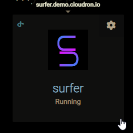
Original:

Suggested option 1:

Suggested option 2:

Their preference was option 2 with more rounded corners, perhaps even an option 3 with shorter arms and shifting the bottom part up and into the top part to interlink them as a blend of options 1 & 2.
There was more discussion, however I thought I'd bring this to you.
Hello! It looks like you're interested in this conversation, but you don't have an account yet.
Getting fed up of having to scroll through the same posts each visit? When you register for an account, you'll always come back to exactly where you were before, and choose to be notified of new replies (either via email, or push notification). You'll also be able to save bookmarks and upvote posts to show your appreciation to other community members.
With your input, this post could be even better 💗
Register Login