Status legend in the dashboard header
-
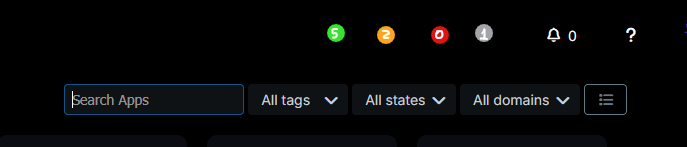
I have a small UX suggestion that could make the dashboard even more glance friendly by checking the overall app health in one quick look. There’s some empty space at the very top. What if that area had a color-coded status legend with counts? Something like little dots with numbers:
Green – All good / running
Yellow – Update available
Red – Unresponsive app
Grey – Stopped appTo expand on this, if you click on one of the circles, it'll filter the app grid and show the affected apps. It'll quickly help pinpoint which app is down and which needs updating, etc.
-
@robi said in Status legend in the dashboard header:
How about big dots with numbers inside?
how is that different to @humptydumpty mock-up of dots with numbers inside above?


Hello! It looks like you're interested in this conversation, but you don't have an account yet.
Getting fed up of having to scroll through the same posts each visit? When you register for an account, you'll always come back to exactly where you were before, and choose to be notified of new replies (either via email, or push notification). You'll also be able to save bookmarks and upvote posts to show your appreciation to other community members.
With your input, this post could be even better 💗
Register Login