Eleutheria Pay - Open source donation platform
-
@jdaviescoates
EuroGBP seems to be the dafault. I can add back a currency default (with USD as the fallback if the default is not valid). Or I can try to be fancy and detect location and use USD or CAD as the fallback (probably USD its more widely used/known)Also, I just now realize that there are button style radio-buttons for bootstrap which I missed by not scrolling down:
https://bootstrap-vue.org/docs/components/form-radioI'll look into making these changes. I do agree it looks many times better.
@atrilahiji said in Eleutheria Pay - Open source donation platform:
GBP seems to be the dafault.
I think that's just because I've linked to collective that are UK based and have set that in their settings.
-
@atrilahiji ah, I guess editing timeout options must've changed with the recent update.
I found your new demo at https://eleutheriapaydemo.atrilahiji.dev/ in the repo as you suggested

If I were you I wouldn't default the amount to the lowest amount either, I note everyone else seems to go in the middle somewhere.
e.g. https://opencollective.com/mutual-interest-media/donate
I also like prefer how they've designed the UI over what you've got so far (although, overall, really great work, thanks!)
I'd be intrigued to know what currency it displays when you go to that link? I note I can't choose, but I don't know if that's because the default has been set by the collective, or if it's worked out my location (I think probably the former)
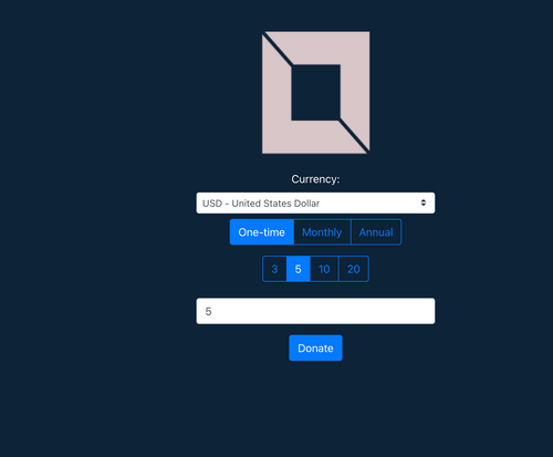
@jdaviescoates Pushed a change to make it look more like OpenCollective. There wont be a demo up yet as I want to have a few more things sorted (like a dedicated "other" button that reveals the textbox. Regular radiobuttons don't behave this way so I suspect I'd need to hack something together for this.
I've gotta say, I'm really liking the feedback

-
@jdaviescoates Pushed a change to make it look more like OpenCollective. There wont be a demo up yet as I want to have a few more things sorted (like a dedicated "other" button that reveals the textbox. Regular radiobuttons don't behave this way so I suspect I'd need to hack something together for this.
I've gotta say, I'm really liking the feedback

@atrilahiji said in Eleutheria Pay - Open source donation platform:
I've gotta say, I'm really liking the feedback
You are very welcome. Since I'm not a coder it's nice to be able contribute another way

-
@atrilahiji said in Eleutheria Pay - Open source donation platform:
I've gotta say, I'm really liking the feedback
You are very welcome. Since I'm not a coder it's nice to be able contribute another way

This is what it would look like (don't mind the lack of title. Its the frontend running locally without the backend so it cant get the info.
-
This is what it would look like (don't mind the lack of title. Its the frontend running locally without the backend so it cant get the info.
-
@atrilahiji If you are going with a dark theme, might I recommend the following colors for button highlights:
- #375a7f
- #444
- #40739e
- #353b48
Also, I'd checkout https://flatuicolors.com/ for some color palette ideas

@murgero Good idea! UX definitely isn't my specialty

-
@murgero Good idea! UX definitely isn't my specialty

-
@atrilahiji Always happy to put input in on an awesome project! If you need help with anything, let me know

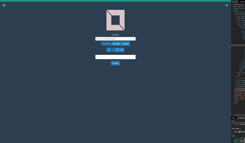
Landed on something like this for now:
My theme variables look like this at the moment:
:root {
    --bg-color: #ffffff;
    --text-color: #2c3e50;
    --button-color: #2980b9;
    --top-nav-color: #16a085;
}
[data-theme="dark"] {
    --bg-color: #2c3e50;
    --text-color: #ffffff;
    --button-color: #2980b9;
    --top-nav-color: #16a085;
}
All I am doing is setting the active button to 80% brightness at the moment. Turns out I have to try and re-do Bootstrap's active button styling when I try and add a new color variant. I would like other opinions on this as well. Of course all of this is going to be easily configurable via these css variables so we are just talking about defaults.
-
Nice, you can prob set the amount field width to say 6-characters unless you're feeling very lucky!

-
Nice, you can prob set the amount field width to say 6-characters unless you're feeling very lucky!

@marcusquinn hahaha yeah I’m going to make that tiny
-
TBH I'd make everything, except the logo, left-aligned too. Makes it easier to embed in an iframe and suite most common form styles.
-
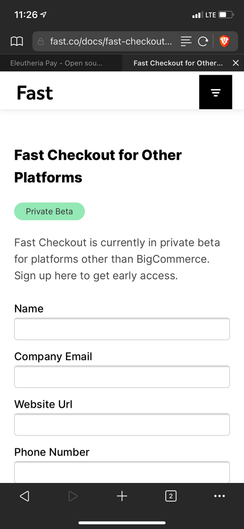
I realise this is for Stripe, and they are pretty good, but I'm also curious to try Fast at some point too, seems quite slick & friction-free:
-
TBH I'd make everything, except the logo, left-aligned too. Makes it easier to embed in an iframe and suite most common form styles.
@marcusquinn Normally I'd be inclined to agree, but because the only content is the form, I personally prefer centered. I am open to be swayed the other way if we get some more opinions.
As for Fast, I'll take a look. Definitely looks interesting

-
TBH I'd make everything, except the logo, left-aligned too. Makes it easier to embed in an iframe and suite most common form styles.
@marcusquinn said in Eleutheria Pay - Open source donation platform:
TBH I'd make everything, except the logo, left-aligned too. Makes it easier to embed in an iframe and suite most common form styles.
I don't agree with this - using responsive UI building tools, it would be better to center-align objects, but keep text left aligned where it makes sense.
@atrilahiji You should implement a plugin system so others of us can write integrations for other platforms as wanted.
Like I'd really like a PayPal and Bitcoin (Coinbase, BitPay, etc) integration.
-
@marcusquinn said in Eleutheria Pay - Open source donation platform:
TBH I'd make everything, except the logo, left-aligned too. Makes it easier to embed in an iframe and suite most common form styles.
I don't agree with this - using responsive UI building tools, it would be better to center-align objects, but keep text left aligned where it makes sense.
@atrilahiji You should implement a plugin system so others of us can write integrations for other platforms as wanted.
Like I'd really like a PayPal and Bitcoin (Coinbase, BitPay, etc) integration.
@murgero In reply to the iframe / embed - there should be JS code that allows a simpler UI to be embedded into a website Something like <script src="someEmbed.js"></script> That will embed into the current page, a button at the bottom of the browser window that says something like "Support Me?" or whatever.
-
@murgero In reply to the iframe / embed - there should be JS code that allows a simpler UI to be embedded into a website Something like <script src="someEmbed.js"></script> That will embed into the current page, a button at the bottom of the browser window that says something like "Support Me?" or whatever.
@murgero good idea! I’ll take a look at embed stuff. As for plugins, I’m definitely looking to split the payment processors out into a sort of plugin system. It’s going to require a lot of abstracting out the payment system specifics from the rest of the app. It’s going to be interesting to try this as plug-ins will have front end and back end components. At least Stripe does (frontend-> backend-> frontend)
I also welcome contributions if anyone wants. I’ll figure out if external accounts on my GitLab have the correct permissions and write up a contribution guide
-
I realise this is for Stripe, and they are pretty good, but I'm also curious to try Fast at some point too, seems quite slick & friction-free:
 FeelsBadMan. We'll have to wait.
 -
Made a couple of updates. One of them was an endpoint that serves an SVG donation badge that can be embedded in websites or git readme files. I added it to my repo here if you wanna see:
https://git.lahijiapps.dev/atrilahiji/eleutheriapay
Also trying to figure out how to tweak the cloudron package to properly merge .env files and the styles.css file. Right now while updates work on cloudron, I have to manually add config changes to the .env file.
-
 FeelsBadMan. We'll have to wait.
@atrilahiji nice, left-align makes much more sense to me. I don't even know that I've every seen a centre-aligned form, constrained width to a max would make more sense, as the container would be centred, rather than the content. Good stuff.
-
Made a couple of updates. One of them was an endpoint that serves an SVG donation badge that can be embedded in websites or git readme files. I added it to my repo here if you wanna see:
https://git.lahijiapps.dev/atrilahiji/eleutheriapay
Also trying to figure out how to tweak the cloudron package to properly merge .env files and the styles.css file. Right now while updates work on cloudron, I have to manually add config changes to the .env file.
Hello! It looks like you're interested in this conversation, but you don't have an account yet.
Getting fed up of having to scroll through the same posts each visit? When you register for an account, you'll always come back to exactly where you were before, and choose to be notified of new replies (either via email, or push notification). You'll also be able to save bookmarks and upvote posts to show your appreciation to other community members.
With your input, this post could be even better 💗
Register Login


