Bug: Mobile Sidebar UI Rendering Issue
-
Summary:
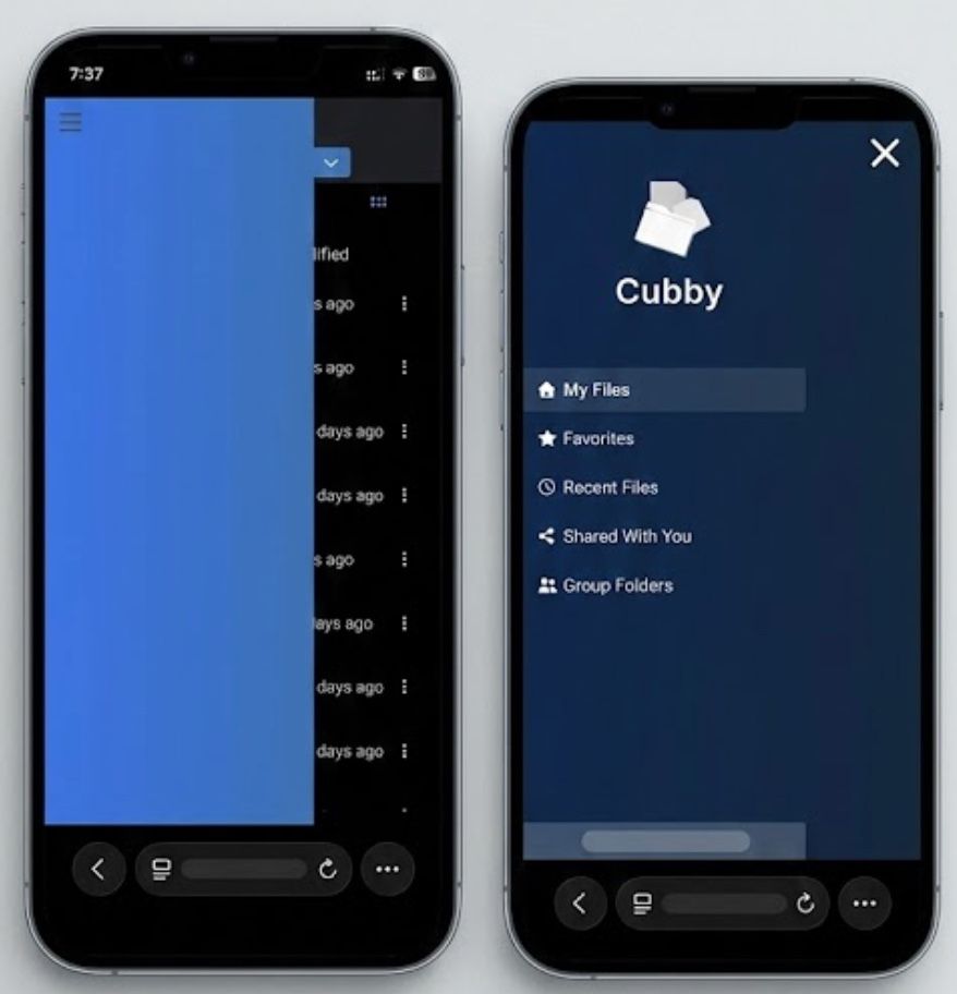
On mobile devices, the Cubby sidebar fails to render as a properly scaled overlay. Instead of a standard navigation drawer, it appears as a large, static blue block that obscures the file list (left image) or occupies the entire screen without proper responsive scaling (right image).
Environment:
- Platform: Safari on iOS26
- Component: Navigation Sidebar / Hamburger Menu
Steps to Reproduce:
- Open Cubby on a mobile browser.
- Observe the initial state (large blue block covering half the screen).
- Click the Hamburger Menu icon.
Actual Result:
Initial View: A solid blue rectangular block permanently obscures the left side of the file view, making it impossible to see file names or metadata.
Expanded View: Clicking the hamburger menu opens a full-screen navigation list, but the background and element scaling appear inconsistent with a mobile-responsive design.
Expected Result:
The sidebar should remain hidden by default on mobile. When the hamburger menu is clicked, it should slide out as a clean, responsive drawer that can be easily dismissed. -
Unfortunately, Tim Apple has me locked into his ecosystem! But I am sure the Android app will come in handy for plenty of users!

-
 N nebulon marked this topic as a question on
-
N nebulon has marked this topic as solved on
-
Thank you!
Hello! It looks like you're interested in this conversation, but you don't have an account yet.
Getting fed up of having to scroll through the same posts each visit? When you register for an account, you'll always come back to exactly where you were before, and choose to be notified of new replies (either via email, or push notification). You'll also be able to save bookmarks and upvote posts to show your appreciation to other community members.
With your input, this post could be even better 💗
Register Login