
Mail app Feature Request: improve minimized compose UX
-
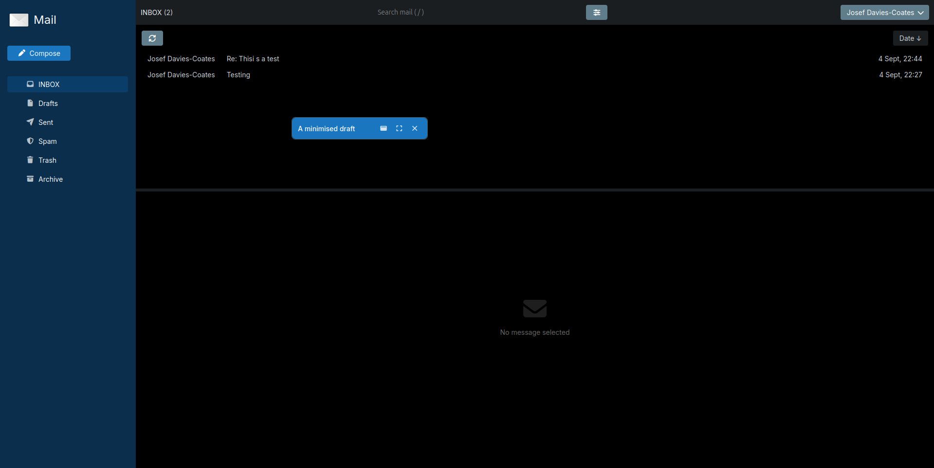
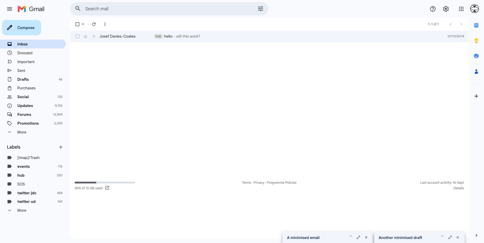
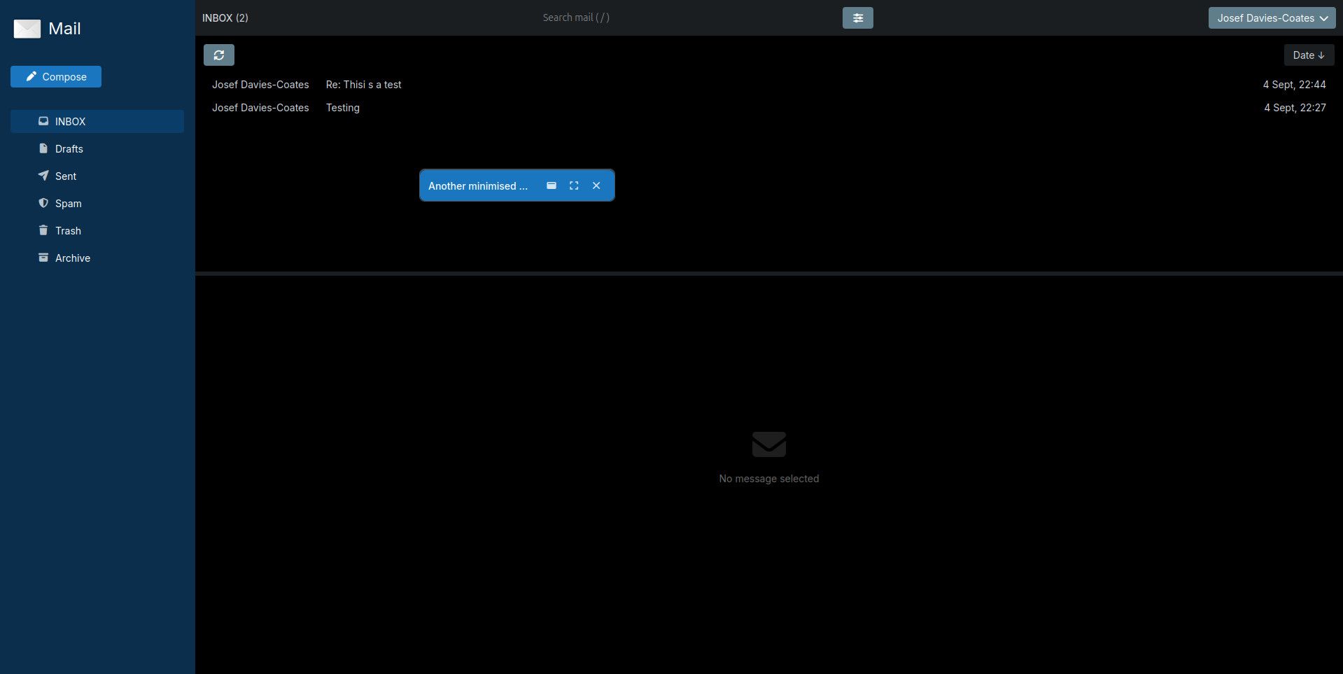
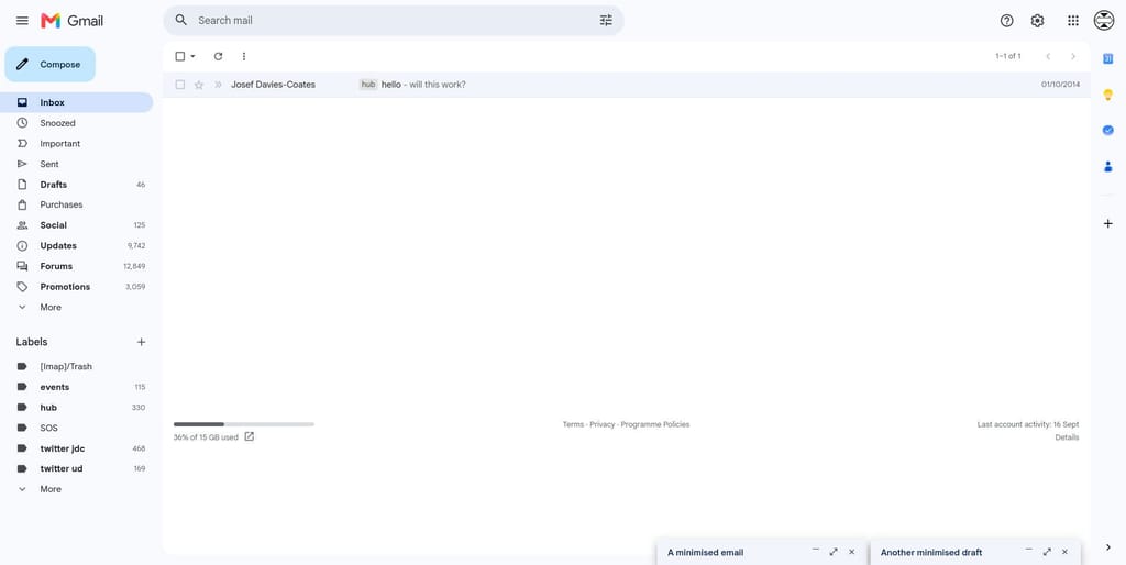
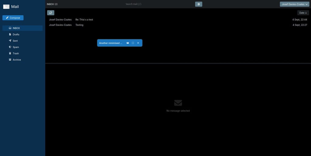
IMHO it's a bit of strange UX that when minimising the compose window it just becomes a random little floating bar in the middle-ish of the screen, rather than e.g. being docked down the bottom of the screen as in Gmail:
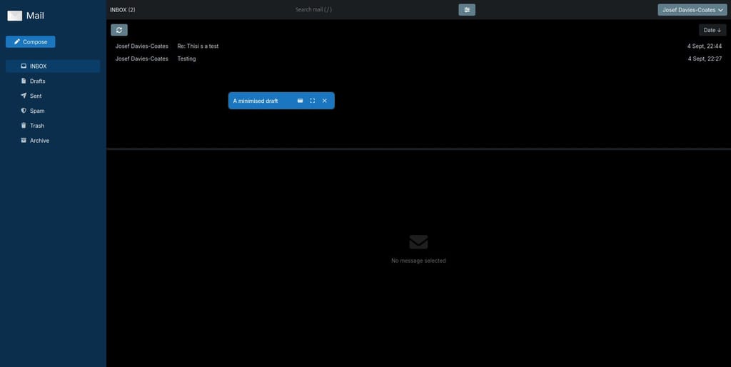
I like how Gmail does it (and how it's possible to have multiple drafts on the go which the fantastic new Cloudron Mail app also does, but it randomly puts them in the middle of the screen and on top of one another):
-
 J jdaviescoates referenced this topic
Hello! It looks like you're interested in this conversation, but you don't have an account yet.
Getting fed up of having to scroll through the same posts each visit? When you register for an account, you'll always come back to exactly where you were before, and choose to be notified of new replies (either via email, or push notification). You'll also be able to save bookmarks and upvote posts to show your appreciation to other community members.
With your input, this post could be even better 💗
Register Login