Display bug in new system info tab / disk usage
-
A few days ago I was wondering why the disk space/usage on one of my machines didn't update properly or rather why it was taking so long to calculate, it never actually finished and I thought I would get back after a bit to check it.
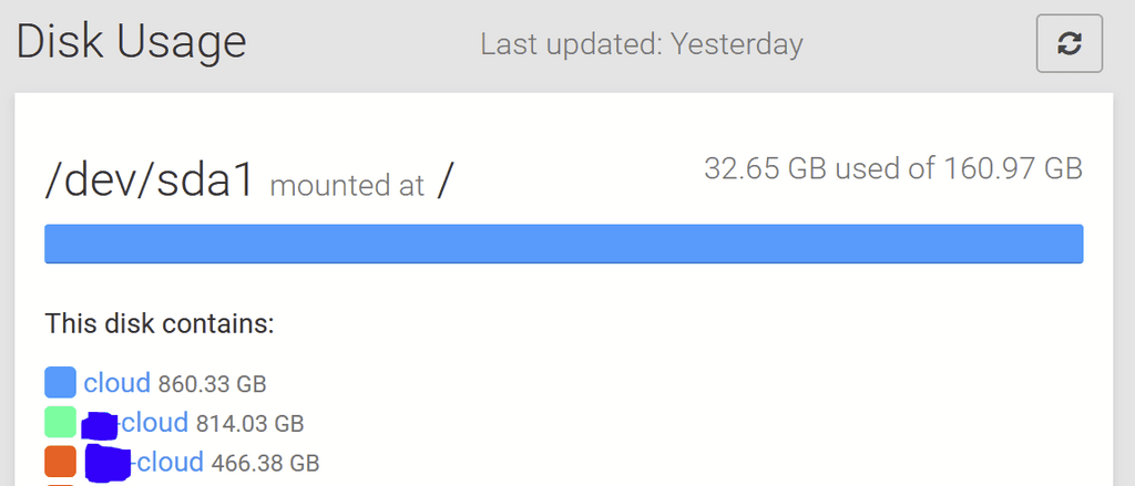
I've done that now and I'm pleased that the volumes now also show up in the space usage tab, but this screws up the display of the general list (and also takes a long time to finish):

As you can see, the machine has 160GB in total, but each of the three mounted volumes you see here is 1TB in size and it tries to show those bars in the main used space as well (which is great, but could we also display it like "860 GB of 1 TB in use, 140 GB available" at the bottom so we can see at one glance how the resources are doing?), but it goes way outside the screen (because it's that much more GB) and also shows a horizontal scrollbar when hovering the blue bar. Would be cool if those two could be either separated or added to the total disk space (I would opt for the former though, because they are independent mounts).
Hope that makes sense

-
 N nebulon marked this topic as a question on
-
 N nebulon has marked this topic as solved on
Hello! It looks like you're interested in this conversation, but you don't have an account yet.
Getting fed up of having to scroll through the same posts each visit? When you register for an account, you'll always come back to exactly where you were before, and choose to be notified of new replies (either via email, or push notification). You'll also be able to save bookmarks and upvote posts to show your appreciation to other community members.
With your input, this post could be even better 💗
Register Login
