Eleutheria Pay - Open source donation platform
-
TBH I'd make everything, except the logo, left-aligned too. Makes it easier to embed in an iframe and suite most common form styles.
@marcusquinn Normally I'd be inclined to agree, but because the only content is the form, I personally prefer centered. I am open to be swayed the other way if we get some more opinions.
As for Fast, I'll take a look. Definitely looks interesting

-
TBH I'd make everything, except the logo, left-aligned too. Makes it easier to embed in an iframe and suite most common form styles.
@marcusquinn said in Eleutheria Pay - Open source donation platform:
TBH I'd make everything, except the logo, left-aligned too. Makes it easier to embed in an iframe and suite most common form styles.
I don't agree with this - using responsive UI building tools, it would be better to center-align objects, but keep text left aligned where it makes sense.
@atrilahiji You should implement a plugin system so others of us can write integrations for other platforms as wanted.
Like I'd really like a PayPal and Bitcoin (Coinbase, BitPay, etc) integration.
-
@marcusquinn said in Eleutheria Pay - Open source donation platform:
TBH I'd make everything, except the logo, left-aligned too. Makes it easier to embed in an iframe and suite most common form styles.
I don't agree with this - using responsive UI building tools, it would be better to center-align objects, but keep text left aligned where it makes sense.
@atrilahiji You should implement a plugin system so others of us can write integrations for other platforms as wanted.
Like I'd really like a PayPal and Bitcoin (Coinbase, BitPay, etc) integration.
@murgero In reply to the iframe / embed - there should be JS code that allows a simpler UI to be embedded into a website Something like <script src="someEmbed.js"></script> That will embed into the current page, a button at the bottom of the browser window that says something like "Support Me?" or whatever.
-
@murgero In reply to the iframe / embed - there should be JS code that allows a simpler UI to be embedded into a website Something like <script src="someEmbed.js"></script> That will embed into the current page, a button at the bottom of the browser window that says something like "Support Me?" or whatever.
@murgero good idea! I’ll take a look at embed stuff. As for plugins, I’m definitely looking to split the payment processors out into a sort of plugin system. It’s going to require a lot of abstracting out the payment system specifics from the rest of the app. It’s going to be interesting to try this as plug-ins will have front end and back end components. At least Stripe does (frontend-> backend-> frontend)
I also welcome contributions if anyone wants. I’ll figure out if external accounts on my GitLab have the correct permissions and write up a contribution guide
-
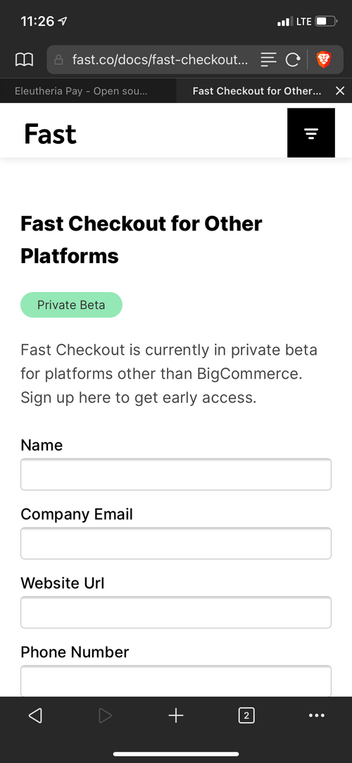
I realise this is for Stripe, and they are pretty good, but I'm also curious to try Fast at some point too, seems quite slick & friction-free:
 FeelsBadMan. We'll have to wait.
 -
Made a couple of updates. One of them was an endpoint that serves an SVG donation badge that can be embedded in websites or git readme files. I added it to my repo here if you wanna see:
https://git.lahijiapps.dev/atrilahiji/eleutheriapay
Also trying to figure out how to tweak the cloudron package to properly merge .env files and the styles.css file. Right now while updates work on cloudron, I have to manually add config changes to the .env file.
-
 FeelsBadMan. We'll have to wait.
@atrilahiji nice, left-align makes much more sense to me. I don't even know that I've every seen a centre-aligned form, constrained width to a max would make more sense, as the container would be centred, rather than the content. Good stuff.
-
Made a couple of updates. One of them was an endpoint that serves an SVG donation badge that can be embedded in websites or git readme files. I added it to my repo here if you wanna see:
https://git.lahijiapps.dev/atrilahiji/eleutheriapay
Also trying to figure out how to tweak the cloudron package to properly merge .env files and the styles.css file. Right now while updates work on cloudron, I have to manually add config changes to the .env file.
-
Made a couple of updates. One of them was an endpoint that serves an SVG donation badge that can be embedded in websites or git readme files. I added it to my repo here if you wanna see:
https://git.lahijiapps.dev/atrilahiji/eleutheriapay
Also trying to figure out how to tweak the cloudron package to properly merge .env files and the styles.css file. Right now while updates work on cloudron, I have to manually add config changes to the .env file.
@atrilahiji said in Eleutheria Pay - Open source donation platform:
Also trying to figure out how to tweak the cloudron package to properly merge .env files and the styles.css file. Right now while updates work on cloudron, I have to manually
Can I also make another suggestion? Can you add the option to detect dark mode enabled browsers (chrome, firefox, edge, etc all support this feature) so the site's dark mode toggle follows the users OS-determined settings?
https://stackoverflow.com/questions/50840168/how-to-detect-if-the-os-is-in-dark-mode-in-browsers
Once this project is more stable, I plan to use it as well for accepting donations.
-
@atrilahiji said in Eleutheria Pay - Open source donation platform:
Also trying to figure out how to tweak the cloudron package to properly merge .env files and the styles.css file. Right now while updates work on cloudron, I have to manually
Can I also make another suggestion? Can you add the option to detect dark mode enabled browsers (chrome, firefox, edge, etc all support this feature) so the site's dark mode toggle follows the users OS-determined settings?
https://stackoverflow.com/questions/50840168/how-to-detect-if-the-os-is-in-dark-mode-in-browsers
Once this project is more stable, I plan to use it as well for accepting donations.
@murgero already done. What it should be doing (I’ll verify again) is use your locastorage first. If it’s your first time visiting it will detect your system settings.
This means that if you manually toggle to light mode and come back, it will still be light and ignore your system preferences
-
@atrilahiji nice, left-align makes much more sense to me. I don't even know that I've every seen a centre-aligned form, constrained width to a max would make more sense, as the container would be centred, rather than the content. Good stuff.
@marcusquinn I will have to respectfully disagree with that one. That being said, the CSS is fully user customizable
-
@marcusquinn I will have to respectfully disagree with that one. That being said, the CSS is fully user customizable
@atrilahiji No worries, just my POV, noting the above Fast screenshot and similar with Stripe, Paypal and every other checkout form I've ever seen.

-
@atrilahiji No worries, just my POV, noting the above Fast screenshot and similar with Stripe, Paypal and every other checkout form I've ever seen.

@marcusquinn Something like this?
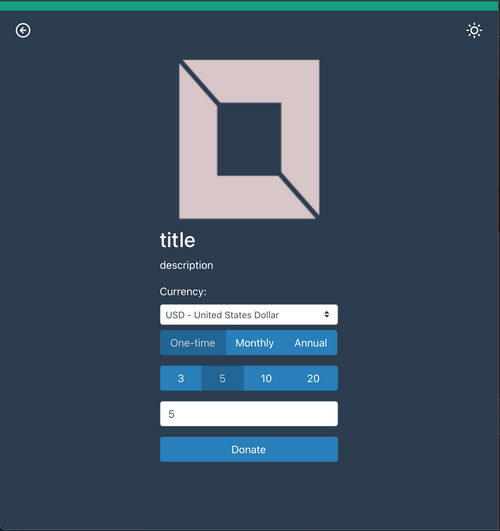
@murgero @jdaviescoates opinions?
-
@marcusquinn Something like this?

@murgero @jdaviescoates opinions?
-
Thanks for the feedback guys. I pushed and deployed a new demo and I think I have the hand of hang of bootstrap breakpoints.
-
Thanks for the feedback guys. I pushed and deployed a new demo and I think I have the hand of hang of bootstrap breakpoints.
-
@murgero Oh the new demo link is https://eleutheriapaydemo.atrilahiji.dev/
I cant update the OP anymore (dunno why) but its updated on the repo.
-
@murgero Oh the new demo link is https://eleutheriapaydemo.atrilahiji.dev/
I cant update the OP anymore (dunno why) but its updated on the repo.
@atrilahiji said in Eleutheria Pay - Open source donation platform:
I cant update the OP anymore (dunno why) but its updated on the repo.
I think when @Staff updated this NodeBB a load of default settings got changed, including making it so we can now no longer edit old posts. I'd like that change to be changed back.
-
@marcusquinn Something like this?

@murgero @jdaviescoates opinions?
@atrilahiji Thats nice

-
@atrilahiji Thats nice

For the radio-button styles, It might look better to invert, so blue text on white. We always try to make high-contract for visually-impaired accessibility.

