Include min and max in memory graph

-
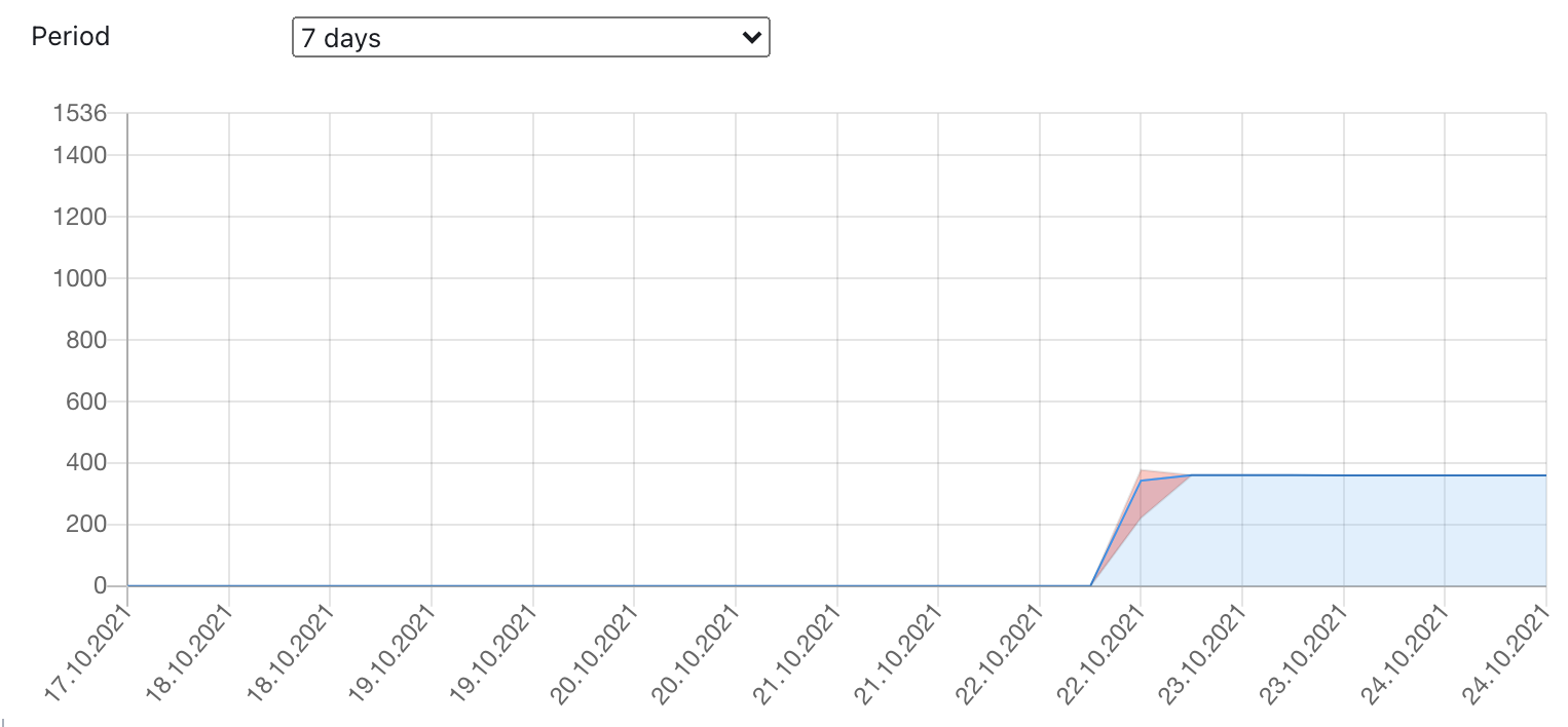
App graphs are currently averaged over a timespan of 6 hours per datapoint (or 5 minutes for the past 24 hours), which can give a misleading picture of the app's actual memory consumption. For example, you're unlikely to see a spike that would force the app to restart.
We can partially solve this problem by also including target data for min and max values in the graph.
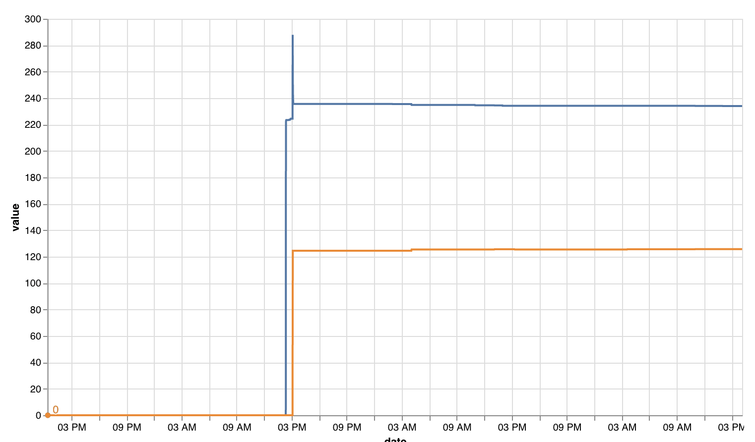
To give a concrete example, here is a Vega-Lite plot of the raw datapoints (memory and swap):
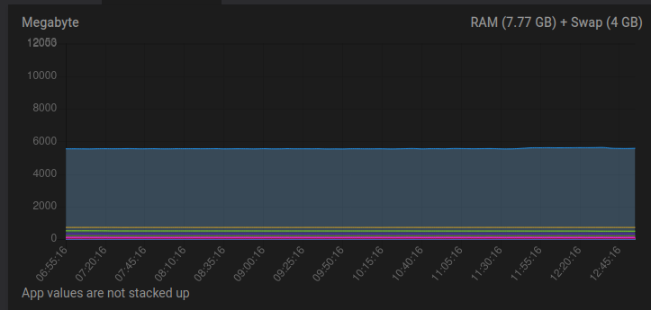
We see a spike right at the beginning, but looking at the Cloudron graph this spike is absent:
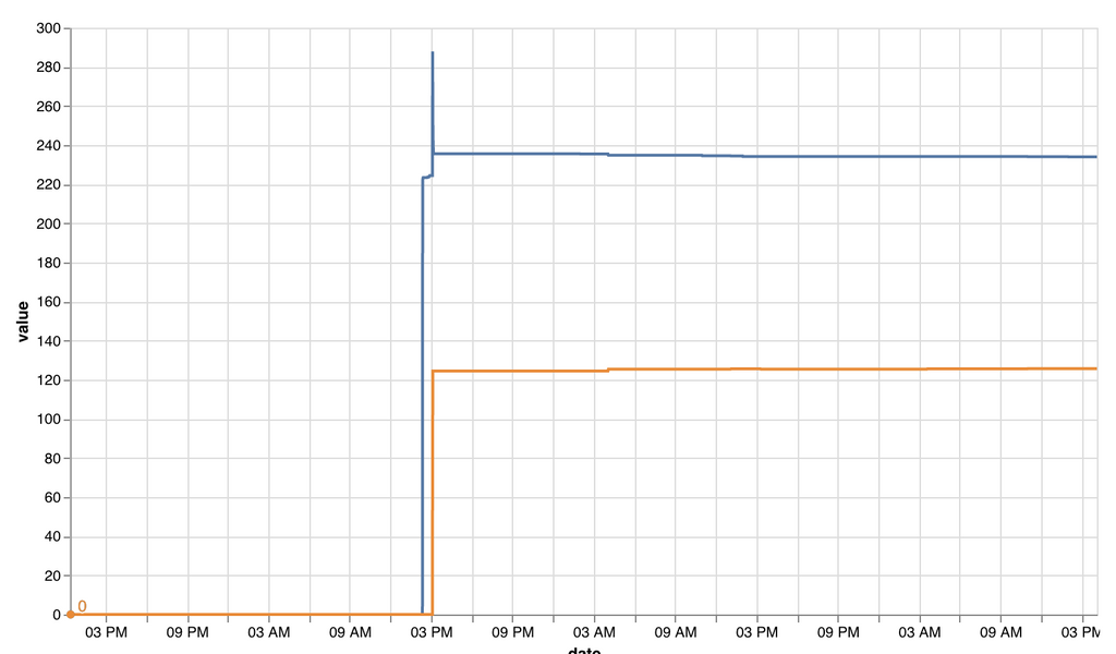
Here is a Chart.js recreation of the Cloudron graph, but with added targets for
minandmax. Also,tensionhas been set to0to not give the false impression that the data resolution would be higher than it actually is:
The exact representation would still have to be figured out, but hopefully this example can serve as a basis for further discussion.
-
A few more observations:
- The number of queried datapoints varies greatly, from 288 for the past 24 hours down to 28 for the past 7 days. I'd recommend to define a fixed number of datapoints and calculate the interval based on the selected period. If we go with 144 datapoints, we end up with the following intervals:
- 12 hours: 5min (currently 5min)
- 24 hours: 10min (currently 5min)
- 7 days: 70min (currently 6h)
- 30 days: 5h (currently 6h)
- Gaps are currently filled with preceding values (or 0 for the missing values at the beginning). I'd argue that any
nullvalues should be passed to Chart.js and shown as gaps in the chart. - The timestamps in the returned graphite data are currently dropped, and instead the offsets are recalculated. I'm not sure why this has been done, and would recommend to just convert the timestamps that are already associated with the data. Afaik these are identical for all targets.
(Please correct me if any of these are wrong.)
- The number of queried datapoints varies greatly, from 288 for the past 24 hours down to 28 for the past 7 days. I'd recommend to define a fixed number of datapoints and calculate the interval based on the selected period. If we go with 144 datapoints, we end up with the following intervals:
-
 B BrutalBirdie referenced this topic on
-
B BrutalBirdie referenced this topic on
-
@fiwand thanks for reporting! Will look into this for our next release but we didn't intend to average points over 6 hours, atleast not intentionally.
@girish I wonder if this ever got addressed?
I mean currently my memory graph is showing very odd things:
- It is showing memory consumption from apps that are not running
- Turning off the RAM hungry apps does not reflect in the graph
So I wonder if these issues have to do with the averaging timespan?
Also in general I do find it pretty hard to read and get info for the individual apps because they're all stacked at the bottom and you can hardly select an individual app. Is this just me? And to be fair to overall graph area is pretty small, would their be a way to "zoom" into it or something? - sorry this show be in another post, shouldn't it.
-
@girish I wonder if this ever got addressed?
I mean currently my memory graph is showing very odd things:
- It is showing memory consumption from apps that are not running
- Turning off the RAM hungry apps does not reflect in the graph
So I wonder if these issues have to do with the averaging timespan?
Also in general I do find it pretty hard to read and get info for the individual apps because they're all stacked at the bottom and you can hardly select an individual app. Is this just me? And to be fair to overall graph area is pretty small, would their be a way to "zoom" into it or something? - sorry this show be in another post, shouldn't it.
@avatar1024 said in Include min and max in memory graph:
Also in general I do find it pretty hard to read and get info for the individual apps because they're all stacked at the bottom and you can hardly select an individual app.
Same, personally I find these graphs to be almost completely useless
 (so if I want to look at a specific app I look at the graphs for just that app in the app setting)
 -
@girish I wonder if this ever got addressed?
I mean currently my memory graph is showing very odd things:
- It is showing memory consumption from apps that are not running
- Turning off the RAM hungry apps does not reflect in the graph
So I wonder if these issues have to do with the averaging timespan?
Also in general I do find it pretty hard to read and get info for the individual apps because they're all stacked at the bottom and you can hardly select an individual app. Is this just me? And to be fair to overall graph area is pretty small, would their be a way to "zoom" into it or something? - sorry this show be in another post, shouldn't it.
@avatar1024 yeah, admittedly those values are so small and close together that it's not readable. To address this, in 7.3 we just started hiding the apps that don't consume much memory. I don't know if this improves the situation.
It is showing memory consumption from apps that are not running
That is indeed a bug, will get that fixed.