What's coming in 7.2
-
We will be deploying a sign up flow at cloudron.io soon. This requires a new release on the Cloudron side. So, not many features here.
What’s coming in 7.2
- Auto-provision license from cloudron.io. This will create another flow for users to get started with Cloudron - one can sign up at cloudron.io and just run a command listed there to be auto-provisioned with cloudron license. The current install flow will remain.
- Give backups a name and control how they are preserved/cleaned up.
- Rework the backup code to use async/await
- support: add a separate system user named
cloudron-supportfor remote access. With this one doesn't need to enable ssh access for root. - Unify the app data and volumes code/ui
- Finish up async/await cleanup in backup code
We also seem to have already accumulated some important fixes:
- mail: hide log button for non-superadmins
- firewall: do not add duplicate ldap redirect rules
- ldap: respond to RootDSE
- nginx: update to 1.20.0-1
- Check if CNAME record exists and remove it if overwrite is set
- cifs: use credentials file for better password support
- installer: rework script to fix DNS resolution issues
- backup cleaner: do not clean if not mounted
- restore: fix sftp private key perms
- sshfs: fix bug where sshfs mounts were generated without unbound dependancy
-
@girish Regarding the Cloudron-support user, what would be the flow when asking for support? User is deactivated by default and enabled? Will it be password based or token?
@ruihildt said in What's coming in 7.2:
@girish Regarding the Cloudron-support user, what would be the flow when asking for support? User is deactivated by default and enabled? Will it be password based or token?
The flow for the user remains the same - you just have to go to Support -> Enable Remote Access.
Internally, what this used to do was to add or remove our ssh key into
/root/.ssh/authorized_keys. On our side, we used tossh -i <private_key> root@ip. With this change, the keys will be added into thecloudron-supportuser. So, in/home/cloudron-support/.ssh/authorized_keys. We will usessh -i <private_key> cloudron-support@ipinstead. Thecloudron-supportuser is also added in sudoers so that we can get root access once we SSH'ed in.No password based access, only based on ssh keys like before. So, sshd_config can have
PasswordAuthentication no -
 G girish referenced this topic on
-
Newbie question here for backups… does the async/await make the performance improve significantly for backup times to backends like Wasabi or does it apply more to local backups to external block storage disks and stuff like that? Curious I guess of the real-world impact from that change. Fingers crossed for improved backup times.
-
7.2.0 is published for new installs. Highly recommend existing installation to not upgrade. Existing installations won't auto-upgrade (yet), so all you have to do is to not explicitly upgrade.
We made the release since we have to make a cloudron.io release as well to get the new sign up flow going.
-
This also includes the proxyAuth change that allows Firefly iii to authenticate again, correct?
@infogulch yes! I already pushed out the Firefly-III update, in case you want to test that.
-
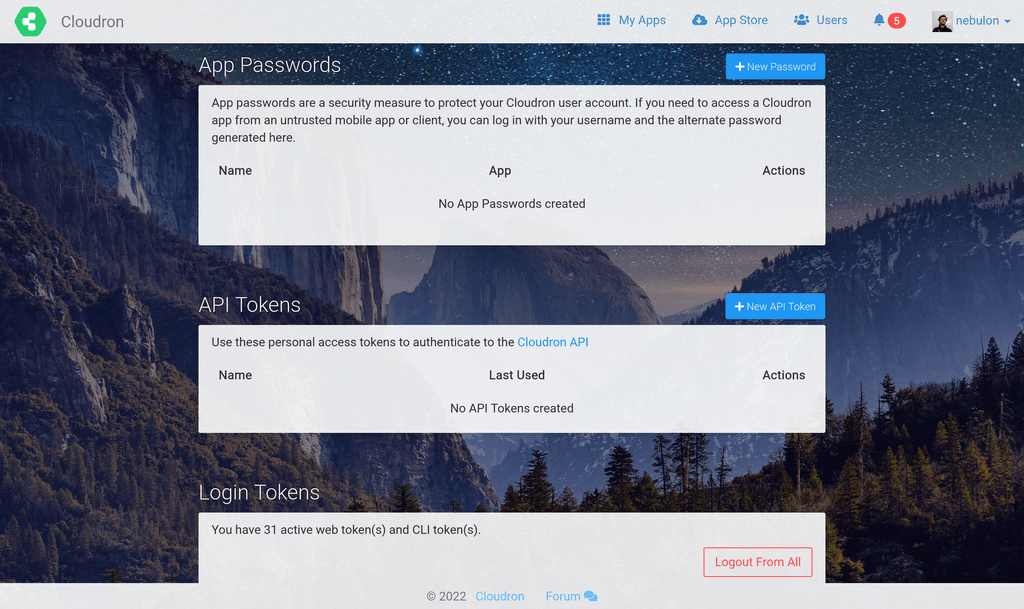
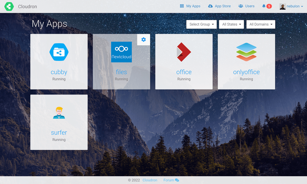
We also have started to introduce the ability to add a personal background image now for some customization, which might give a more personal touch. I am currently working through some css styling related issues and likely after the first release of the feature, there will be some rougher edges depending on the user-selected background image (think of contrast and such), but we will iterate on that.
By default there will be no background image.
Just some preview images here:


-
@infogulch yes! I already pushed out the Firefly-III update, in case you want to test that.
-
@girish said in What's coming in 7.2:
Unify the app data and volumes code/ui
This didn't make it to the release since it requires a bit more refactoring.
But otherwise, we will start rolling out 7.2.1 this week.
-
 G girish unpinned this topic on
-
We also have started to introduce the ability to add a personal background image now for some customization, which might give a more personal touch. I am currently working through some css styling related issues and likely after the first release of the feature, there will be some rougher edges depending on the user-selected background image (think of contrast and such), but we will iterate on that.
By default there will be no background image.
Just some preview images here:


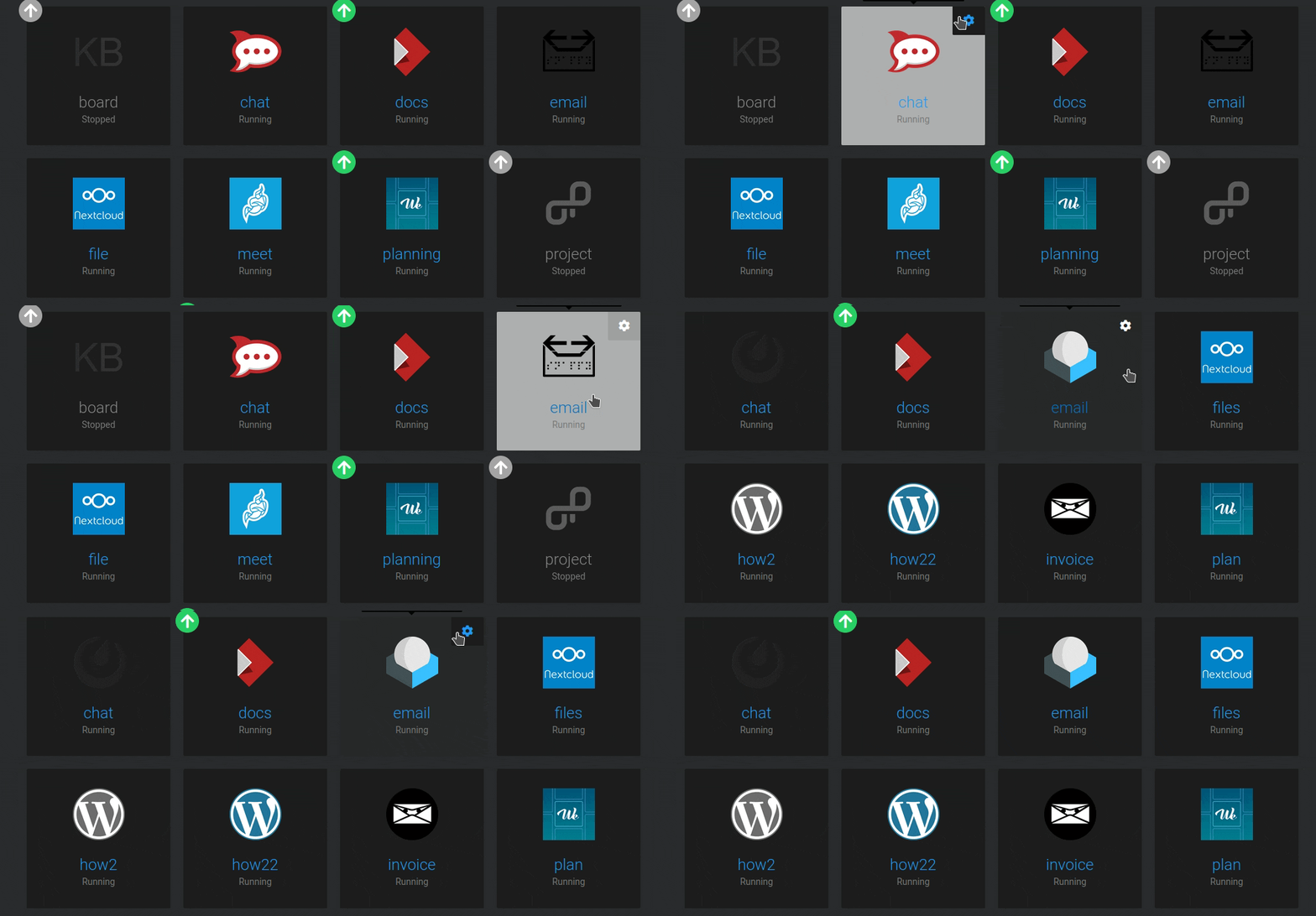
@nebulon Hello, just updated to 7.2.2 today and on dark theme the new contrast on app hoover looks a bit off I think. Actually it feel like something in between 7.1 and 7.2 would be good, i.e: lighter than in 7.1 so it stands out more but darker than in 7.2 so it blends more with the background.
Also I think the square around the gear icon should remain with the same background as the rest of the app if not hoovered over (as it was the case in 7.1) since the gear itself stands out enough with it's white colour.
-
@nebulon Hello, just updated to 7.2.2 today and on dark theme the new contrast on app hoover looks a bit off I think. Actually it feel like something in between 7.1 and 7.2 would be good, i.e: lighter than in 7.1 so it stands out more but darker than in 7.2 so it blends more with the background.
Also I think the square around the gear icon should remain with the same background as the rest of the app if not hoovered over (as it was the case in 7.1) since the gear itself stands out enough with it's white colour.

@avatar1024 thanks for the feedback. I've put in a few style changes to start supporting custom background images. Given how stylesheet changes cascade, I expect a few more glitches with the combination of light/dark mode and both with backgrounds. I will get this fixed for next release.
-
@avatar1024 thanks for the feedback. I've put in a few style changes to start supporting custom background images. Given how stylesheet changes cascade, I expect a few more glitches with the combination of light/dark mode and both with backgrounds. I will get this fixed for next release.
-
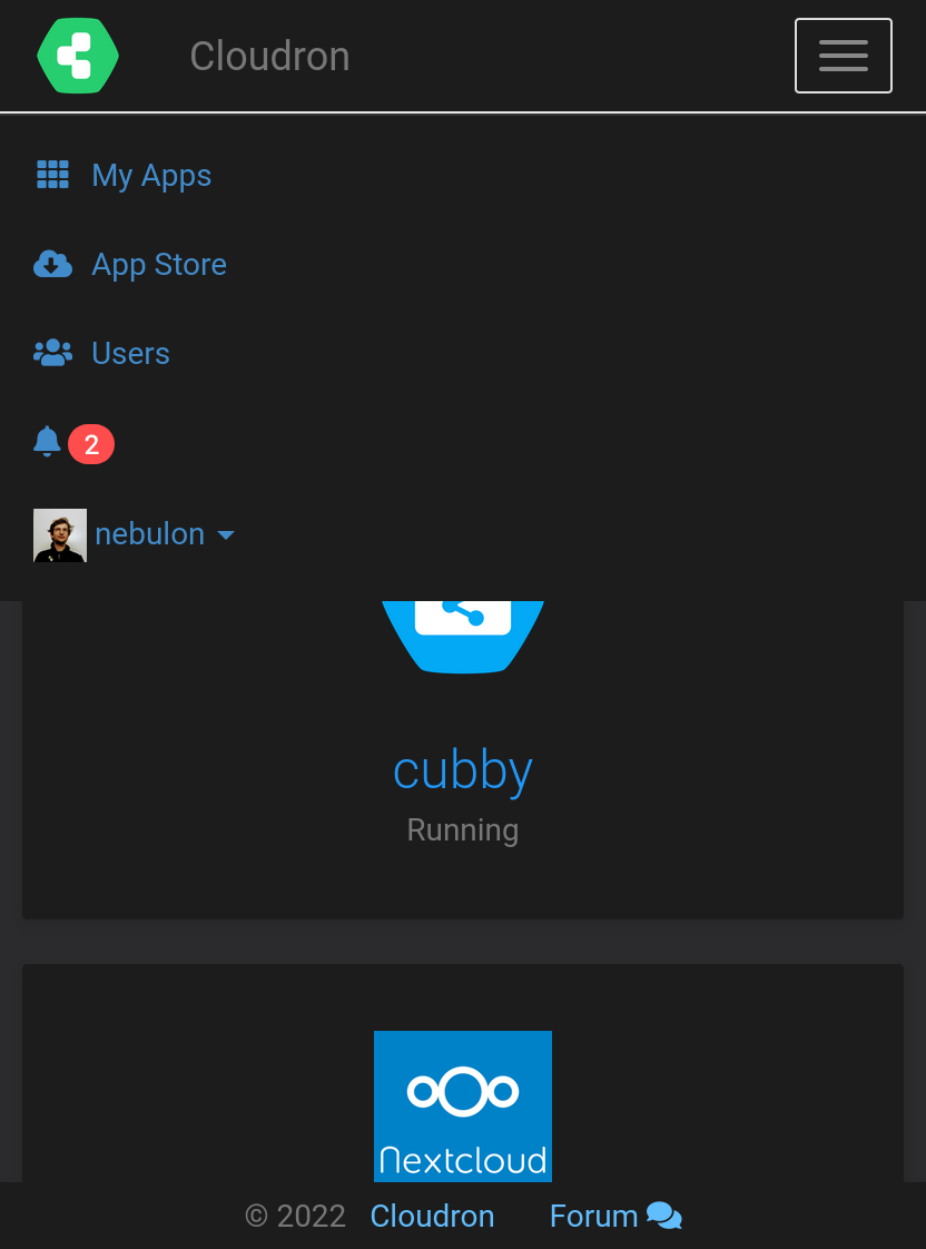
@nebulon There's a glitch in the view of the scrolldown menu on mobile view which needs to be fixed.
-
@micmc thanks for the detailed video, unfortunately I can't reproduce this, possibly this got fixed as a sideeffect with latest changes for 7.3 already:
Hello! It looks like you're interested in this conversation, but you don't have an account yet.
Getting fed up of having to scroll through the same posts each visit? When you register for an account, you'll always come back to exactly where you were before, and choose to be notified of new replies (either via email, or push notification). You'll also be able to save bookmarks and upvote posts to show your appreciation to other community members.
With your input, this post could be even better 💗
Register Login


