You ready for the silliest Feature Request Ever? Colour-coded edges in the Notifications view!
-
So, I'm looking at my Notifications...there are 10 right now. I scan starting at the top...good, they're all "Such-and-such an App has been Updated". BUT, the last one, just as I was going to click "All Read" says the app in question ran out of memory! Yikes. What would happen if I skipped over and didn't notice that? You know what would have made me notice that sooner and clearly? A RED line on the left, rather than a Blue one. Maybe even different colours for Updated-Blue; Update Available-Purple; there's gotta be something for Green.
Anyway, this would be nice, but I have no clue how tough it would be to tie a colour to an notifiable event.

-
I like it, not at all silly
-
Absolutely not silly. From a usability point of view, it's an excellent idea.
-
This is actually quite a simple change and I like it. Most effort is to define like 3-4 colors to group the various notifications so it makes sense.
@nebulon said in You ready for the silliest Feature Request Ever? Colour-coded edges in the Notifications view!:
Most effort is to define like 3-4 colors to group the various notifications so it makes sense.
I propose a simple traffic light system:
Just based on notifications I've had recently:
App Updated -> Green (i.e. this is not a problem at all/ No action required)
App Out of Memory -> Yellow or Orange, I think probably Orange as it's closer to red (i.e. this could be a problem if it keeps happening/Action should probably be taken.)
Backup Failed -> Red (i.e. this is a serious problem/ Action required.) -
@jdaviescoates What about "Reboot required"? Perhaps the existing Blue, seeing as it is neither good nor bad, but merely a notification?
-
@jdaviescoates What about "Reboot required"? Perhaps the existing Blue, seeing as it is neither good nor bad, but merely a notification?
@scooke said in You ready for the silliest Feature Request Ever? Colour-coded edges in the Notifications view!:
@jdaviescoates What about "Reboot required"? Perhaps the existing Blue, seeing as it is neither good nor bad, but merely a notification?
I think I'd make that red myself as I think it's often about applying security patches.
"required" = action needs to be taken, so red.
-
@scooke I've just edited my proposal to distinguish Green/ Orange/ Red based on whether or not action needs to be taken

-
After some discussion internally, we figured that we first need to add notification classification, which we currently don't have. Once that is done other things like color-coding are possible but that seems to have various drawbacks still, and it's not too clear if it actually adds much benefit.
Still once the classification is there, the real value for users might then come if we add apprise support. That way we don't have to decide on behalf of the user what is sent where. As that is an inherently hard topic, since Cloudron spans from personal home users to power-users with 100s of apps on one instance.
Will be adding the notification types for a start and test apprise on the side then to check if it holds up to its promise.
@nebulon said in You ready for the silliest Feature Request Ever? Colour-coded edges in the Notifications view!:
various drawbacks still, and it's not too clear if it actually adds much benefit.
What are the drawbacks you perceive?
I think it would clearly add benefits. As @scooke pointed out, the vast majority of updates are just "x app successfully updated" but then buried amongst them are important things about apps running out of memory, are reboot being required, a backup having failed, disk space running out etc.
@nebulon said in You ready for the silliest Feature Request Ever? Colour-coded edges in the Notifications view!:
we first need to add notification classification
Perhaps in the first instance as a first iteration you could simple classify like this:
- App update notifications (who really cases about these anyway
 ?)
?) - Everything else (this is always where the important stuff is that needs actioning)
You could even then go ahead and colour code those too. It's basically the "everything else" ones we need to know about/ need highlighted in some way.
In some ways, why do I even need to know that an app has successfully updated?
@nebulon said in You ready for the silliest Feature Request Ever? Colour-coded edges in the Notifications view!:
the real value for users might then come if we add apprise support.
That'd be nice for sure, but I think just doing the above would still be a quick useful win (or maybe just add a button - "clear all app notification updates" but of course you'd still need a simple system to classify those first.
Let's not let perfect be the enemy of the good, or whatever that saying is

- App update notifications (who really cases about these anyway
-
So currently the real important actionable notifications (like reboot, email misconfiguration, ...) already bubble up to the top until they are solved. Others like out-of-memory notifications are only really actionable if they happen again and again, one should not immediately jump onto fixing this, as mentioned in the notification itself.
On top of all this, comes the different Cloudron use-cases and user perception on what is useful/important and what isn't.
But I agree while we won't be able to solve it perfectly, it still makes sense to improve a bit and we can go step-by-step here.
@nebulon said in You ready for the silliest Feature Request Ever? Colour-coded edges in the Notifications view!:
So currently the real important actionable notifications (like reboot, email misconfiguration, ...) already bubble up to the top until they are solved.
Do they?
I've never noticed that.
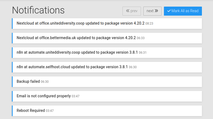
I just went to look at my notifications and they look like this right now:

The 3 most important ones have not bubbled up to the top, they are at the bottom after 4 "updated to package version" notifications.
(also, just as an aside: in my case this specific "Email is not configured properly" notification is actually not at all important, as it's for an app/ domain for which I'm not using any email, is already set to Outbound email only, and is an domain I don't control the DNS for and so can't actually fix myself - so I'd actually like to be able tell Cloudron to never tell me about it again. And I've seen that desire expressed by others on this forum before too)
-
@nebulon said in You ready for the silliest Feature Request Ever? Colour-coded edges in the Notifications view!:
So currently the real important actionable notifications (like reboot, email misconfiguration, ...) already bubble up to the top until they are solved.
Do they?
I've never noticed that.
I just went to look at my notifications and they look like this right now:

The 3 most important ones have not bubbled up to the top, they are at the bottom after 4 "updated to package version" notifications.
(also, just as an aside: in my case this specific "Email is not configured properly" notification is actually not at all important, as it's for an app/ domain for which I'm not using any email, is already set to Outbound email only, and is an domain I don't control the DNS for and so can't actually fix myself - so I'd actually like to be able tell Cloudron to never tell me about it again. And I've seen that desire expressed by others on this forum before too)
-
@nebulon said in You ready for the silliest Feature Request Ever? Colour-coded edges in the Notifications view!:
So currently the real important actionable notifications (like reboot, email misconfiguration, ...) already bubble up to the top until they are solved.
Do they?
I've never noticed that.
I just went to look at my notifications and they look like this right now:

The 3 most important ones have not bubbled up to the top, they are at the bottom after 4 "updated to package version" notifications.
(also, just as an aside: in my case this specific "Email is not configured properly" notification is actually not at all important, as it's for an app/ domain for which I'm not using any email, is already set to Outbound email only, and is an domain I don't control the DNS for and so can't actually fix myself - so I'd actually like to be able tell Cloudron to never tell me about it again. And I've seen that desire expressed by others on this forum before too)
-
@jdaviescoates btw , for the email , you can go to Email -> Outbound -> Disabled - if that applies to your situation. Then, that notification won't appear.
@girish said in You ready for the silliest Feature Request Ever? Colour-coded edges in the Notifications view!:
@jdaviescoates btw , for the email , you can go to Email -> Outbound -> Disabled - if that applies to your situation. Then, that notification won't appear.
Thanks, I may do that. But perhaps not, because presumably that'd stop Wordfence telling me about issues it finds with that WordPress site too? (although perhaps I should also double check if it is/ can actually do/ing that now given the current email status...)
-
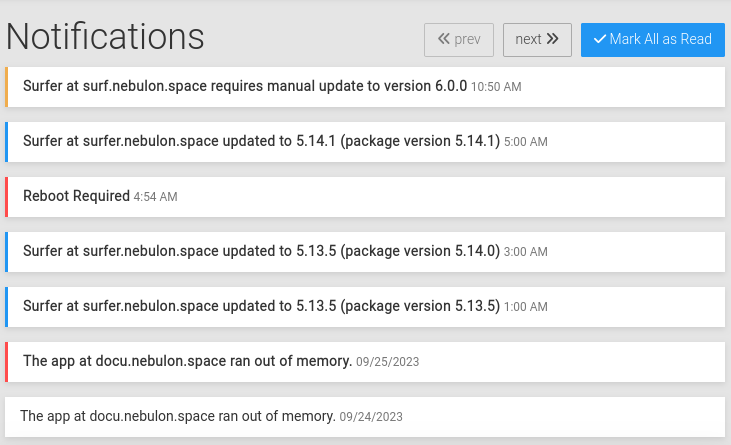
We've added some basic color coding now for next release:

With this we can then later add something like apprise depending on notification types.
@nebulon great stuff, thanks!
Are you able to share a list of what notifications go which colour?
-
The current color coding is a client side filter https://git.cloudron.io/cloudron/box/-/blob/master/dashboard/src/js/index.js?ref_type=heads#L121
All possible notification types are at https://git.cloudron.io/cloudron/box/-/blob/master/src/notifications.js?ref_type=heads#L12
