Cloudron 9.0 (beta) bug reports
-
Hi,
while testing version 9.0.1 i run into domain limit.
 Is this a new limit?
Greetings
Christian -
When in the
/#/system-updateview, while editing the values, the hours-dropdown doesn't show the current values and if I select one, it selects them all.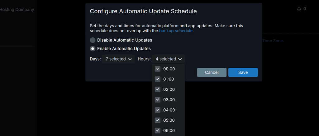
When trying to select a day, the dropdown just disappears and the console shows "TypeError: can't access property "value", item is undefined"
-
For these new notification settings it would also be nice to send an optional webhook or something. I am for example using ntfy for all kinds of notifications and would definitely prefer this channel over E-Mail.
-
Here is what I noticed is off:
- Looks sharp with a few caveats, speed of info being populated. The UI loads first, then the dynamic parts start coming in a few seconds later. Can this be cached? Feels slower than previous UX.
- The sidebar doesn't appear to be able to dock or minimize to the icons, or be adjusted in width. Makes everything on the right smaller.
- Still no way to tell how many apps are running from a glance at the dashboard
- Still no keyboard navigation? Feels slower with the mouse and expanding menus vs old way. It's also off the screen requiring scrolling when all are expanded. Slower.
- Many dialogs can't be exited or cancelled by pressing escape. For ex: adding a new mailbox user, tab to highlight the domain then Esc doesn't work, same for the next tab down to the next field. Ties in with No 4.
- When initiating actions the confirmation dialog is way at the top, requiring more time travel mouse wise. Centering it on screen would be good, dynamically placing the dialog at the same level as the previous button on screen would be better, and turning off confirmations (as an option) would be best!
")
- While dialog buttons can be switched via tab and better visualized thanks to the white border styling (in dark mode) the highlighted button cannot be pressed/confirmed with space, only enter.
- In System > Services the cloudron service still has no restart button in the three-dot menu. Yet docker does? I think we should do away with the three dot menu, it's yet another click with no benefit. The instant icon/buttons were great and visually easy. The menu is visually mute and far away fom the previous column.
- When I click on Backups, I want to see backups, not a dropdown with more options that are not backups. Just include the app archive below the backup information and save space. Come to think of it, why have expanding menus at all? App config doesn't, it just moves to another inner menu with all the options closer to the action. Would be more consistent across the two modals.
- Server menu could use copy buttons for easier sharing of info during troubleshooting or vanity posts and better formatted. This is what it looks like pasting the last two lines:
Uptime
20 hours
Cloudron Creation Time
9 months ago
^^ O_O that is a human gestation time.. and if you just installed Cloudron 9.. oh wait you upgraded. Nevermind.")
- The size of all the tiles is smaller. It might be nice to have a zoom/size feature to help visually if on larger screens.
- Almost thought we lost branding, but it's under Appearance. Okay? Why do external links on the dashboard have anything to do with Appearance? It could be a single button +[-∞-] on the Dashboard itself. Move Branding to System.
- The tile/list toggle button is nice, but then we have the burried three dot menu again. Icons not hidden by the menu are so much better.
- Why is the label and the location linking to the same external link? Let the label go to the config page and location go to the external link.
- The list view sort by reverse App Title is a bit broken as it separates lowercase and upper case letters, sorting each as a group, not as a whole list. Ignore the case.
- There don't appear to be hints hovering the mouse over the red triangles.
- It would be nice if the Event Log would have a button or links to the app config in question.
- In the Server menu, why hide the beautiful app list and file sizes? If you don't want to load it every time because of the graphs, have a cached version that updates. The list is not clickable, and I'd want to go to the App settings if I do. An enhancement would be to pull out the Backup Enabled setting for each app, as this view is often what I stare at trying to figure out why my backups are so large.
- Since there were no notifications, I couldn't test those, but I hope the same pattern applies with links to the App Config being more useful than the external subdomain.
- Mattermost App tile icon is almost entire invisible in dark mode, and completely invisible on mouseover :-0
-
Add an
autocomplete=offattribute where deemed necessary, e.g the user creation modal email, username, and password recovery inputs.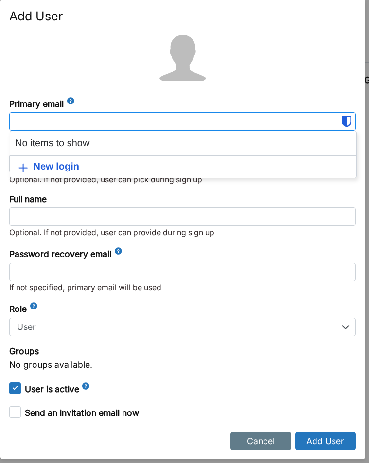
@Lanhild we actually already set that in the forms. It appears bitwarden ignores that or at least thinks it knows better. Firefox suggestions are prevented through it already for me.
I also tested the demos at https://developer.mozilla.org/en-US/docs/Web/HTML/Reference/Attributes/autocomplete with bitwarden and it is all over the place there

If anyone knows some quirks to please bitwarden, happy to try and add.
-
Just updated to 9.0.2, different message again in the
/#/serverview and still no graphs:box:metrics BoxError: Could not get disk stats of mapper/vg0-root at readDiskMetrics (/home/yellowtent/box/src/metrics.js:121:27) at async readSystemMetrics (/home/yellowtent/box/src/metrics.js:160:25) at async pipeSystemToMap (/home/yellowtent/box/src/metrics.js:431:21)Not using a cloud server on this one, but a dedicated one - shouldn't matter though, right?
Some other notes:
When changing the timezone in
/#/system-settings, there's no indication that anything changed, a bit of visual feedback would be nice that it actually saved the changes (for the language you can see that it changed, but a "settings saved/updated" message would be nice to have).The "Add Backup" button in
/#/backup-sitesis gone, but the admin user can still see "Schedule & Retention" (which both throws an error "Uncaught (in promise) TypeError: can't access property "id", day is undefined" in the console), "Content" and "Config", which both show the popup but you're not able to change anything (which is good, because those should be not there). And the Remove button shouldn't be there either, also throws an error in the console: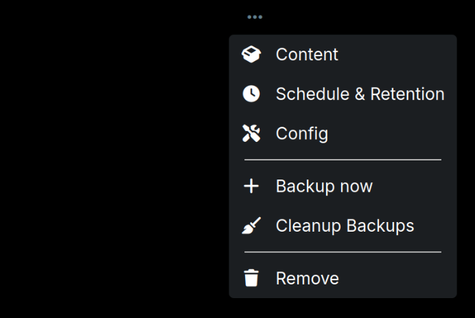
-
@Lanhild we actually already set that in the forms. It appears bitwarden ignores that or at least thinks it knows better. Firefox suggestions are prevented through it already for me.
I also tested the demos at https://developer.mozilla.org/en-US/docs/Web/HTML/Reference/Attributes/autocomplete with bitwarden and it is all over the place there
If anyone knows some quirks to please bitwarden, happy to try and add.
-
Just updated to 9.0.2, different message again in the
/#/serverview and still no graphs:box:metrics BoxError: Could not get disk stats of mapper/vg0-root at readDiskMetrics (/home/yellowtent/box/src/metrics.js:121:27) at async readSystemMetrics (/home/yellowtent/box/src/metrics.js:160:25) at async pipeSystemToMap (/home/yellowtent/box/src/metrics.js:431:21)Not using a cloud server on this one, but a dedicated one - shouldn't matter though, right?
Some other notes:
When changing the timezone in
/#/system-settings, there's no indication that anything changed, a bit of visual feedback would be nice that it actually saved the changes (for the language you can see that it changed, but a "settings saved/updated" message would be nice to have).The "Add Backup" button in
/#/backup-sitesis gone, but the admin user can still see "Schedule & Retention" (which both throws an error "Uncaught (in promise) TypeError: can't access property "id", day is undefined" in the console), "Content" and "Config", which both show the popup but you're not able to change anything (which is good, because those should be not there). And the Remove button shouldn't be there either, also throws an error in the console:@msbt Can you try
cat /proc/mounts | grep -w /? This should print the root partition name. After that, what doeslsblk -ndo PKNAME <root-partition>print ? This is supposed to give the root disk name (or empty).Can you also post the contents of
/proc/diskstats? -
updating gave me a few additional notifications
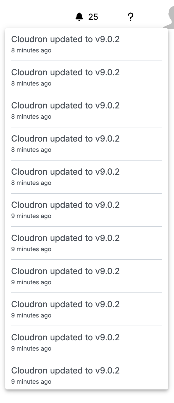
-
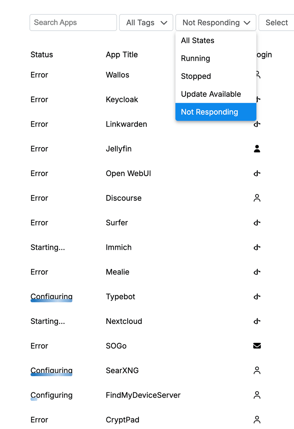
Can we separate "Error" and "Configurating"/"Starting" into their own respective filters?
-
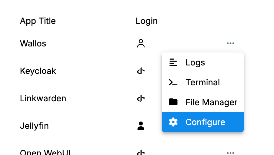
Perhaps add "Restart App" to this menu
-
In the list overview, maybe link the App Title to the config page and the location to the App

-
Trying to configure one of the errored apps via the config page to
/#/app/027418b6-3b3b-4a22-aef5-47e31d544d73/infowon't load the content. Full error logs below:/#/app/18b0e933-6df6-4d2a-9066-ed852e7c35d2/info:1 Refused to load the font 'data:font/woff2;base64,d09GMk9UVE8AAA/IAAkAAAAAIi4AAA9/A4EBAAAAAAAAAAAAAAAAAAAAAAAAAAAAATYCJAQGBmADgRwFiH0AghwHIA22GYUWESMRdnLSigfwXxK0JUN3PWgtIVtGtFABIUcjR8vMKvVNUhctBQIndOh7wFzNSdpf090C0MDGNSSuod3GJyMkmSUKlm72kk6vLpKqU4SDLlGqOoHx7wzNIRzzvZseTSBF/CoWaAkVRa5inol55lqxm5oz/9pr/qq+GXmakr21m0KxnJeWZ3dOoSo0//sTGj5e/r///znN1cDq77IugUrslFAFYg2CIfrG8Y3Q37GCqLAnZVKJvSuQC/x0zjP8v7/fp1rJjZ8tzGQcKS6iBFIAJMtql0EBKwIFJDuugO7Ztucm55fDg6nLQiMNIEFoAX1WesldzzU7W7qlB5C8/++0N/TOuYAMJkEJWxa0H6VUF8my5XljyWqW/HtHCdpC8/dzpf3Zo1xx...5FI3LRfrLhMDFvEwF2uOoME+/Gh0MqYxkm4s05u6D4DyLBRemu4kMtB6Nv/NOFUZPitzFD8qL8o0r+kYrPnnsY0vWZd5GEzsCREC+Wz3APkfzeqsAp0tZw0lLrhuy2DNy1E1VNM1LqdhIO45OPIwT3rftapv3Bq7mdNHFSgnKIkN8flMKWHNJF9U1BMQglWyx3EZ7e5f02oBD3RnnUPJn1p0wir+pGFraC2kyNDOKF8tvhNtQ4Hcy0KjTgZz2eIU55xre6wlnEltXkEBDbif0x/5SQnkBBsVWmb3r49ic42aAZm9yFY1aRg7n+S55ntbIbUFoODVCE879nRYAuMN+ACxenLXW8IjGFgtIdIwdl+hm8IjDZChcfQWQE4njeBgZtMFXgB6tKKFfpy23VFRCE125CitD/JeFiLDnXDHDSEnA6F9x0fPn4hNuPX1WQu8Z38LPLmCxI8nJVmHouX1lTh3BMEinPhg07NI3cNPSeEiWEBfG4rV6SAQMAAAA=' because it violates the following Content Security Policy directive: "font-src https: 'self'". utils-DU_yvWFO.js:529 Already activated index-BD2J48mQ.js:41571 Cloudron dashboard v9.0.2 /api/v1/profile/avatar/uid-7a405c74-4ed4-4512-9b5c-cdc35e949680?ts=1760635082196:1 Failed to load resource: the server responded with a status of 404 () style-D0iG7PtA.js:1980 TypeError: Cannot read properties of undefined (reading 'installationState') at hashChange (index-BD2J48mQ.js:24924:59) at index-BD2J48mQ.js:24970:7 logError @ style-D0iG7PtA.js:1980 style-D0iG7PtA.js:1980 TypeError: Cannot read properties of undefined (reading 'installationState') at hashChange (index-BD2J48mQ.js:24924:59) at index-BD2J48mQ.js:24970:7 logError @ style-D0iG7PtA.js:1980Edit:
This is actually a bit more of an elaborate issue it seems.
cloudron update --app {domain}
Error: App at location {domain} not found
    at getApp (/opt/homebrew/lib/node_modules/cloudron/src/actions.js:201:38)
    at process.processTicksAndRejections (node:internal/process/task_queues:105:5)
    at async Command.update (/opt/homebrew/lib/node_modules/cloudron/src/actions.js:805:21)


App update error: App at location {domain} not found