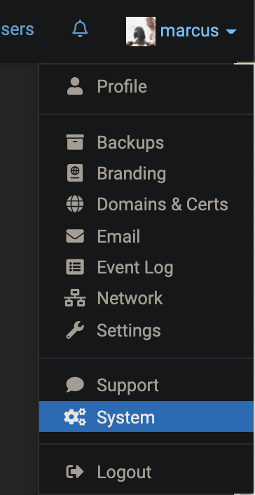
Suggestion: Changing the "System" menu text to "Resources"
-
Minor thing but I think the "System" link name and cogs icon would be better as "Resources" with a bar-chart icon perhaps:
-
Nice, that makes much more sense.
While you're there, I wonder if "System" should go below "Settings", as that's more frequently of interest, whereas "Support" rightly deserves to be after a divider as a less-frequent / last-resort link.
I'd then also put "Event Log" in that divider, above "Support" for the same reasons.
-
We were trying hard to avoid the 'S' overload - system, support, settings, services... I like the suggestion of Resources or Graphs instead of System. I don't know how commonly understood 'Resources' is though (even though we use it in App view).
-
I don't think the S's matter as they are functional words. "System" to me is a generic term though, "Resources" makes sense though, as in:
"Do you have enough System to run that App?" doesn't sound right.
"Do you have enough Resources for those Apps?" make more sense -> user goes to check Resources.
-
We were trying hard to avoid the 'S' overload - system, support, settings, services... I like the suggestion of Resources or Graphs instead of System. I don't know how commonly understood 'Resources' is though (even though we use it in App view).
@girish Equally;
- "System" could be "Monitoring" or "Analytics".
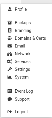
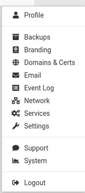
- "Services" could be named "Resources", that tab controls the allocation of resources.
I see the conundrums, I never get these things right first time, sometimes you need to try something, live with it and see if it feels right over time or niggles the mind once you have context. Always nice to reach that happy structure where there's a place for everything and everything is in its place
")
-
I think "Services" is a good name for that view, since it contains the system services management UI.
For the "System" part I am still unsure if this is a pure graph/analytics view or something with action buttons (currently it has at least the reboot button there...)
-
I think "Services" is a good name for that view, since it contains the system services management UI.
For the "System" part I am still unsure if this is a pure graph/analytics view or something with action buttons (currently it has at least the reboot button there...)
@nebulon Agreed. System is definitely too vague, and there are services you can restart in there, it's not a view only dashboard.
Based on the discussion, I'd like to suggest grouping logs and graphs under the same page with Monitoring as name. In terms of concept, it's quite similar, the presentation of the content is different.
One counter-argument would be it adds a click to get there, but on the plus side, it will lighten the menu list, which is getting longer (and thus harder) to process.
Hello! It looks like you're interested in this conversation, but you don't have an account yet.
Getting fed up of having to scroll through the same posts each visit? When you register for an account, you'll always come back to exactly where you were before, and choose to be notified of new replies (either via email, or push notification). You'll also be able to save bookmarks and upvote posts to show your appreciation to other community members.
With your input, this post could be even better 💗
Register Login