IMHO: Cloudron 6.0.1 Button Coloring for Console, Logs is Odd
-

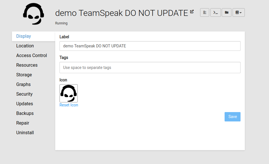
The new Buttons top right next to the App Label replaced the "Console" Tab on left.
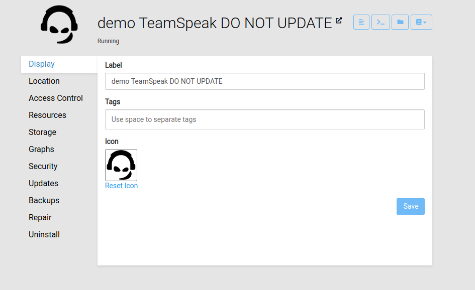
Which is nice, but I think the coloring is odd.
Everything else funktional (which does something) in Cloudron has the Blue color, like the "Save" Button or "Reset Icon" aka.#2196f3Would look like this.

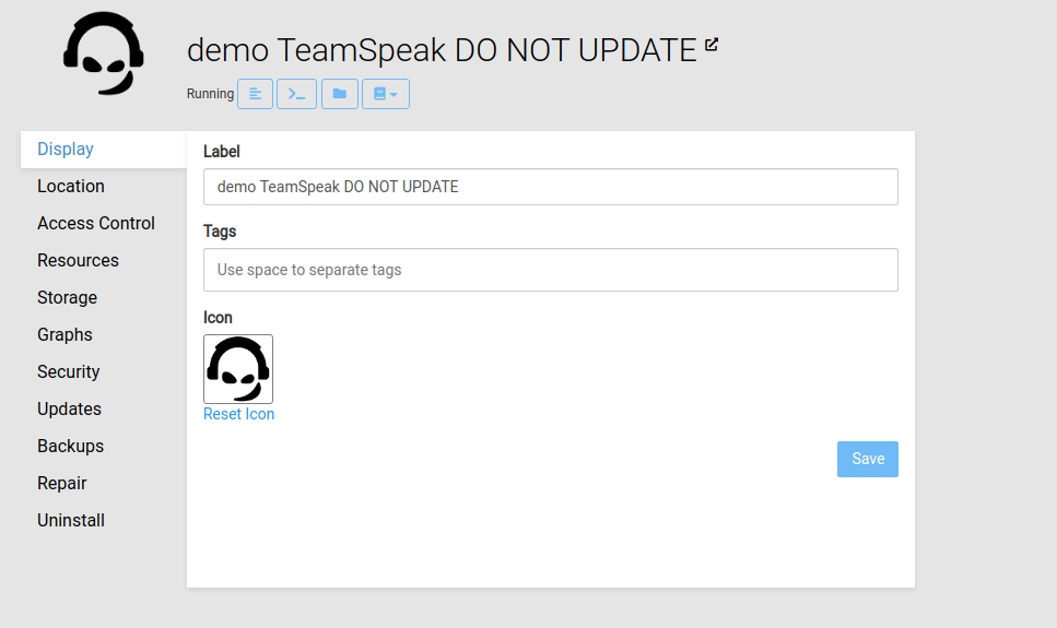
Another Idea is to place the buttons next to the actual status of the app.
With the mindset "Oh I see the state is Running? Where can I see whats going on?"
Well right next to you
(ps: I am no Web Designer nor Web Developer so please excuse the poor execution)


-
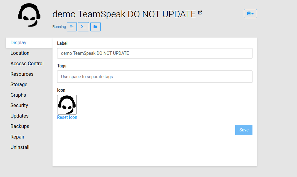
So moving the buttons next to the status would break many times when there is some actual different status and even the progressbar shown. Also it would mean the buttons are not consistently at the same spot, which is not nice for muscle-memory.
The coloring is chosen to keep consistency with other views where there are action buttons on the top right and generally we don't have blue outline buttons anywhere. We have played with making them solid buttons, but then they raise quire a lot of attention to that and might distract from the action buttons in the views below.
Hello! It looks like you're interested in this conversation, but you don't have an account yet.
Getting fed up of having to scroll through the same posts each visit? When you register for an account, you'll always come back to exactly where you were before, and choose to be notified of new replies (either via email, or push notification). You'll also be able to save bookmarks and upvote posts to show your appreciation to other community members.
With your input, this post could be even better 💗
Register Login
