Graphics for Cloudron resource usage?
-
Is there a graphic which allows us at a glance to see how resource hungry each Cloudron application is?
For example, a bar chart which displayed how much RAM each application used could help us at a glance gather which applications are most thirsty for RAM?
I would like to see a stacked chart showing which of the applictions running are taking up most of the resources.
@loudlemur this could be helpful
equally there is Prometheus and Grafana here on Cloudron.
To be honest, I haven't got my head around using these.
I'm looking for a good 'monkey see, monkey do' tutorial. -
@loudlemur this could be helpful
equally there is Prometheus and Grafana here on Cloudron.
To be honest, I haven't got my head around using these.
I'm looking for a good 'monkey see, monkey do' tutorial.Mike Bostock is great for DataViz. He has a website, Observable, which has loads of examples of different types of chart created using D3.
https://observablehq.com/@d3?tab=notebooks&type=public
You can interact with the charts, changing their parameters. Here are a few related to this issue. If people haven't seen Observable before, definitely take a look!
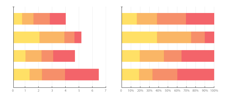
https://observablehq.com/@d3/diverging-stacked-bar-chart
https://observablehq.com/@d3/stacked-normalized-horizontal-bar
https://observablehq.com/@thetylerwolf/day-9-stacked-bar-chart
-
@loudlemur this could be helpful
equally there is Prometheus and Grafana here on Cloudron.
To be honest, I haven't got my head around using these.
I'm looking for a good 'monkey see, monkey do' tutorial. -
The graph is illegible. The writing on the horizontal/x axis overwrites itself. A quick fix might be to have the details there written vertically, or on a biased, rather than horizontally.
The available/unused memory ought to be indicated more clearly, along with an indication of which processes are gobbling up most RAM.
https://observablehq.com/@mpdroid/the-golden-goose-stock-portfolio
https://observablehq.com/@ssiegmund/stacked-area-playground
https://observablehq.com/@jianan-li/kickstarter-time-series-analysis-part-2
Hello! It looks like you're interested in this conversation, but you don't have an account yet.
Getting fed up of having to scroll through the same posts each visit? When you register for an account, you'll always come back to exactly where you were before, and choose to be notified of new replies (either via email, or push notification). You'll also be able to save bookmarks and upvote posts to show your appreciation to other community members.
With your input, this post could be even better 💗
Register Login