What's coming in 7.2
-
This also includes the proxyAuth change that allows Firefly iii to authenticate again, correct?
-
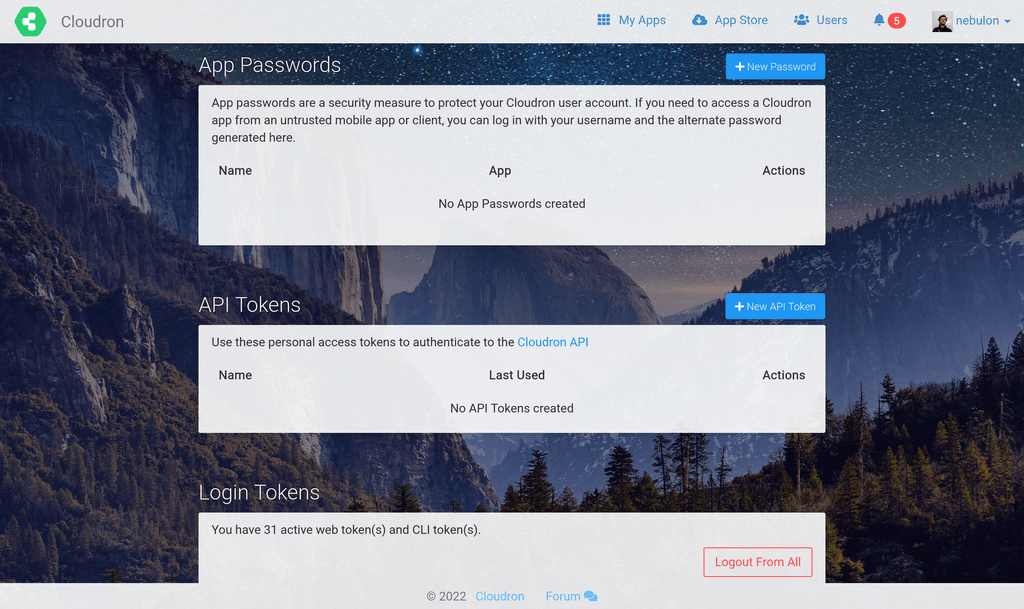
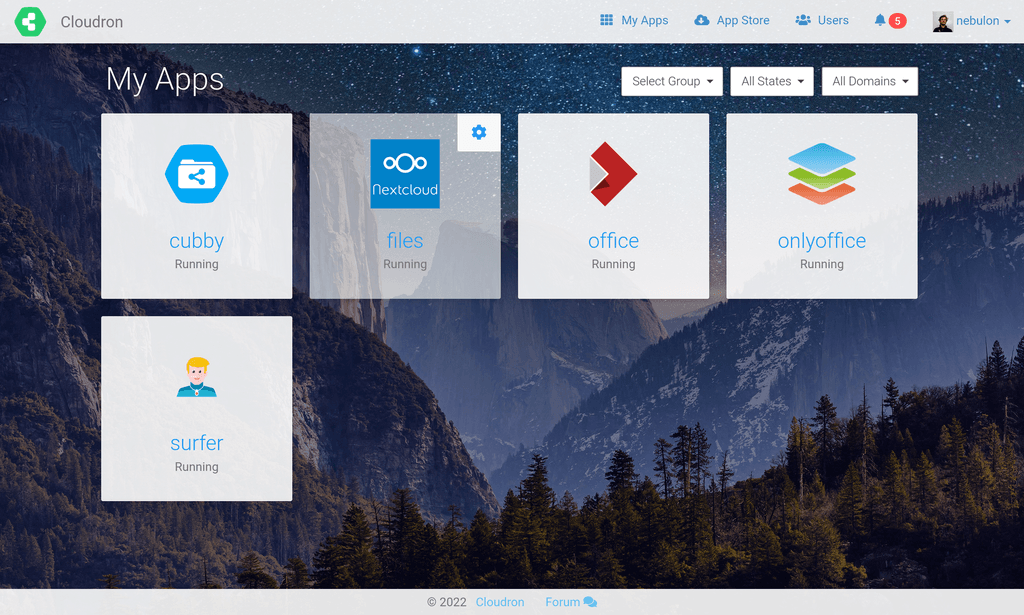
We also have started to introduce the ability to add a personal background image now for some customization, which might give a more personal touch. I am currently working through some css styling related issues and likely after the first release of the feature, there will be some rougher edges depending on the user-selected background image (think of contrast and such), but we will iterate on that.
By default there will be no background image.
Just some preview images here:


-
@infogulch yes! I already pushed out the Firefly-III update, in case you want to test that.
-
 G girish unpinned this topic on
-
We also have started to introduce the ability to add a personal background image now for some customization, which might give a more personal touch. I am currently working through some css styling related issues and likely after the first release of the feature, there will be some rougher edges depending on the user-selected background image (think of contrast and such), but we will iterate on that.
By default there will be no background image.
Just some preview images here:


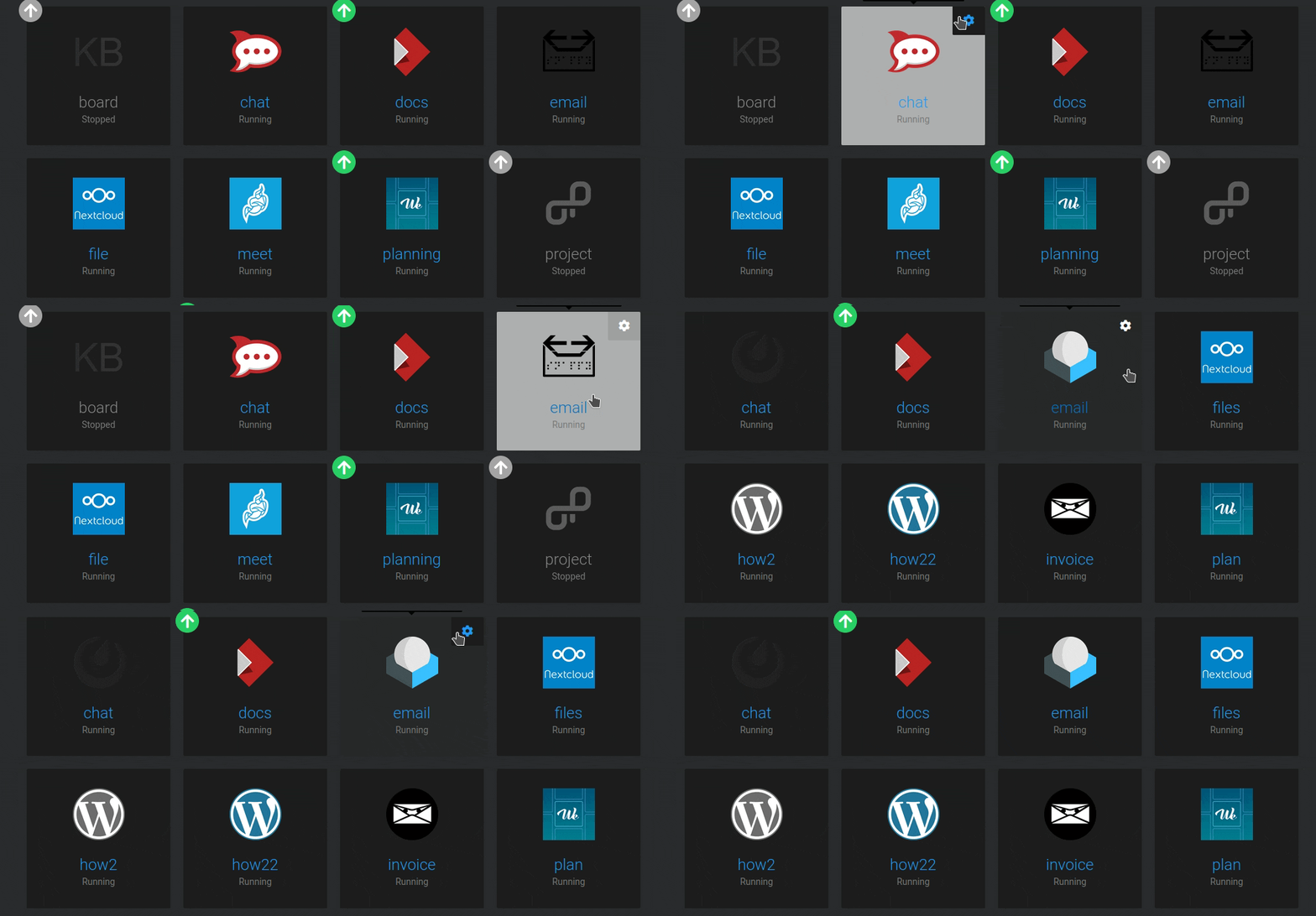
@nebulon Hello, just updated to 7.2.2 today and on dark theme the new contrast on app hoover looks a bit off I think. Actually it feel like something in between 7.1 and 7.2 would be good, i.e: lighter than in 7.1 so it stands out more but darker than in 7.2 so it blends more with the background.
Also I think the square around the gear icon should remain with the same background as the rest of the app if not hoovered over (as it was the case in 7.1) since the gear itself stands out enough with it's white colour.
-
@nebulon Hello, just updated to 7.2.2 today and on dark theme the new contrast on app hoover looks a bit off I think. Actually it feel like something in between 7.1 and 7.2 would be good, i.e: lighter than in 7.1 so it stands out more but darker than in 7.2 so it blends more with the background.
Also I think the square around the gear icon should remain with the same background as the rest of the app if not hoovered over (as it was the case in 7.1) since the gear itself stands out enough with it's white colour.

@avatar1024 thanks for the feedback. I've put in a few style changes to start supporting custom background images. Given how stylesheet changes cascade, I expect a few more glitches with the combination of light/dark mode and both with backgrounds. I will get this fixed for next release.
-
@avatar1024 thanks for the feedback. I've put in a few style changes to start supporting custom background images. Given how stylesheet changes cascade, I expect a few more glitches with the combination of light/dark mode and both with backgrounds. I will get this fixed for next release.
-
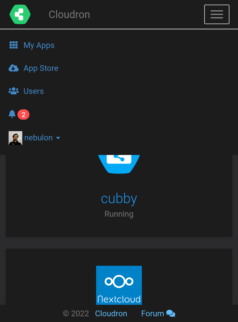
@nebulon There's a glitch in the view of the scrolldown menu on mobile view which needs to be fixed.
-
@micmc thanks for the detailed video, unfortunately I can't reproduce this, possibly this got fixed as a sideeffect with latest changes for 7.3 already:
Hello! It looks like you're interested in this conversation, but you don't have an account yet.
Getting fed up of having to scroll through the same posts each visit? When you register for an account, you'll always come back to exactly where you were before, and choose to be notified of new replies (either via email, or push notification). You'll also be able to save bookmarks and upvote posts to show your appreciation to other community members.
With your input, this post could be even better 💗
Register Login


