Cloudron 9.0 (beta) bug reports
-
Here is what I noticed is off:
- Looks sharp with a few caveats, speed of info being populated. The UI loads first, then the dynamic parts start coming in a few seconds later. Can this be cached? Feels slower than previous UX.
- The sidebar doesn't appear to be able to dock or minimize to the icons, or be adjusted in width. Makes everything on the right smaller.
- Still no way to tell how many apps are running from a glance at the dashboard
- Still no keyboard navigation? Feels slower with the mouse and expanding menus vs old way. It's also off the screen requiring scrolling when all are expanded. Slower.
- Many dialogs can't be exited or cancelled by pressing escape. For ex: adding a new mailbox user, tab to highlight the domain then Esc doesn't work, same for the next tab down to the next field. Ties in with No 4.
- When initiating actions the confirmation dialog is way at the top, requiring more time travel mouse wise. Centering it on screen would be good, dynamically placing the dialog at the same level as the previous button on screen would be better, and turning off confirmations (as an option) would be best!
")
- While dialog buttons can be switched via tab and better visualized thanks to the white border styling (in dark mode) the highlighted button cannot be pressed/confirmed with space, only enter.
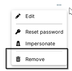
- In System > Services the cloudron service still has no restart button in the three-dot menu. Yet docker does? I think we should do away with the three dot menu, it's yet another click with no benefit. The instant icon/buttons were great and visually easy. The menu is visually mute and far away fom the previous column.
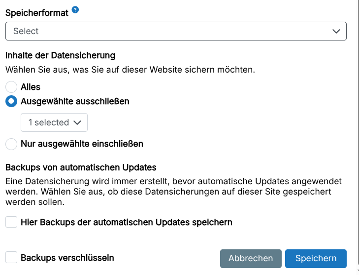
- When I click on Backups, I want to see backups, not a dropdown with more options that are not backups. Just include the app archive below the backup information and save space. Come to think of it, why have expanding menus at all? App config doesn't, it just moves to another inner menu with all the options closer to the action. Would be more consistent across the two modals.
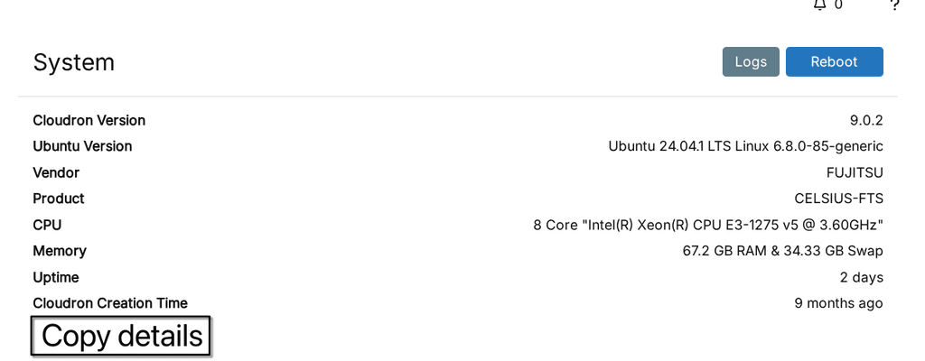
- Server menu could use copy buttons for easier sharing of info during troubleshooting or vanity posts and better formatted. This is what it looks like pasting the last two lines:
Uptime
20 hours
Cloudron Creation Time
9 months ago
^^ O_O that is a human gestation time.. and if you just installed Cloudron 9.. oh wait you upgraded. Nevermind.")
- The size of all the tiles is smaller. It might be nice to have a zoom/size feature to help visually if on larger screens.
- Almost thought we lost branding, but it's under Appearance. Okay? Why do external links on the dashboard have anything to do with Appearance? It could be a single button +[-∞-] on the Dashboard itself. Move Branding to System.
- The tile/list toggle button is nice, but then we have the burried three dot menu again. Icons not hidden by the menu are so much better.
- Why is the label and the location linking to the same external link? Let the label go to the config page and location go to the external link.
- The list view sort by reverse App Title is a bit broken as it separates lowercase and upper case letters, sorting each as a group, not as a whole list. Ignore the case.
- There don't appear to be hints hovering the mouse over the red triangles.
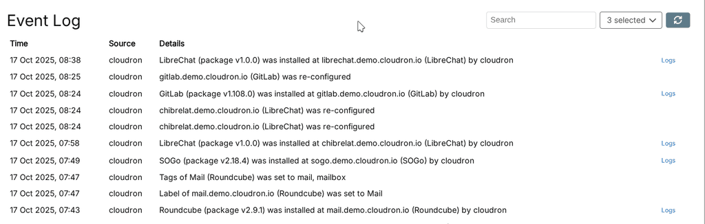
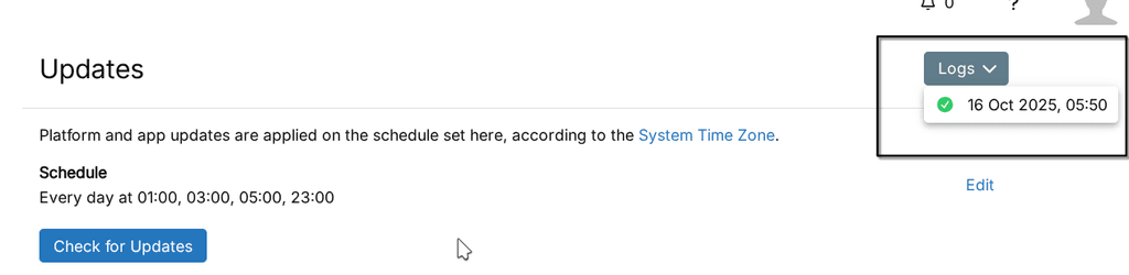
- It would be nice if the Event Log would have a button or links to the app config in question.
- In the Server menu, why hide the beautiful app list and file sizes? If you don't want to load it every time because of the graphs, have a cached version that updates. The list is not clickable, and I'd want to go to the App settings if I do. An enhancement would be to pull out the Backup Enabled setting for each app, as this view is often what I stare at trying to figure out why my backups are so large.
- Since there were no notifications, I couldn't test those, but I hope the same pattern applies with links to the App Config being more useful than the external subdomain.
- Mattermost App tile icon is almost entire invisible in dark mode, and completely invisible on mouseover :-0
@robi said in Cloudron 9.0 (beta) bug reports:
Here is what I noticed is off:
- Looks sharp with a few caveats, speed of info being populated. The UI loads first, then the dynamic parts start coming in a few seconds later. Can this be cached? Feels slower than previous UX.
- The sidebar doesn't appear to be able to dock or minimize to the icons, or be adjusted in width. Makes everything on the right smaller.
- Still no way to tell how many apps are running from a glance at the dashboard
- Still no keyboard navigation? Feels slower with the mouse and expanding menus vs old way. It's also off the screen requiring scrolling when all are expanded. Slower.
- Many dialogs can't be exited or cancelled by pressing escape. For ex: adding a new mailbox user, tab to highlight the domain then Esc doesn't work, same for the next tab down to the next field. Ties in with No 4.
- When initiating actions the confirmation dialog is way at the top, requiring more time travel mouse wise. Centering it on screen would be good, dynamically placing the dialog at the same level as the previous button on screen would be better, and turning off confirmations (as an option) would be best!
- While dialog buttons can be switched via tab and better visualized thanks to the white border styling (in dark mode) the highlighted button cannot be pressed/confirmed with space, only enter.
- In System > Services the cloudron service still has no restart button in the three-dot menu. Yet docker does? I think we should do away with the three dot menu, it's yet another click with no benefit. The instant icon/buttons were great and visually easy. The menu is visually mute and far away fom the previous column.
- When I click on Backups, I want to see backups, not a dropdown with more options that are not backups. Just include the app archive below the backup information and save space. Come to think of it, why have expanding menus at all? App config doesn't, it just moves to another inner menu with all the options closer to the action. Would be more consistent across the two modals.
- Server menu could use copy buttons for easier sharing of info during troubleshooting or vanity posts and better formatted. This is what it looks like pasting the last two lines:
Uptime
20 hours
Cloudron Creation Time
9 months ago
^^ O_O that is a human gestation time.. and if you just installed Cloudron 9.. oh wait you upgraded. Nevermind. - The size of all the tiles is smaller. It might be nice to have a zoom/size feature to help visually if on larger screens.
- Almost thought we lost branding, but it's under Appearance. Okay? Why do external links on the dashboard have anything to do with Appearance? It could be a single button +[-∞-] on the Dashboard itself. Move Branding to System.
- The tile/list toggle button is nice, but then we have the burried three dot menu again. Icons not hidden by the menu are so much better.
- Why is the label and the location linking to the same external link? Let the label go to the config page and location go to the external link.
- The list view sort by reverse App Title is a bit broken as it separates lowercase and upper case letters, sorting each as a group, not as a whole list. Ignore the case.
- There don't appear to be hints hovering the mouse over the red triangles.
- It would be nice if the Event Log would have a button or links to the app config in question.
- In the Server menu, why hide the beautiful app list and file sizes? If you don't want to load it every time because of the graphs, have a cached version that updates. The list is not clickable, and I'd want to go to the App settings if I do. An enhancement would be to pull out the Backup Enabled setting for each app, as this view is often what I stare at trying to figure out why my backups are so large.
- Since there were no notifications, I couldn't test those, but I hope the same pattern applies with links to the App Config being more useful than the external subdomain.
- Mattermost App tile icon is almost entire invisible in dark mode, and completely invisible on mouseover :-0
@staff for visibility
-
The message makes it as if there is no form validation before authenticating the request. If this is the case, might want to check in on that.
@Lanhild this is fixed now. Start/Stop is also moved back to toolbar as well.
@humptydumpty we are monitoring the thread
@robi thanks for the detailed notes! Have to process them slowly.
I think a general comment since I don't want people getting discouraged
Currently, we focus on just getting the release out and fixing any breakage of functionality. Fixing and polishing the UI is a never ending task. FWIW, we see many issues too but have to prioritize. The UI stuff will get ironed out in the coming months (after all, the previous UI had 10 years of polish, this one hasn't even hit users yet). -
Hi there - thanks for the great work on v9.
For the little I played with, it looks and feels great so far.From the demo server, I will pinch in with a couple of questions/comments too:
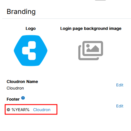
- 1 - Branding - Footer: This seems to be available only from the login page and not from the dashboard anymore. is this intended?
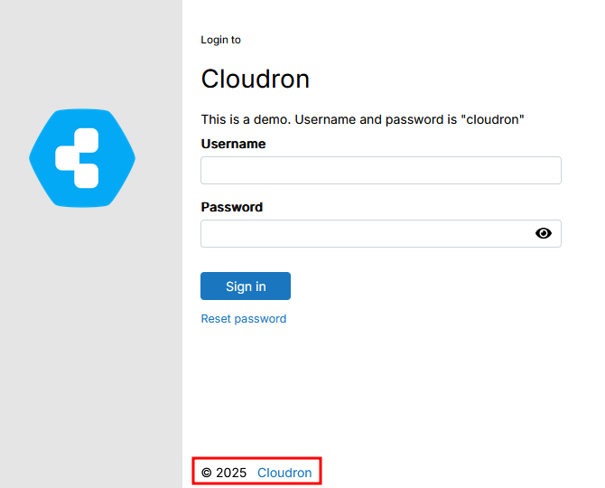
In v8, we store some references and links to internal help documentation etc in the footer. So I wonder if/what could replace this in v9?
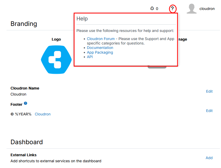
- 2 - The help menu:
Is this something visible to all users?No it is not, tried and saw.- Related to the point above, instead of the footer, potentially, I would love the opportunity to have such an help menu option for non-admin users, so long as the content is editable / amendable by admin. I hope that I make sense
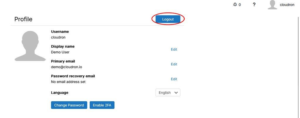
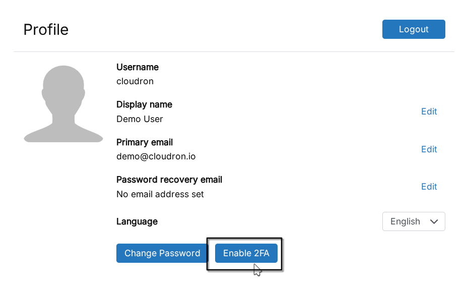
- 3 - Log out - This is for sure a matter of tastes and colour etc.. but since I got confused initially: working on a fairly big screen I looked for the logout button for longer than I believe I should. Instinctively (or maybe from previous version) I was looking for it below the username as I clicked on it.
Then I noticed it on the profile page.
Maybe it is only me, but should it remain there, then I would suggest potentially a change of colour, to something that pops up a little bit more.
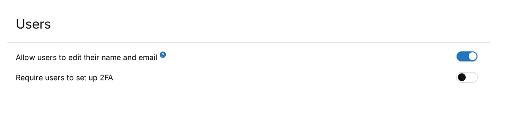
- 4 - Menu item for user with User Manager priviledges (possibly this is not tied to v9 entirely)
At the moment, a user with a user manager role see the following menu items
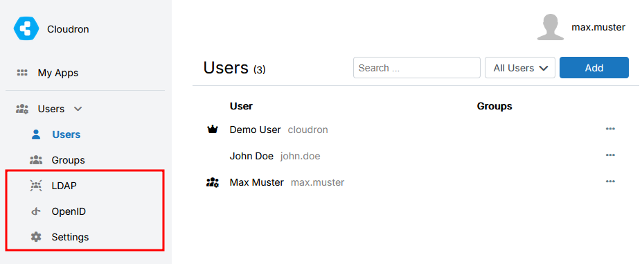
Clicking on the LDAP/OpenID/Settings option open the "My Apps" page.
While I think it is right that the User Manager does not have access to these options, I think that the options should simply not be visible, rather that to open another / different page. This is likely to create confusion.I hope that it makes sense.
Speaking personally, v9 gives already a very nice feeling.
This is it for now and my short play around - I might pop back in later on with more.
Many thanks for all the work and support in the background!@Neiluj said in Cloudron 9.0 (beta) bug reports:
1 - Branding - Footer: This seems to be available only from the login page and not from the dashboard anymore. is this intended?
The footer is not used the main dashboard any more. Only in the login page and emails. I think generally footers are gone on most dashboards (bold claim?).
Seems like a good idea to make '?' text customizable, especially for non-admins.
-
@Lanhild this is fixed now. Start/Stop is also moved back to toolbar as well.
@humptydumpty we are monitoring the thread
@robi thanks for the detailed notes! Have to process them slowly.
I think a general comment since I don't want people getting discouraged
Currently, we focus on just getting the release out and fixing any breakage of functionality. Fixing and polishing the UI is a never ending task. FWIW, we see many issues too but have to prioritize. The UI stuff will get ironed out in the coming months (after all, the previous UI had 10 years of polish, this one hasn't even hit users yet). -
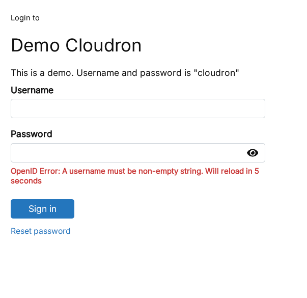
login dashboard has minor CSP error:
kjFizNC6g5WWSmRHHlAqzX34uPV4YhB8kglL3_b3O5A:1 Refused to load the font 'data:font/woff2;base64,d09GMk9UVE8AAA/IAAkAAAAAIi4AAA9/A4EBAAAAAAAAAAAAAAAAAAAAAAAAAAAAATYCJAQGBmADgRwFiH0AghwHIA22GYUWESMRdnLSigfwXxK0JUN3PWgtIVtGtFABIUcjR8vMKvVNUhctBQIndOh7wFzNSdpf090C0MDGNSSuod3GJyMkmSUKlm72kk6vLpKqU4SDLlGqOoHx7wzNIRzzvZseTSBF/CoWaAkVRa5inol55lqxm5oz/9pr/qq+GXmakr21m0KxnJeWZ3dOoSo0//sTGj5e/r///znN1cDq77IugUrslFAFYg2CIfrG8Y3Q37GCqLAnZVKJvSuQC/x0zjP8v7/fp1rJjZ8tzGQcKS6iBFIAJMtql0EBKwIFJDuugO7Ztucm55fDg6nLQiMNIEFoAX1WesldzzU7W7qlB5C8/++0N/TOuYAMJkEJWxa0H6VUF8my5XljyWqW/HtHCdpC8/dzpf3Zo1xx...5FI3LRfrLhMDFvEwF2uOoME+/Gh0MqYxkm4s05u6D4DyLBRemu4kMtB6Nv/NOFUZPitzFD8qL8o0r+kYrPnnsY0vWZd5GEzsCREC+Wz3APkfzeqsAp0tZw0lLrhuy2DNy1E1VNM1LqdhIO45OPIwT3rftapv3Bq7mdNHFSgnKIkN8flMKWHNJF9U1BMQglWyx3EZ7e5f02oBD3RnnUPJn1p0wir+pGFraC2kyNDOKF8tvhNtQ4Hcy0KjTgZz2eIU55xre6wlnEltXkEBDbif0x/5SQnkBBsVWmb3r49ic42aAZm9yFY1aRg7n+S55ntbIbUFoODVCE879nRYAuMN+ACxenLXW8IjGFgtIdIwdl+hm8IjDZChcfQWQE4njeBgZtMFXgB6tKKFfpy23VFRCE125CitD/JeFiLDnXDHDSEnA6F9x0fPn4hNuPX1WQu8Z38LPLmCxI8nJVmHouX1lTh3BMEinPhg07NI3cNPSeEiWEBfG4rV6SAQMAAAA=' because it violates the following Content Security Policy directive: "font-src https: 'self'".

background:1  GET https://my.tld.com/api/v1/cloudron/background 404 (Not Found)
Then on, enter password additional error:
style-CMkpM2bh.js:12426  POST https://my.tld.com/openid/interaction/kjFizNC6g5WWSmRHHlAqzX34uPV4YhB8kglL3_b3O5A/login 401 (Unauthorized)
request @ style-CMkpM2bh.js:12426
post @ style-CMkpM2bh.js:12456
onSubmit @ oidc_login-oGYAt-kS.js:60
callWithErrorHandling @ style-CMkpM2bh.js:1922
callWithAsyncErrorHandling @ style-CMkpM2bh.js:1929
emit @ style-CMkpM2bh.js:5971
onClick @ style-CMkpM2bh.js:13965
callWithErrorHandling @ style-CMkpM2bh.js:1922
callWithAsyncErrorHandling @ style-CMkpM2bh.js:1929
invoker @ style-CMkpM2bh.js:7517
and on the 2FA page the TOTP Token Submit button doesn't use the translation but displays
login.signInActionThese errors persist on the dashboard:
(index):59 Refused to load the font 'data:font/woff2;base64,d09GMk9UVE8AAA/IAAkAAAAAIi4AAA9/A4EBAAAAAAAAAAAAAAAAAAAAAAAAAAAAATYCJAQGBmADgRwFiH0AghwHIA22GYUWESMRdnLSigfwXxK0JUN3PWgtIVtGtFABIUcjR8vMKvVNUhctBQIndOh7wFzNSdpf090C0MDGNSSuod3GJyMkmSUKlm72kk6vLpKqU4SDLlGqOoHx7wzNIRzzvZseTSBF/CoWaAkVRa5inol55lqxm5oz/9pr/qq+GXmakr21m0KxnJeWZ3dOoSo0//sTGj5e/r///znN1cDq77IugUrslFAFYg2CIfrG8Y3Q37GCqLAnZVKJvSuQC/x0zjP8v7/fp1rJjZ8tzGQcKS6iBFIAJMtql0EBKwIFJDuugO7Ztucm55fDg6nLQiMNIEFoAX1WesldzzU7W7qlB5C8/++0N/TOuYAMJkEJWxa0H6VUF8my5XljyWqW/HtHCdpC8/dzpf3Zo1xx...5FI3LRfrLhMDFvEwF2uOoME+/Gh0MqYxkm4s05u6D4DyLBRemu4kMtB6Nv/NOFUZPitzFD8qL8o0r+kYrPnnsY0vWZd5GEzsCREC+Wz3APkfzeqsAp0tZw0lLrhuy2DNy1E1VNM1LqdhIO45OPIwT3rftapv3Bq7mdNHFSgnKIkN8flMKWHNJF9U1BMQglWyx3EZ7e5f02oBD3RnnUPJn1p0wir+pGFraC2kyNDOKF8tvhNtQ4Hcy0KjTgZz2eIU55xre6wlnEltXkEBDbif0x/5SQnkBBsVWmb3r49ic42aAZm9yFY1aRg7n+S55ntbIbUFoODVCE879nRYAuMN+ACxenLXW8IjGFgtIdIwdl+hm8IjDZChcfQWQE4njeBgZtMFXgB6tKKFfpy23VFRCE125CitD/JeFiLDnXDHDSEnA6F9x0fPn4hNuPX1WQu8Z38LPLmCxI8nJVmHouX1lTh3BMEinPhg07NI3cNPSeEiWEBfG4rV6SAQMAAAA=' because it violates the following Content Security Policy directive: "font-src https: 'self'". utils-CAYJrJwJ.js:529 Already activated index-B27HHYVP.js:41649 Cloudron dashboard v9.0.3 uid-7a405c74-4ed4-4512-9b5c-cdc35e949680:1 GET https://my.tld.com/api/v1/profile/avatar/uid-7a405c74-4ed4-4512-9b5c-cdc35e949680?ts=1760915353587 404 (Not Found) -
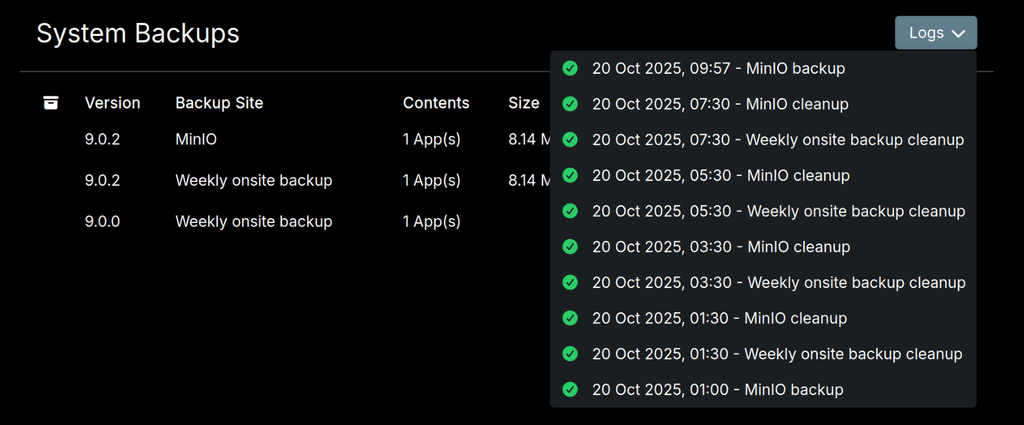
Unsure if I'm not just missing the right place to look, but I can't see more than one automated backup in the
/#/backup-sitesview (or in the app directly)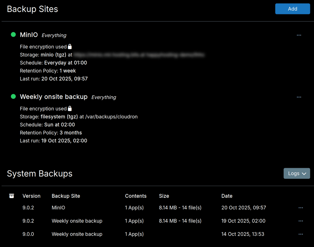
That list should show multiple MinIO backups (since they're daily with a week retention), but it only showed the one from last night and now the one I triggered manually (now I'm not even sure if it showed the MinIO at all). Where can I see the list of all current backups?
-
Unsure if I'm not just missing the right place to look, but I can't see more than one automated backup in the
/#/backup-sitesview (or in the app directly)That list should show multiple MinIO backups (since they're daily with a week retention), but it only showed the one from last night and now the one I triggered manually (now I'm not even sure if it showed the MinIO at all). Where can I see the list of all current backups?
-
@msbt it should be listed in the System Backups. Can you check the Logs drop down? Maybe something failed?
-
@msbt it should be listed in the System Backups. Can you check the Logs drop down? Maybe something failed?
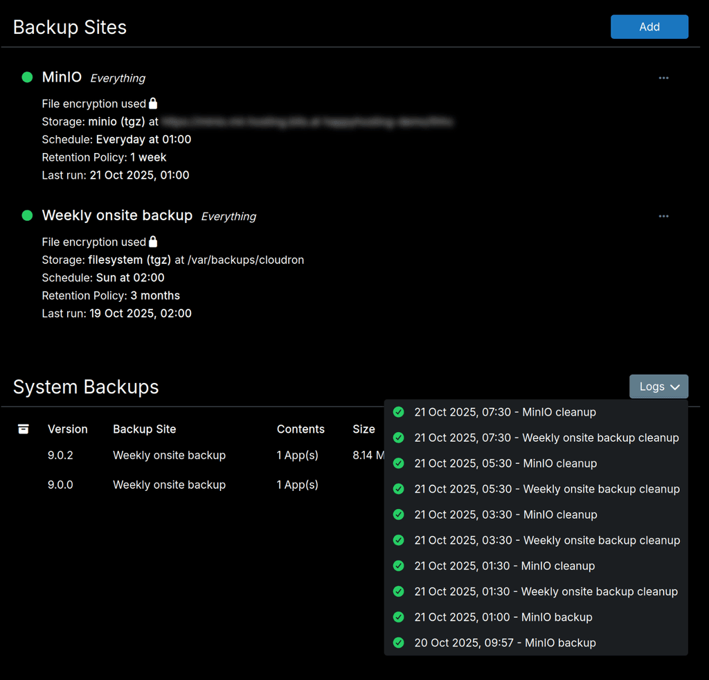
@girish I remembered correctly, the automated MinIO backup isn't showing at all:
Hello! It looks like you're interested in this conversation, but you don't have an account yet.
Getting fed up of having to scroll through the same posts each visit? When you register for an account, you'll always come back to exactly where you were before, and choose to be notified of new replies (either via email, or push notification). You'll also be able to save bookmarks and upvote posts to show your appreciation to other community members.
With your input, this post could be even better 💗
Register Login