Dashbard UX enhancement suggestions
-
While you're at it, could you check why the focus on the tiles (keyboard navigation) has no visual effect?
hm at least in firefox here the a tag element does get the system default focus outline. The tabfocus order is a bit strange though, as it also cycles through the action buttons which are hidden withou hover at the moment.
-
@infogulch said
when I'm only half paying attention
Important point that makes me nervous about stop/restart buttons too easily to be (mis)clicked.
Please do also have in mind that you lovely people here are power users. We should always cross-check ideas with a persona who is a non-frequent administrator.
That is one reason why I tend to find non-disruptive changes. Mapped to the (absolutely valid) requirement to reduce searching for the fuctions (stop / restart) - would it be feasible to have redundant additional links on several tabs?
@hexbin said in Dashbard UX enhancement suggestions:
makes me nervous about stop/restart buttons too easily to be (mis)clicked
I think that's a fair concern. That's actually part of why I was suggesting earlier the option of an Actions dropdown menu... it'd do two things: 1) keep the number of buttons down and more importantly 2) prevent mis-clicks since to restart or stop you'd need to make two separate clicks because they'd be covered by a general Actions button that needs a click too.
I guess it may not hurt to also have an "Are you sure?" prompt, but I think 3 clicks (at least how I"m envisioning it) seems maybe a bit much too.
My two cents:
- If we go with a parent Actions button that covers the Stop and Restart buttons from mis-clicks, then it's good as-is at that point.
- If we keep both the Stop and Restart buttons in the top button row though where they can be easily misclicked, then I think we should have an "Are you sure" type of pop-up to prevent those misclicks.
")
-
@nebulon said
at least in firefox here the a tag element does get the system default focus outline
Technically correct - but aren't we kinda hard trying to make that invisible?

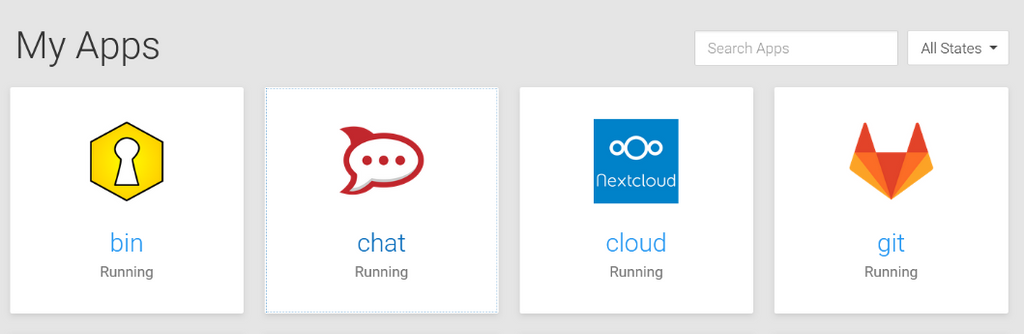
(Spoiler: it's the chat tile that has the focus)
@hexbin said in Dashbard UX enhancement suggestions:
Technically correct - but aren't we kinda hard trying to make that invisible?
Ah I see, indeed this is way to sublte here. As such our stylesheet does not configure that, so it appears to be a bad match with the current custom and system style.
-
Ideally we'd rarely have to visit troubleshooting tools and start/stop buttons as the app monitor would handle that more intelligently for us.
Until then, making things more obvious and adding additional distinguishing visual elements such as the triangle pointing right and square box for start and stop respectively.
-
Regarding the fix for the app item action items, which are currently shown on hover, we have done a few tests with the three dots icon and a dropdown. It didn't make too much sense to us and also it kindof looked strange and not very intuitive.
Now the current version is a bit simplified from this. It will show a single button in the top-right corner as suggested here. This is always shown now for admins. Clicking that will bring up the app configure/info view which has an improved toolbar on the top right, containing all the actions.
This change has the same amount of clicks required as the dropdown now and also works better on mobile/tablet.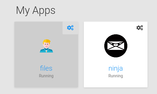
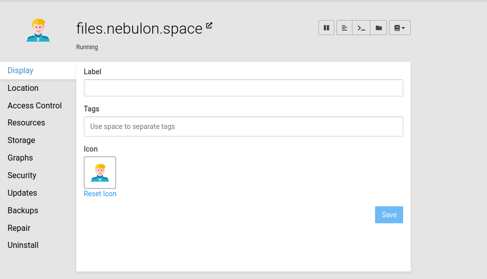
You can see the stop/pause action also being more prominent up there now.
-
Also the grid item focus is now adjusted to look like, but I am not yet sure if I keep it as such
@hexbin the actual system and browser native focus is still untouched and I think given that we haven't done any visual focus handling, you will see similar issues on other products unless you adjust your system settings for the native style. I also think that not interfering with the native one here is correct, as if I adjust my system for example to have a style with high contrast (this is on linux gnome) then the native focus rendering is also adjusted well, which I think is what we want.
@nebulon Nice. If it's a button now, rather than a drop-down, that makes more sense to use an icon representing the destination.
Personally, I'd prefer the single-cog icon here and for the Service menus, if you'd consider that?
Web Design & Development: https://www.evergreen.je
Technology & Apps: https://www.marcusquinn.com -
@nebulon Nice. If it's a button now, rather than a drop-down, that makes more sense to use an icon representing the destination.
Personally, I'd prefer the single-cog icon here and for the Service menus, if you'd consider that?
-
Also the grid item focus is now adjusted to look like, but I am not yet sure if I keep it as such
@hexbin the actual system and browser native focus is still untouched and I think given that we haven't done any visual focus handling, you will see similar issues on other products unless you adjust your system settings for the native style. I also think that not interfering with the native one here is correct, as if I adjust my system for example to have a style with high contrast (this is on linux gnome) then the native focus rendering is also adjusted well, which I think is what we want.
@nebulon Awesome improvements!
given that we haven't done any visual focus handling
Unfortunately it's a very widespread bad habit among web designers to unconsciously style only :hover states. By omitting :focus, accessibility is actively reduced. Not blaming anyone. You might want to check if your CSS files serve this finding.
The defaults are not always a good fallback. Not many people actually know that they could adjust their system (not even many among those who rely on assistive technologies). When we avoid touching the way the defaults do the styling (e. g.
outline) we can still do a lot for accessibility")
-
Now that we've satisfied some basic power users' needs - mind if I get back to the original motivation (description field, login type)?
At least once a week I have to tell an app-using team member that it's not their fault and to stop blaming themselves (no, you are not "too stupid").
It would be such a blessing to help non-admins help themselves.
-
@nebulon Awesome improvements!
given that we haven't done any visual focus handling
Unfortunately it's a very widespread bad habit among web designers to unconsciously style only :hover states. By omitting :focus, accessibility is actively reduced. Not blaming anyone. You might want to check if your CSS files serve this finding.
The defaults are not always a good fallback. Not many people actually know that they could adjust their system (not even many among those who rely on assistive technologies). When we avoid touching the way the defaults do the styling (e. g.
outline) we can still do a lot for accessibility@hexbin said in Dashbard UX enhancement suggestions:
The defaults are not always a good fallback. Not many people actually know that they could adjust their system (not even many about those who rely on assistive technologies). When we avoid touching the way the defaults do the styling (e. g. outline) we can still do a lot for accessibility
so we are on track here, I've added the darker outline, but the native one is still inset of that. I have not restyled this (not visible in the screenshot, as real focus went to the screenshot tool
) -
@nebulon That looks so much cleaner! Thanks for your hard work!

-
Regarding the fix for the app item action items, which are currently shown on hover, we have done a few tests with the three dots icon and a dropdown. It didn't make too much sense to us and also it kindof looked strange and not very intuitive.
Now the current version is a bit simplified from this. It will show a single button in the top-right corner as suggested here. This is always shown now for admins. Clicking that will bring up the app configure/info view which has an improved toolbar on the top right, containing all the actions.
This change has the same amount of clicks required as the dropdown now and also works better on mobile/tablet.You can see the stop/pause action also being more prominent up there now.
@nebulon said in Dashbard UX enhancement suggestions:
You can see the stop/pause action also being more prominent up there now.
It's looking like a great improvement, thanks for the hard work and for taking all our feedback into consideration.
Just two quick questions:
-
Is there any intention to add the Restart button too, or is it only a stop button (which I assume then translates to a start button when stopped) for now? I suppose the restart button isn't as necessary now since it's also in the File Viewer area which is generally when we'd need to restart an app anyways after editing a file. Though I still like the idea of sticking to how operating systems UI are done, where the shutdown and restart buttons are next to each other.
-
Is there an "are you sure" pop-up when clicking/tapping the shutdown/pause button to avoid miss clicks?
Bonus question: Should the shutdown/pause button perhaps be the "Power-off" icon instead of the "Pause" icon? I guess it could work either way, just thinking the Power Off one may make a little bit more sense at a glance.
-
-
Now that we've satisfied some basic power users' needs - mind if I get back to the original motivation (description field, login type)?
At least once a week I have to tell an app-using team member that it's not their fault and to stop blaming themselves (no, you are not "too stupid").
It would be such a blessing to help non-admins help themselves.
-
@hexbin wondering if login-type icon might be better in the top-left now to balance the cog top-right?
@marcusquinn Sounds like a good idea. I'm sure we can trust the wonderful Cloudron team with design decisions (and weighing those against technical feasability).
As long as they can make this happen - nag, nag
-
Hello power users, here's a collection of newbie users' experience feedback for the dashboard:
- Confusion about what app to use for what purpose (in the respective organization)
- Confusion about "wrong login credentials"
(Whining at a high level, they are all very happy with Cloudron)
Here's a suggestion to mitigate confusion:
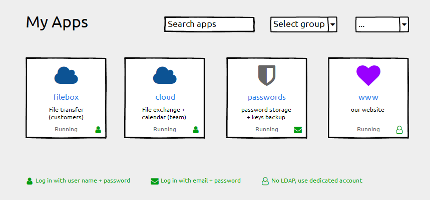
- Keep the label field untouched ("filebox"). Using the subdomain part as a default works well and we do not want any disruption here
- Add a description field for individual information ("File transfer"). This can be empty by default.
- Add login type information (if possible). Depending on the permissions handling of the grid-item-actions layer you could add that icon there, otherwise append it with an :after element to the container. Plus a legend below.
Happy to help with CSS fumbling if that helps getting forward
And Please forgive me for not having digged deeply into possibly related issues. I found #1804 with a "perhaps related".
-
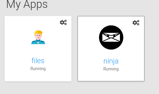
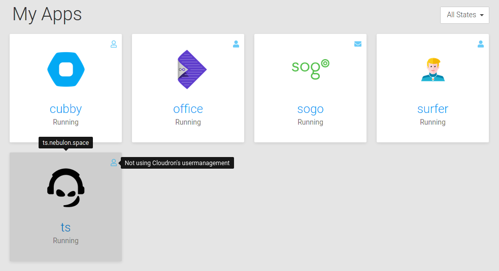
@hexbin ok I did some attempt there and we now show such an icon with a tooltip for non-admins. Admins should know already, as well as they can get that info in the app detail view. Always showing them felt a bit too cluttered.
@nebulon Very nice! Can you post the text for each? I like wording things, and context helps
-
@hexbin ok I did some attempt there and we now show such an icon with a tooltip for non-admins. Admins should know already, as well as they can get that info in the app detail view. Always showing them felt a bit too cluttered.
-
@hexbin ok I did some attempt there and we now show such an icon with a tooltip for non-admins. Admins should know already, as well as they can get that info in the app detail view. Always showing them felt a bit too cluttered.
-
The tooltip text will be finalized in weblate due to translation, will push this in a bit.
For the description, we won't do this right now as it has various text-length issues and we already have tags and the option to give descriptive names, which already indicated in this thread can also be used to clarify to some extent. In the end this would be just the same with the same visual space limitations as the app name field, so I am not sure where the benefit is, besides limiting space even further due to more fields.
Hello! It looks like you're interested in this conversation, but you don't have an account yet.
Getting fed up of having to scroll through the same posts each visit? When you register for an account, you'll always come back to exactly where you were before, and choose to be notified of new replies (either via email, or push notification). You'll also be able to save bookmarks and upvote posts to show your appreciation to other community members.
With your input, this post could be even better 💗
Register Login