Cloudron makes it easy to run web apps like WordPress, Nextcloud, GitLab on your server. Find out more or install now.


Skip to content
  • Categories
  • Recent
  • Tags
  • Popular
  • Bookmarks
  • Search
Skins
  • Light
  • Cerulean
  • Cosmo
  • Flatly
  • Journal
  • Litera
  • Lumen
  • Lux
  • Materia
  • Minty
  • Morph
  • Pulse
  • Sandstone
  • Simplex
  • Sketchy
  • Spacelab
  • United
  • Yeti
  • Zephyr
  • Dark
  • Cyborg
  • Darkly
  • Quartz
  • Slate
  • Solar
  • Superhero
  • Vapor

  • Default (No Skin)
  • No Skin
Collapse
Brand Logo

Cloudron Forum

Apps | Demo | Docs | Install
  1. Cloudron Forum
  2. Feature Requests
  3. Dashbard UX enhancement suggestions

Dashbard UX enhancement suggestions

Scheduled Pinned Locked Moved Solved Feature Requests
userinterface
62 Posts 12 Posters 14.8k Views 12 Watching
  • Oldest to Newest
  • Newest to Oldest
  • Most Votes
    Reply
    • Reply as topic
    Log in to reply
    This topic has been deleted. Only users with topic management privileges can see it.
    • ? Offline
      ? Offline
      A Former User
      wrote on last edited by
      #49

      @nebulon That looks so much cleaner! Thanks for your hard work! 😄

      1 Reply Last reply
      1
      • nebulonN nebulon

        Regarding the fix for the app item action items, which are currently shown on hover, we have done a few tests with the three dots icon and a dropdown. It didn't make too much sense to us and also it kindof looked strange and not very intuitive.
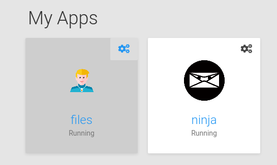
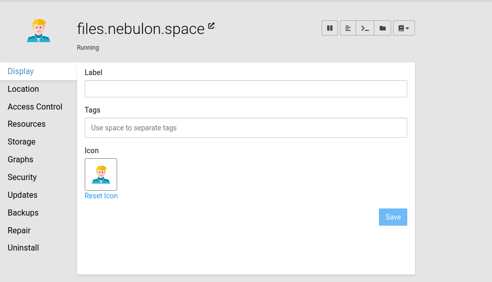
        Now the current version is a bit simplified from this. It will show a single button in the top-right corner as suggested here. This is always shown now for admins. Clicking that will bring up the app configure/info view which has an improved toolbar on the top right, containing all the actions.
        This change has the same amount of clicks required as the dropdown now and also works better on mobile/tablet.
        Screenshot_2021-04-07 Bonsai.png

        Screenshot_2021-04-07 Bonsai(1).png

        You can see the stop/pause action also being more prominent up there now.

        d19dotcaD Offline
        d19dotcaD Offline
        d19dotca
        wrote on last edited by d19dotca
        #50

        @nebulon said in Dashbard UX enhancement suggestions:

        You can see the stop/pause action also being more prominent up there now.

        It's looking like a great improvement, thanks for the hard work and for taking all our feedback into consideration.

        Just two quick questions:

        1. Is there any intention to add the Restart button too, or is it only a stop button (which I assume then translates to a start button when stopped) for now? I suppose the restart button isn't as necessary now since it's also in the File Viewer area which is generally when we'd need to restart an app anyways after editing a file. Though I still like the idea of sticking to how operating systems UI are done, where the shutdown and restart buttons are next to each other.

        2. Is there an "are you sure" pop-up when clicking/tapping the shutdown/pause button to avoid miss clicks?

        Bonus question: Should the shutdown/pause button perhaps be the "Power-off" icon instead of the "Pause" icon? I guess it could work either way, just thinking the Power Off one may make a little bit more sense at a glance.

        --
        Dustin Dauncey
        www.d19.ca

        1 Reply Last reply
        1
        • hexbinH hexbin

          Now that we've satisfied some basic power users' needs - mind if I get back to the original motivation (description field, login type)?

          At least once a week I have to tell an app-using team member that it's not their fault and to stop blaming themselves (no, you are not "too stupid").

          It would be such a blessing to help non-admins help themselves.

          marcusquinnM Offline
          marcusquinnM Offline
          marcusquinn
          wrote on last edited by
          #51

          @hexbin wondering if login-type icon might be better in the top-left now to balance the cog top-right?

          Web Design https://www.evergreen.je
          Development https://brandlight.org
          Life https://marcusquinn.com

          hexbinH 1 Reply Last reply
          2
          • marcusquinnM marcusquinn

            @hexbin wondering if login-type icon might be better in the top-left now to balance the cog top-right?

            hexbinH Offline
            hexbinH Offline
            hexbin
            wrote on last edited by
            #52

            @marcusquinn Sounds like a good idea. I'm sure we can trust the wonderful Cloudron team with design decisions (and weighing those against technical feasability).

            As long as they can make this happen - nag, nag 🙂

            1 Reply Last reply
            1
            • hexbinH hexbin

              Hello power users, here's a collection of newbie users' experience feedback for the dashboard:

              • Confusion about what app to use for what purpose (in the respective organization)
              • Confusion about "wrong login credentials"

              (Whining at a high level, they are all very happy with Cloudron)

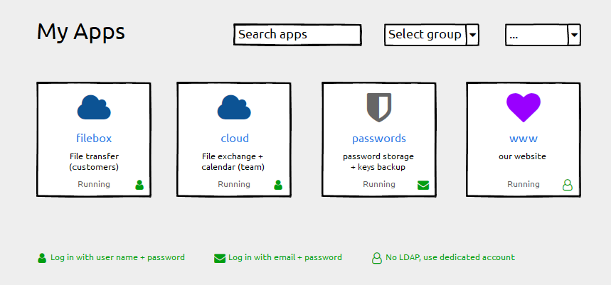
              Here's a suggestion to mitigate confusion:
              Cloudron-dashboard-enhancements_210326hxb.png

              • Keep the label field untouched ("filebox"). Using the subdomain part as a default works well and we do not want any disruption here
              • Add a description field for individual information ("File transfer"). This can be empty by default.
              • Add login type information (if possible). Depending on the permissions handling of the grid-item-actions layer you could add that icon there, otherwise append it with an :after element to the container. Plus a legend below.

              Happy to help with CSS fumbling if that helps getting forward 😉

              And Please forgive me for not having digged deeply into possibly related issues. I found #1804 with a "perhaps related".

              nebulonN Offline
              nebulonN Offline
              nebulon
              Staff
              wrote on last edited by
              #53

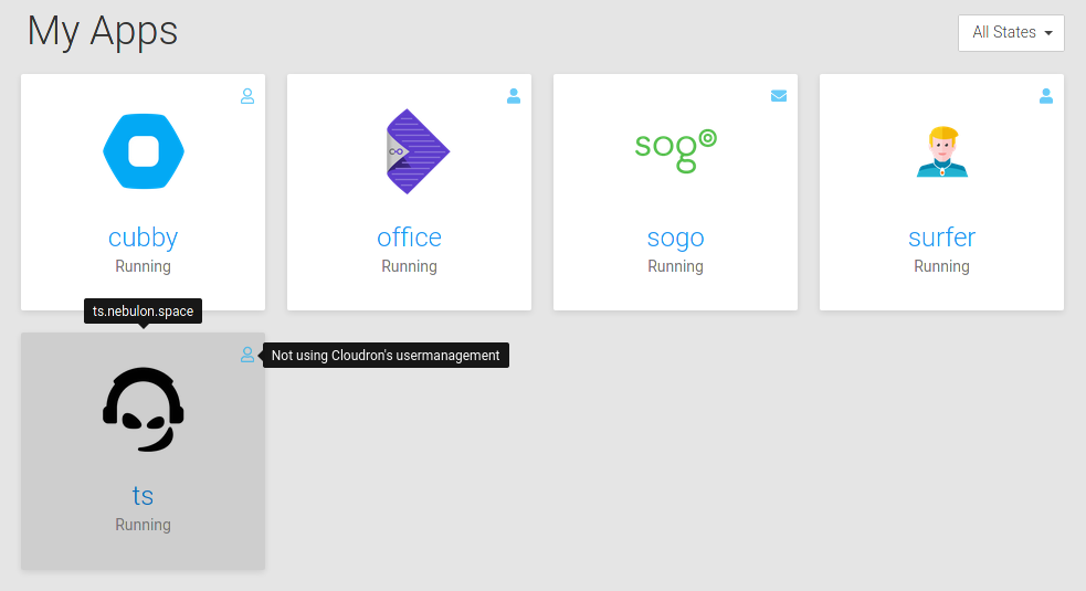
              @hexbin ok I did some attempt there and we now show such an icon with a tooltip for non-admins. Admins should know already, as well as they can get that info in the app detail view. Always showing them felt a bit too cluttered.
              cd711b7e-121c-4798-92af-1a29be099096-image.png

              marcusquinnM hexbinH jdaviescoatesJ 4 Replies Last reply
              9
              • nebulonN nebulon

                @hexbin ok I did some attempt there and we now show such an icon with a tooltip for non-admins. Admins should know already, as well as they can get that info in the app detail view. Always showing them felt a bit too cluttered.

                cd711b7e-121c-4798-92af-1a29be099096-image.png

                marcusquinnM Offline
                marcusquinnM Offline
                marcusquinn
                wrote on last edited by
                #54

                @nebulon Very nice! Can you post the text for each? I like wording things, and context helps 🙂

                Web Design https://www.evergreen.je
                Development https://brandlight.org
                Life https://marcusquinn.com

                1 Reply Last reply
                0
                • nebulonN nebulon

                  @hexbin ok I did some attempt there and we now show such an icon with a tooltip for non-admins. Admins should know already, as well as they can get that info in the app detail view. Always showing them felt a bit too cluttered.

                  cd711b7e-121c-4798-92af-1a29be099096-image.png

                  hexbinH Offline
                  hexbinH Offline
                  hexbin
                  wrote on last edited by
                  #55

                  @nebulon Aaaawesome! The tooltip solution is closer to where it's needed, good. (But be aware of possible accessibility implications.)

                  1 Reply Last reply
                  0
                  • nebulonN nebulon

                    @hexbin ok I did some attempt there and we now show such an icon with a tooltip for non-admins. Admins should know already, as well as they can get that info in the app detail view. Always showing them felt a bit too cluttered.

                    cd711b7e-121c-4798-92af-1a29be099096-image.png

                    hexbinH Offline
                    hexbinH Offline
                    hexbin
                    wrote on last edited by
                    #56

                    @nebulon Any progress with the description field yet?

                    1 Reply Last reply
                    0
                    • nebulonN Offline
                      nebulonN Offline
                      nebulon
                      Staff
                      wrote on last edited by
                      #57

                      The tooltip text will be finalized in weblate due to translation, will push this in a bit.

                      For the description, we won't do this right now as it has various text-length issues and we already have tags and the option to give descriptive names, which already indicated in this thread can also be used to clarify to some extent. In the end this would be just the same with the same visual space limitations as the app name field, so I am not sure where the benefit is, besides limiting space even further due to more fields.

                      1 Reply Last reply
                      0
                      • nebulonN nebulon

                        @hexbin ok I did some attempt there and we now show such an icon with a tooltip for non-admins. Admins should know already, as well as they can get that info in the app detail view. Always showing them felt a bit too cluttered.

                        cd711b7e-121c-4798-92af-1a29be099096-image.png

                        jdaviescoatesJ Offline
                        jdaviescoatesJ Offline
                        jdaviescoates
                        wrote on last edited by
                        #58

                        @nebulon great stuff!

                        but re:

                        Admins should know already, as well as they can get that info in the app detail view. Always showing them felt a bit too cluttered.

                        Personally I'd like to see it as an Admin too (if you've got loads of apps it's hard to remember how each is set-up) 🙂

                        I use Cloudron with Gandi & Hetzner

                        d19dotcaD 1 Reply Last reply
                        2
                        • jdaviescoatesJ jdaviescoates

                          @nebulon great stuff!

                          but re:

                          Admins should know already, as well as they can get that info in the app detail view. Always showing them felt a bit too cluttered.

                          Personally I'd like to see it as an Admin too (if you've got loads of apps it's hard to remember how each is set-up) 🙂

                          d19dotcaD Offline
                          d19dotcaD Offline
                          d19dotca
                          wrote on last edited by
                          #59

                          @jdaviescoates Agreed. Likely not an issue for a server with only a few apps, but can be a quick time saver for that at-a-glance info when hosting many of them. I'd personally like to see a toggle that allows this for admins so that it's not there for people who don't want to see them. But that can always be second iteration. haha.

                          --
                          Dustin Dauncey
                          www.d19.ca

                          1 Reply Last reply
                          1
                          • hexbinH Offline
                            hexbinH Offline
                            hexbin
                            wrote on last edited by
                            #60

                            I love you 💙

                            1 Reply Last reply
                            2
                            • marcusquinnM Offline
                              marcusquinnM Offline
                              marcusquinn
                              wrote on last edited by
                              #61

                              The Running / Stopped text sticks out more like a sore thumb now 🙂

                              Web Design https://www.evergreen.je
                              Development https://brandlight.org
                              Life https://marcusquinn.com

                              1 Reply Last reply
                              0
                              • marcusquinnM Offline
                                marcusquinnM Offline
                                marcusquinn
                                wrote on last edited by
                                #62

                                I tend not to use this on mobile, but still using rollover suggests that issue isn't covered with this update?

                                Web Design https://www.evergreen.je
                                Development https://brandlight.org
                                Life https://marcusquinn.com

                                1 Reply Last reply
                                0
                                Reply
                                • Reply as topic
                                Log in to reply
                                • Oldest to Newest
                                • Newest to Oldest
                                • Most Votes


                                  • Login

                                  • Don't have an account? Register

                                  • Login or register to search.
                                  • First post
                                    Last post
                                  0
                                  • Categories
                                  • Recent
                                  • Tags
                                  • Popular
                                  • Bookmarks
                                  • Search