Dashbard UX enhancement suggestions
-
Now that we've satisfied some basic power users' needs - mind if I get back to the original motivation (description field, login type)?
At least once a week I have to tell an app-using team member that it's not their fault and to stop blaming themselves (no, you are not "too stupid").
It would be such a blessing to help non-admins help themselves.
-
@hexbin wondering if login-type icon might be better in the top-left now to balance the cog top-right?
@marcusquinn Sounds like a good idea. I'm sure we can trust the wonderful Cloudron team with design decisions (and weighing those against technical feasability).
As long as they can make this happen - nag, nag
")
-
Hello power users, here's a collection of newbie users' experience feedback for the dashboard:
- Confusion about what app to use for what purpose (in the respective organization)
- Confusion about "wrong login credentials"
(Whining at a high level, they are all very happy with Cloudron)
Here's a suggestion to mitigate confusion:
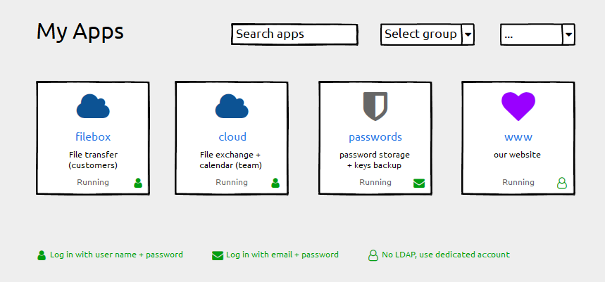
- Keep the label field untouched ("filebox"). Using the subdomain part as a default works well and we do not want any disruption here
- Add a description field for individual information ("File transfer"). This can be empty by default.
- Add login type information (if possible). Depending on the permissions handling of the grid-item-actions layer you could add that icon there, otherwise append it with an :after element to the container. Plus a legend below.
Happy to help with CSS fumbling if that helps getting forward
")
And Please forgive me for not having digged deeply into possibly related issues. I found #1804 with a "perhaps related".
-
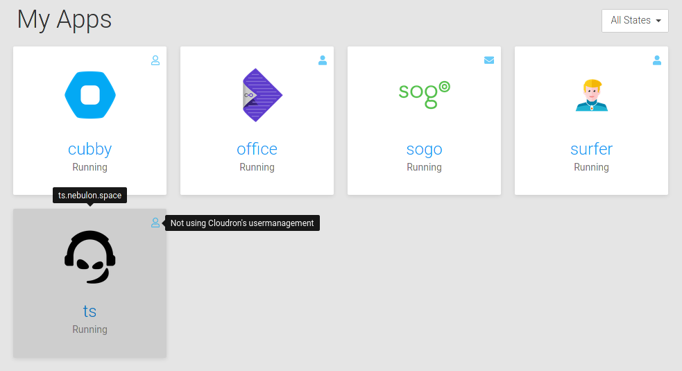
@hexbin ok I did some attempt there and we now show such an icon with a tooltip for non-admins. Admins should know already, as well as they can get that info in the app detail view. Always showing them felt a bit too cluttered.
@nebulon Very nice! Can you post the text for each? I like wording things, and context helps
-
@hexbin ok I did some attempt there and we now show such an icon with a tooltip for non-admins. Admins should know already, as well as they can get that info in the app detail view. Always showing them felt a bit too cluttered.
-
@hexbin ok I did some attempt there and we now show such an icon with a tooltip for non-admins. Admins should know already, as well as they can get that info in the app detail view. Always showing them felt a bit too cluttered.
-
The tooltip text will be finalized in weblate due to translation, will push this in a bit.
For the description, we won't do this right now as it has various text-length issues and we already have tags and the option to give descriptive names, which already indicated in this thread can also be used to clarify to some extent. In the end this would be just the same with the same visual space limitations as the app name field, so I am not sure where the benefit is, besides limiting space even further due to more fields.
-
@hexbin ok I did some attempt there and we now show such an icon with a tooltip for non-admins. Admins should know already, as well as they can get that info in the app detail view. Always showing them felt a bit too cluttered.
@nebulon great stuff!
but re:
Admins should know already, as well as they can get that info in the app detail view. Always showing them felt a bit too cluttered.
Personally I'd like to see it as an Admin too (if you've got loads of apps it's hard to remember how each is set-up)
-
@nebulon great stuff!
but re:
Admins should know already, as well as they can get that info in the app detail view. Always showing them felt a bit too cluttered.
Personally I'd like to see it as an Admin too (if you've got loads of apps it's hard to remember how each is set-up)
@jdaviescoates Agreed. Likely not an issue for a server with only a few apps, but can be a quick time saver for that at-a-glance info when hosting many of them. I'd personally like to see a toggle that allows this for admins so that it's not there for people who don't want to see them. But that can always be second iteration. haha.
-
The Running / Stopped text sticks out more like a sore thumb now
-
I tend not to use this on mobile, but still using rollover suggests that issue isn't covered with this update?

Hello! It looks like you're interested in this conversation, but you don't have an account yet.
Getting fed up of having to scroll through the same posts each visit? When you register for an account, you'll always come back to exactly where you were before, and choose to be notified of new replies (either via email, or push notification). You'll also be able to save bookmarks and upvote posts to show your appreciation to other community members.
With your input, this post could be even better 💗
Register Login