Dropdown menus in dark mode really hard to read
-
I’ve noticed that all dropdown menus in Cloudron when viewing via Safari on iOS is extremely difficult to read. It’s been like this for quite a while now, I just keep forgetting to post about it.
Does anyone else see this as well?
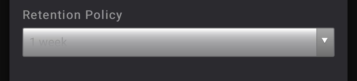
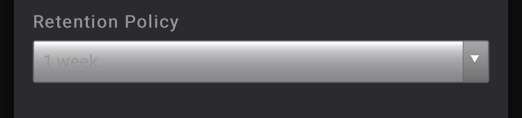
Here’s a screenshot of the dropdown on the Backups page:
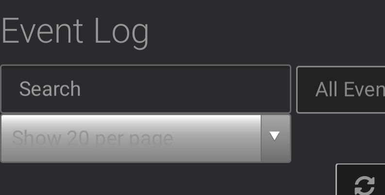
Here’s another from the Mail page near the logs section:
--
Dustin Dauncey
www.d19.ca -
I’ve noticed that all dropdown menus in Cloudron when viewing via Safari on iOS is extremely difficult to read. It’s been like this for quite a while now, I just keep forgetting to post about it.
Does anyone else see this as well?
Here’s a screenshot of the dropdown on the Backups page:
Here’s another from the Mail page near the logs section:
-
I’ve noticed that all dropdown menus in Cloudron when viewing via Safari on iOS is extremely difficult to read. It’s been like this for quite a while now, I just keep forgetting to post about it.
Does anyone else see this as well?
Here’s a screenshot of the dropdown on the Backups page:
Here’s another from the Mail page near the logs section:
-
@imc67 I do not have access to an iOS device readily available. This seems some issue with the iOS native widget rendering and the custom css for dark-mode. Once I can actually reproduce and test this myself, this should be easy to fix.
-
@imc67 I do not have access to an iOS device readily available. This seems some issue with the iOS native widget rendering and the custom css for dark-mode. Once I can actually reproduce and test this myself, this should be easy to fix.
-
@imc67 I do not have access to an iOS device readily available. This seems some issue with the iOS native widget rendering and the custom css for dark-mode. Once I can actually reproduce and test this myself, this should be easy to fix.
-
I got hold of an iPhone temporarily to test this and I've fixed this now with https://git.cloudron.io/cloudron/dashboard/-/commit/ff5ad8b062414d8a972631a19b181c80d2adc15d
Essentially we avoid rendering the native
selectdropdown button but style it ourselves so we can control also how the dark-mode rendering is done.
Hello! It looks like you're interested in this conversation, but you don't have an account yet.
Getting fed up of having to scroll through the same posts each visit? When you register for an account, you'll always come back to exactly where you were before, and choose to be notified of new replies (either via email, or push notification). You'll also be able to save bookmarks and upvote posts to show your appreciation to other community members.
With your input, this post could be even better 💗
Register Login