Option to Restore or Toggle the Old Cloudron UI Layout
-

With that said, we need more customization options, not time wasted maintaining a legacy UI.
-
@humptydumpty
I agree on customization, but the jump to the new dark left-side menu was a lot all at once. It felt rushed with no real way to ease into it, especially for users who were auto-updated. That’s what made it frustrating for me.@DEVBenSon I'm sorry but I fail to understand how it disrupted your workflow since most of the options/menu is visible without having to dig in sub-menus. The dark mode is tied to your system settings, but I'm sure you know that as a DEV, so please explain the issue like I'm 5 again (non- DEV here).
-
Maybe you can get Dashy to work: https://forum.cloudron.io/topic/6409/dashy?_=1769015951148
-
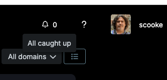
To be fair, the Notifications UX has regressed. Hoping the old way of navigating that comes back at some point.
I'm also always wanting for minimal clicks, and max keyboard navigation.
-
To be fair, the Notifications UX has regressed. Hoping the old way of navigating that comes back at some point.
I'm also always wanting for minimal clicks, and max keyboard navigation.
@marcusquinn said in Option to Restore or Toggle the Old Cloudron UI Layout:
To be fair, the Notifications UX has regressed. Hoping the old way of navigating that comes back at some point.
I'm also always wanting for minimal clicks, and max keyboard navigation.
OMG yes, the keyboard nav has been a wishlist item for so long!
-
@devbenson the old UI is gone for good. It was angular 1 based and this new one is rewritten in vuejs.
There was really no specific vision of making it "modern", we were simply rewriting to a newer framework and coding for small screen first, since angular 1 is unmaintained now. About the side bar: it seemed only natural to move all the options of a management panel to the left . Having all the server management options below the profile icon is not a natural place.
With that in mind, the issues you may be noticing might just be bugs. Feel free to open specific threads and we can discuss and act on them.
There is 9.0.17 being rolled out now which has a collapsible sidebar and quick actions for the listviews (so you don't have to click ... in many of the lists). Maybe that improves things?
Things like keyboard nav are coming.
-
To be fair, the Notifications UX has regressed. Hoping the old way of navigating that comes back at some point.
I'm also always wanting for minimal clicks, and max keyboard navigation.
@marcusquinn said in Option to Restore or Toggle the Old Cloudron UI Layout:
the Notifications UX has regressed
Yes, once you dismiss them now, they are simply gone.
-
@marcusquinn said in Option to Restore or Toggle the Old Cloudron UI Layout:
the Notifications UX has regressed
Yes, once you dismiss them now, they are simply gone.
-
@devbenson the old UI is gone for good. It was angular 1 based and this new one is rewritten in vuejs.
There was really no specific vision of making it "modern", we were simply rewriting to a newer framework and coding for small screen first, since angular 1 is unmaintained now. About the side bar: it seemed only natural to move all the options of a management panel to the left . Having all the server management options below the profile icon is not a natural place.
With that in mind, the issues you may be noticing might just be bugs. Feel free to open specific threads and we can discuss and act on them.
There is 9.0.17 being rolled out now which has a collapsible sidebar and quick actions for the listviews (so you don't have to click ... in many of the lists). Maybe that improves things?
Things like keyboard nav are coming.
@girish it's a deep psychological phenomenon where familiarity is disturbed with dislike and confusion when things are changed and the time invested in learning and optimization is disgarded for a complete new layout where so many things change from left to right or right to left that it does indeed become a productivity problem.
Unfortunately it's also often expressed in less than kind words which is a shocker to those already familiar with the new design.
Different stage of acceptance.
-
Thanks for all the feedback here. For the notifications, we are adding a separate notification view back as it was before, removing the simplistic popover.
I didn't realize it was used a bit like a todo list. This should be part of next release then.
Hello! It looks like you're interested in this conversation, but you don't have an account yet.
Getting fed up of having to scroll through the same posts each visit? When you register for an account, you'll always come back to exactly where you were before, and choose to be notified of new replies (either via email, or push notification). You'll also be able to save bookmarks and upvote posts to show your appreciation to other community members.
With your input, this post could be even better 💗
Register Login
 I used this before to sort of keep track of which apps needed manual updates, or to press the Reboot button if I wasn't ready to do it at the moment of reading the Notification.