Cloudron makes it easy to run web apps like WordPress, Nextcloud, GitLab on your server. Find out more or install now.


Skip to content
  • Categories
  • Recent
  • Tags
  • Popular
  • Bookmarks
  • Search
Skins
  • Light
  • Cerulean
  • Cosmo
  • Flatly
  • Journal
  • Litera
  • Lumen
  • Lux
  • Materia
  • Minty
  • Morph
  • Pulse
  • Sandstone
  • Simplex
  • Sketchy
  • Spacelab
  • United
  • Yeti
  • Zephyr
  • Dark
  • Cyborg
  • Darkly
  • Quartz
  • Slate
  • Solar
  • Superhero
  • Vapor

  • Default (No Skin)
  • No Skin
Collapse
Brand Logo

Cloudron Forum

Apps | Demo | Docs | Install
  1. Cloudron Forum
  2. Discuss
  3. Uhhhh, there's a new Forum theme!

Uhhhh, there's a new Forum theme!

Scheduled Pinned Locked Moved Discuss
28 Posts 14 Posters 3.3k Views 14 Watching
  • Oldest to Newest
  • Newest to Oldest
  • Most Votes
    Reply
    • Reply as topic
    Log in to reply
    This topic has been deleted. Only users with topic management privileges can see it.
    • timconsidineT Online
      timconsidineT Online
      timconsidine
      App Dev
      wrote on last edited by
      #10

      I encountered the new look before I saw the announcement, so it was a surprise.
      Currently I see pro's and con's.
      Mostly just got to get familiar with it.
      Humans are generally resistant to change 😄, especially me !

      1 Reply Last reply
      4
      • P Offline
        P Offline
        p44
        translator
        wrote on last edited by
        #11

        I think readability from mobile is little bit improved with this new theme... Also, new theme seems to give more ability to focus on the contents, than functions/features.

        1 Reply Last reply
        1
        • L Offline
          L Offline
          LoudLemur
          wrote on last edited by LoudLemur
          #12

          This new appearance is the Harmony theme. NodeBB say, " This new default theme places an emphasis on usability and readability, as well as a broader focus on consistent design methology used throughout the templates."

          There is a discussion about Harmony on NodeBB here:

          https://community.nodebb.org/topic/17116/harmony-design-considerations-and-more

          brave_lkDV7fyrK6.png

          brave_rU0HqpspwH.png

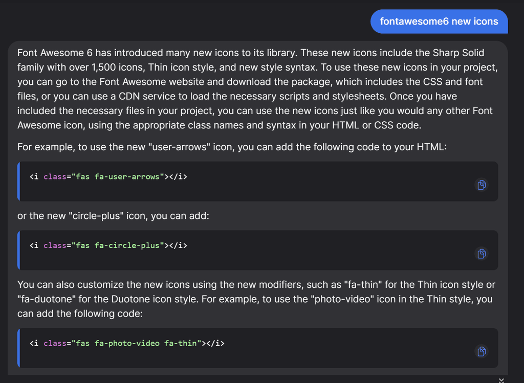
          The new forum also supports FontAwsome 6, so those who like icons might be happy:

          https://blog.fontawesome.com/font-awesome-6-2/

          Via YouChat AI:

          brave_EUwcTW54Ox.png

          Lets just try a couple:

          <i class="fas fa-user-arrows"></i>

          <i class="fas fa-user-arrows"></i>


          <i class="fas fa-circle-plus"></i>

          <i class="fas fa-photo-video fa-thin"></i>

          nichu42N 1 Reply Last reply
          0
          • robiR Offline
            robiR Offline
            robi
            wrote on last edited by
            #13

            That is the first thing that stood out in the new design, the strong separation of the content column from the nav/menu making more screen realestate available for reading, even if slightly less wide, which is easier to scan left to right, like newspaper columns. Content column pipe.

            Now if only one could do a continuous paging down to read the next unread without going back a page.

            Conscious tech

            L 1 Reply Last reply
            2
            • L Offline
              L Offline
              LoudLemur
              wrote on last edited by LoudLemur
              #14

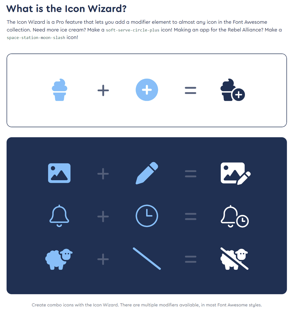
              There is also a Beta Icon Wizard https://fontawesome.com/docs/web/add-icons/icon-wizard

              brave_HgufZEATo3.png

              1 Reply Last reply
              1
              • L Offline
                L Offline
                LoudLemur
                wrote on last edited by LoudLemur
                #15

                And also new animated icons that beat, fade, bounce, spin, flip etc:
                https://fontawesome.com/docs/web/style/animate

                We can make Cloudron bouncier, more spinnier, flipping place.

                1 Reply Last reply
                0
                • L Offline
                  L Offline
                  LoudLemur
                  wrote on last edited by LoudLemur
                  #16

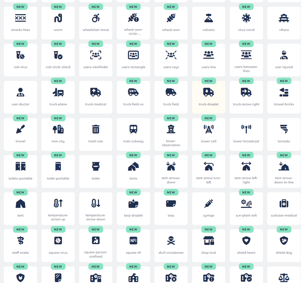
                  Here are some of the new Humanitarian icons:

                  brave_2bvFEeeMUk.png

                  1 Reply Last reply
                  0
                  • L LoudLemur

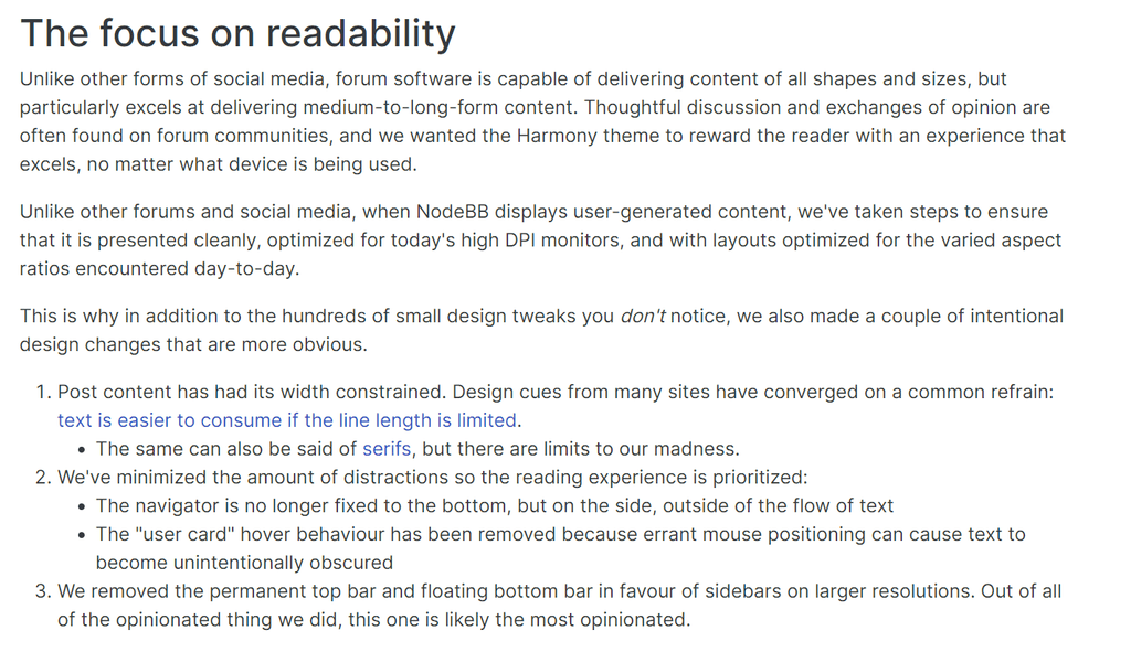
                    This new appearance is the Harmony theme. NodeBB say, " This new default theme places an emphasis on usability and readability, as well as a broader focus on consistent design methology used throughout the templates."

                    There is a discussion about Harmony on NodeBB here:

                    https://community.nodebb.org/topic/17116/harmony-design-considerations-and-more
                    brave_lkDV7fyrK6.png

                    brave_rU0HqpspwH.png

                    The new forum also supports FontAwsome 6, so those who like icons might be happy:

                    https://blog.fontawesome.com/font-awesome-6-2/

                    Via YouChat AI:
                    brave_EUwcTW54Ox.png

                    Lets just try a couple:

                    <i class="fas fa-user-arrows"></i>

                    <i class="fas fa-user-arrows"></i>


                    <i class="fas fa-circle-plus"></i>

                    <i class="fas fa-photo-video fa-thin"></i>

                    nichu42N Offline
                    nichu42N Offline
                    nichu42
                    wrote on last edited by
                    #17

                    @LoudLemur

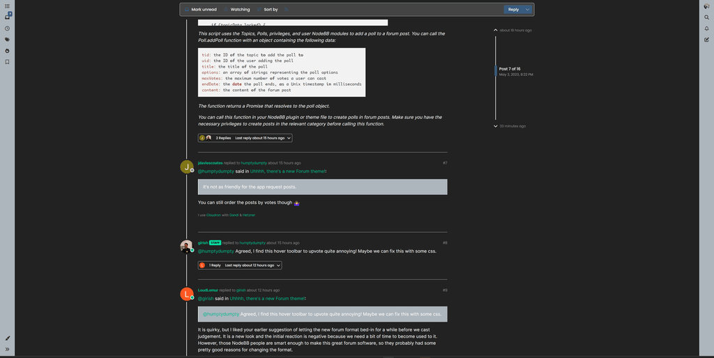
                    Do I have a strange definition of usability and readability?
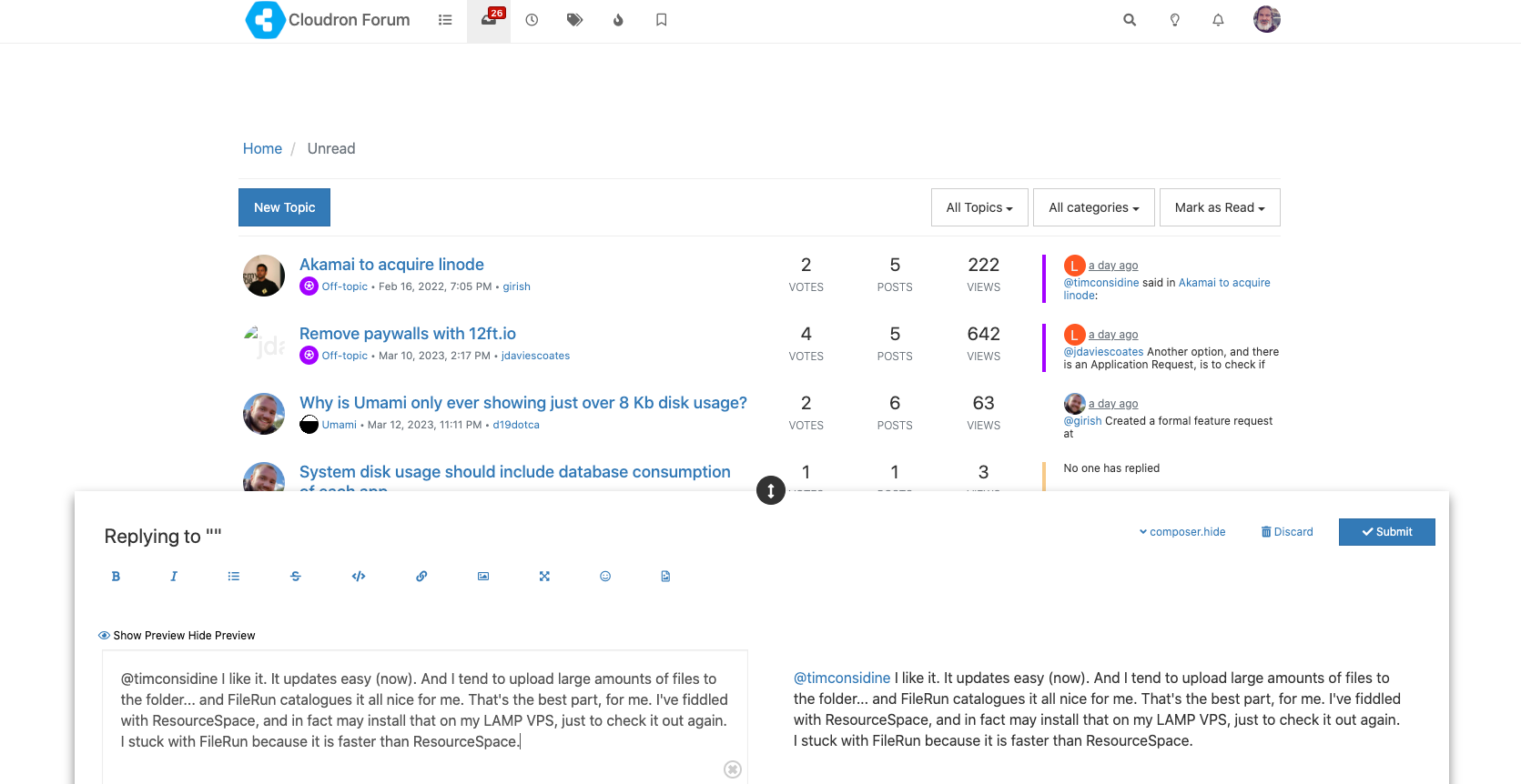
                    This is how the forum renders in my browser:
                    forum.png

                    Matrix: @nichu42:blueplanet.social

                    L 1 Reply Last reply
                    0
                    • J Offline
                      J Offline
                      JLX89
                      wrote on last edited by
                      #18

                      I just have to say, I'm really liking the new layout of the Cloudron Forum and a shout out to @girish @nebulon and @staff for everything you do! It's much appreciated!!

                      1 Reply Last reply
                      3
                      • doodlemania2D Offline
                        doodlemania2D Offline
                        doodlemania2
                        App Dev
                        wrote on last edited by
                        #19

                        I think it's pretty 🙂 But then again, I like new things. Keeps me (less) crumudgenly

                        1 Reply Last reply
                        0
                        • timconsidineT Online
                          timconsidineT Online
                          timconsidine
                          App Dev
                          wrote on last edited by
                          #20

                          It's growing on me .... now I've got over the "who moved effing UNREAD button" 😄
                          Just a reprogramming those instinctive mouse movements

                          robiR 1 Reply Last reply
                          2
                          • nichu42N nichu42

                            @LoudLemur

                            Do I have a strange definition of usability and readability?
                            This is how the forum renders in my browser:
                            forum.png

                            L Offline
                            L Offline
                            LoudLemur
                            wrote on last edited by
                            #21

                            @nichu42 said in Uhhhh, there's a new Forum theme!:

                            @LoudLemur

                            Do I have a strange definition of usability and readability?
                            This is how the forum renders in my browser:
                            forum.png

                            You might be able to improve the look by using the "page zoom" functionality in your browser. Often

                            Ctrl++
                            
                            1 Reply Last reply
                            0
                            • robiR robi

                              That is the first thing that stood out in the new design, the strong separation of the content column from the nav/menu making more screen realestate available for reading, even if slightly less wide, which is easier to scan left to right, like newspaper columns. Content column pipe.

                              Now if only one could do a continuous paging down to read the next unread without going back a page.

                              L Offline
                              L Offline
                              LoudLemur
                              wrote on last edited by
                              #22

                              @robi said in Uhhhh, there's a new Forum theme!:

                              Now if only one could do a continuous paging down to read the next unread without going back a page.

                              There is a Pagination setting in the forum settings which can effect infinite scroll. I like infinite scroll, but people who complain about social media like TickTock, say that it is terrible for people aimlessly scrolling through videos...

                              1 Reply Last reply
                              0
                              • timconsidineT timconsidine

                                It's growing on me .... now I've got over the "who moved effing UNREAD button" 😄
                                Just a reprogramming those instinctive mouse movements

                                robiR Offline
                                robiR Offline
                                robi
                                wrote on last edited by
                                #23

                                @timconsidine said in Uhhhh, there's a new Forum theme!:

                                It's growing on me .... now I've got over the "who moved effing UNREAD button"

                                There appears to be a new profile setting for the default home view which can be set to Unread.

                                Conscious tech

                                1 Reply Last reply
                                1
                                • marcusquinnM Offline
                                  marcusquinnM Offline
                                  marcusquinn
                                  wrote on last edited by
                                  #24

                                  Trying "Slate" as the least offensive Dark theme, but might switch back to Dark Reader, as that seems to do a better job of Dark readability than any designers.

                                  Web Design https://www.evergreen.je
                                  Development https://brandlight.org
                                  Life https://marcusquinn.com

                                  1 Reply Last reply
                                  0
                                  • marcusquinnM Offline
                                    marcusquinnM Offline
                                    marcusquinn
                                    wrote on last edited by
                                    #25

                                    Yeah, "Default" skin + Dark Reader is the least offensive. Still a bit low contrast in areas, but I'll cope.

                                    Web Design https://www.evergreen.je
                                    Development https://brandlight.org
                                    Life https://marcusquinn.com

                                    1 Reply Last reply
                                    0
                                    • humptydumptyH Offline
                                      humptydumptyH Offline
                                      humptydumpty
                                      wrote on last edited by humptydumpty
                                      #26

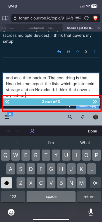
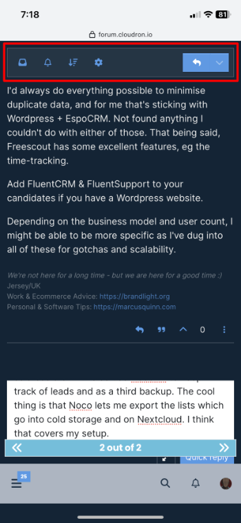
                                      In Brave browser on iOS, the “Quick reply” button is hidden behind the post scroll thing. Also, if the keyboard is open, the top reply menu/button isn't visible.
                                      theme1.png

                                      theme2.PNG

                                      marcusquinnM 1 Reply Last reply
                                      0
                                      • humptydumptyH humptydumpty

                                        In Brave browser on iOS, the “Quick reply” button is hidden behind the post scroll thing. Also, if the keyboard is open, the top reply menu/button isn't visible.

                                        theme1.png

                                        theme2.PNG

                                        marcusquinnM Offline
                                        marcusquinnM Offline
                                        marcusquinn
                                        wrote on last edited by
                                        #27

                                        @humptydumpty Looks like it's viewport is out by the same amount as the size of the tabs. One for upstream reporting.

                                        Web Design https://www.evergreen.je
                                        Development https://brandlight.org
                                        Life https://marcusquinn.com

                                        1 Reply Last reply
                                        1
                                        • necrevistonnezrN Offline
                                          necrevistonnezrN Offline
                                          necrevistonnezr
                                          wrote on last edited by
                                          #28

                                          I like it a lot simply for the reason that, when swiping back on the iPad, with the old theme, sometimes the left bar would get stuck and lay over the forum content. You then had to reload the whole page.

                                          1 Reply Last reply
                                          4
                                          Reply
                                          • Reply as topic
                                          Log in to reply
                                          • Oldest to Newest
                                          • Newest to Oldest
                                          • Most Votes


                                            • Login

                                            • Don't have an account? Register

                                            • Login or register to search.
                                            • First post
                                              Last post
                                            0
                                            • Categories
                                            • Recent
                                            • Tags
                                            • Popular
                                            • Bookmarks
                                            • Search