Uhhhh, there's a new Forum theme!
-
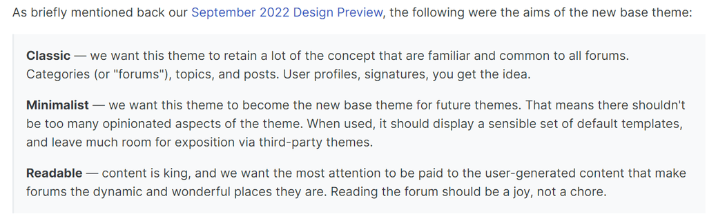
This new appearance is the Harmony theme. NodeBB say, " This new default theme places an emphasis on usability and readability, as well as a broader focus on consistent design methology used throughout the templates."
There is a discussion about Harmony on NodeBB here:
https://community.nodebb.org/topic/17116/harmony-design-considerations-and-more
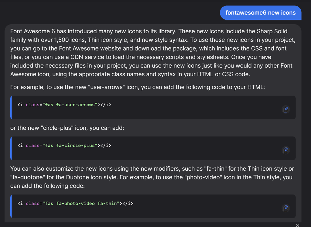
The new forum also supports FontAwsome 6, so those who like icons might be happy:
https://blog.fontawesome.com/font-awesome-6-2/
Via YouChat AI:
Lets just try a couple:
<i class="fas fa-user-arrows"></i>
<i class="fas fa-user-arrows"></i><i class="fas fa-circle-plus"></i>
<i class="fas fa-photo-video fa-thin"></i>
-
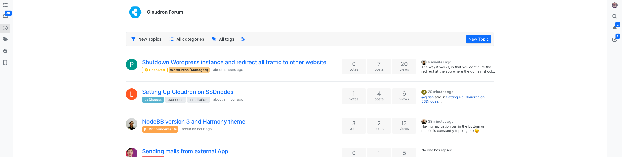
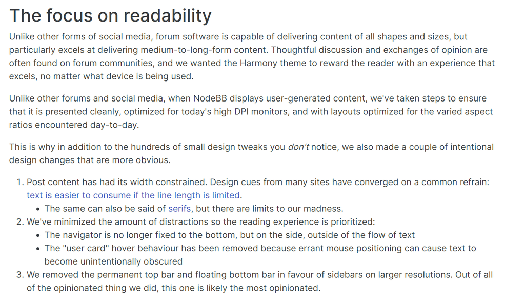
That is the first thing that stood out in the new design, the strong separation of the content column from the nav/menu making more screen realestate available for reading, even if slightly less wide, which is easier to scan left to right, like newspaper columns. Content column pipe.
Now if only one could do a continuous paging down to read the next unread without going back a page.
-
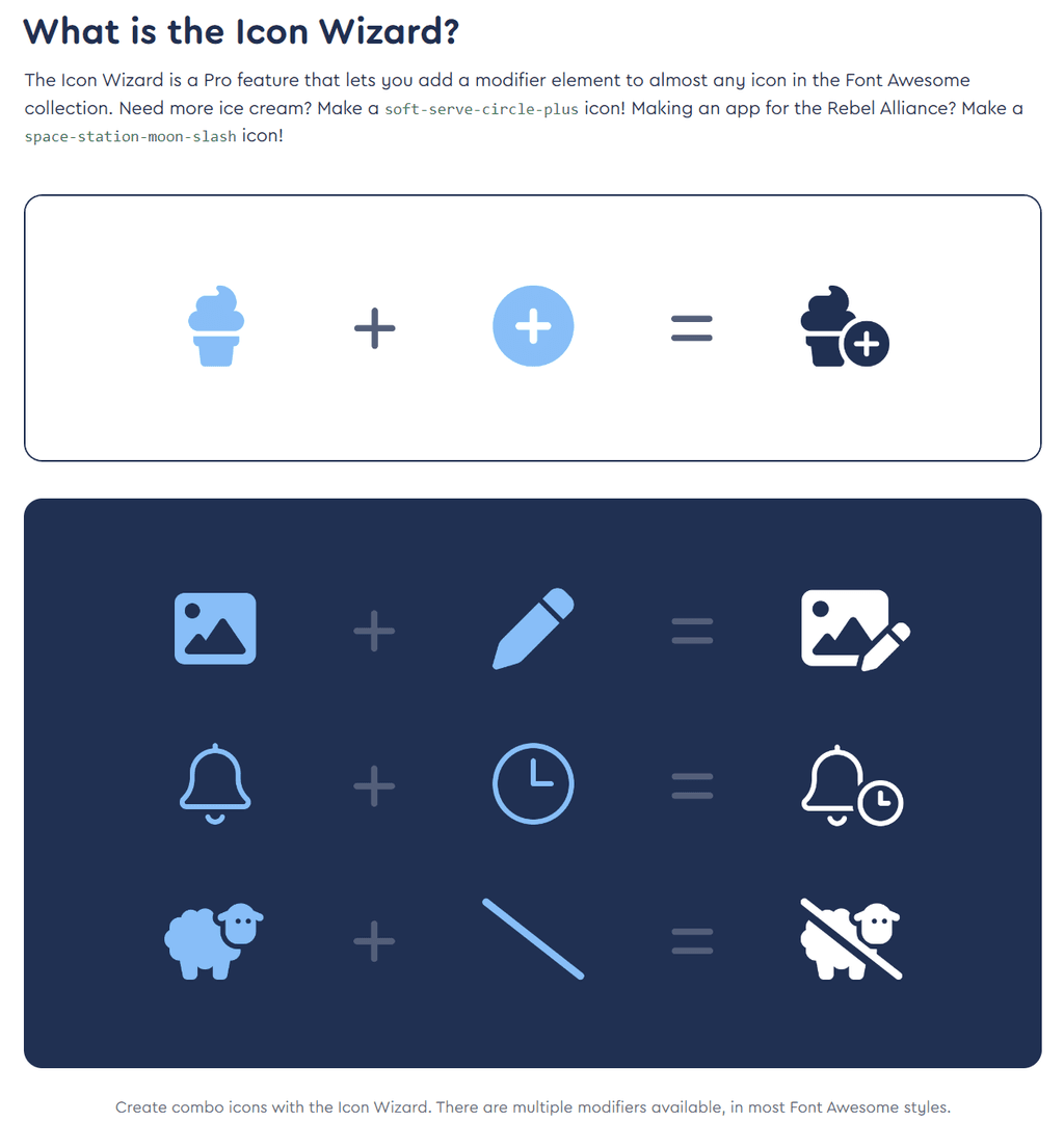
There is also a Beta Icon Wizard https://fontawesome.com/docs/web/add-icons/icon-wizard
-
And also new animated icons that beat, fade, bounce, spin, flip etc:
https://fontawesome.com/docs/web/style/animateWe can make Cloudron bouncier, more spinnier, flipping place.
-
This new appearance is the Harmony theme. NodeBB say, " This new default theme places an emphasis on usability and readability, as well as a broader focus on consistent design methology used throughout the templates."
There is a discussion about Harmony on NodeBB here:
https://community.nodebb.org/topic/17116/harmony-design-considerations-and-more
The new forum also supports FontAwsome 6, so those who like icons might be happy:
https://blog.fontawesome.com/font-awesome-6-2/
Via YouChat AI:
Lets just try a couple:
<i class="fas fa-user-arrows"></i>
<i class="fas fa-user-arrows"></i><i class="fas fa-circle-plus"></i>
<i class="fas fa-photo-video fa-thin"></i>
Do I have a strange definition of usability and readability?
This is how the forum renders in my browser:
-
I think it's pretty
") But then again, I like new things. Keeps me (less) crumudgenly
But then again, I like new things. Keeps me (less) crumudgenly -
It's growing on me .... now I've got over the "who moved effing UNREAD button"

Just a reprogramming those instinctive mouse movementsIndie app dev, huge fan of Cloudron PaaS, scratching my itches : communityapps.appx.uk
-
Do I have a strange definition of usability and readability?
This is how the forum renders in my browser:
@nichu42 said in Uhhhh, there's a new Forum theme!:
Do I have a strange definition of usability and readability?
This is how the forum renders in my browser:
You might be able to improve the look by using the "page zoom" functionality in your browser. Often
Ctrl++ -
That is the first thing that stood out in the new design, the strong separation of the content column from the nav/menu making more screen realestate available for reading, even if slightly less wide, which is easier to scan left to right, like newspaper columns. Content column pipe.
Now if only one could do a continuous paging down to read the next unread without going back a page.
@robi said in Uhhhh, there's a new Forum theme!:
Now if only one could do a continuous paging down to read the next unread without going back a page.
There is a Pagination setting in the forum settings which can effect infinite scroll. I like infinite scroll, but people who complain about social media like TickTock, say that it is terrible for people aimlessly scrolling through videos...
-
It's growing on me .... now I've got over the "who moved effing UNREAD button"
Just a reprogramming those instinctive mouse movements@timconsidine said in Uhhhh, there's a new Forum theme!:
It's growing on me .... now I've got over the "who moved effing UNREAD button"
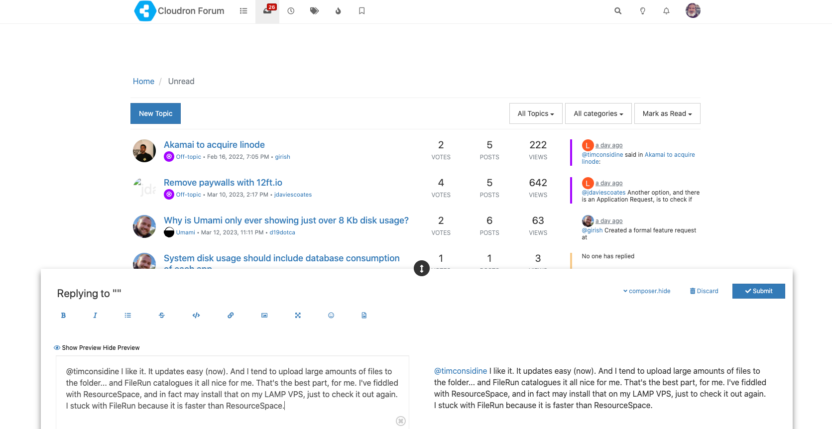
There appears to be a new profile setting for the default home view which can be set to Unread.
-
Trying "Slate" as the least offensive Dark theme, but might switch back to Dark Reader, as that seems to do a better job of Dark readability than any designers.
-
Yeah, "Default" skin + Dark Reader is the least offensive. Still a bit low contrast in areas, but I'll cope.
-
In Brave browser on iOS, the “Quick reply” button is hidden behind the post scroll thing. Also, if the keyboard is open, the top reply menu/button isn't visible.
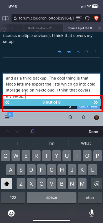
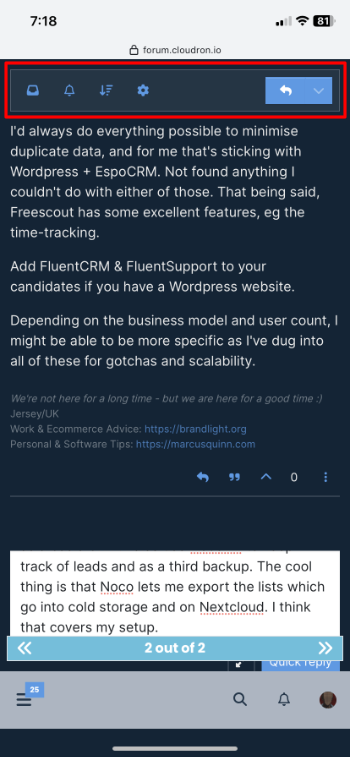
@humptydumpty Looks like it's viewport is out by the same amount as the size of the tabs. One for upstream reporting.
-
I like it a lot simply for the reason that, when swiping back on the iPad, with the old theme, sometimes the left bar would get stuck and lay over the forum content. You then had to reload the whole page.
Hello! It looks like you're interested in this conversation, but you don't have an account yet.
Getting fed up of having to scroll through the same posts each visit? When you register for an account, you'll always come back to exactly where you were before, and choose to be notified of new replies (either via email, or push notification). You'll also be able to save bookmarks and upvote posts to show your appreciation to other community members.
With your input, this post could be even better 💗
Register Login