Are you ok NodeBB?
-
Dammit, was hoping they'd include the cmd-Enter shortcut for Submit?
@marcusquinn said in Are you ok NodeBB?:
Dammit, was hoping they'd include the cmd-Enter shortcut for Submit?
Make a GitHub issue for that. It’s a good idea! Their team is v responsive.
-
@marcusquinn said in Are you ok NodeBB?:
Dammit, was hoping they'd include the cmd-Enter shortcut for Submit?
Make a GitHub issue for that. It’s a good idea! Their team is v responsive.
@Lonk already did, they already fixed, just not sure when it will be included in a release.
-

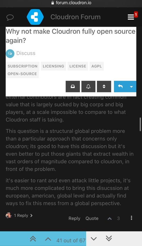
Nor only dark mode i broken but a more serious issue is that the reading space has been reduced by roughly 40%. This is horrible

-
Actually, go to your settings and select the skin as Darkly. Don't use the light bulb button on the top. It seems maybe this is a plugin issue (isn't it always?).
@girish said in Are you ok NodeBB?:
Actually, go to your settings and select the skin as Darkly. Don't use the light bulb button on the top. It seems maybe this is a plugin issue (isn't it always?).
This works to an extent; it messes with the
textareainput field colors, and the unread color which makes notifications unreadable (some weird orange color):
I may just go back to
defaultand use "dark mode" the lightbulb way. -
@girish said in Are you ok NodeBB?:
Actually, go to your settings and select the skin as Darkly. Don't use the light bulb button on the top. It seems maybe this is a plugin issue (isn't it always?).
This works to an extent; it messes with the
textareainput field colors, and the unread color which makes notifications unreadable (some weird orange color):
I may just go back to
defaultand use "dark mode" the lightbulb way. -
@girish said in Are you ok NodeBB?:
@lonk If I turn off the light bulb and just choose Darkly, it works ok here.

That worked. The notifications are still improperly outlined in orange, but the text is green in this theme so it's easier to see even if it's not the most ideal constrast. It's better than my screenshot.

-
@yusf @atrilahiji I opened https://github.com/NodeBB/nodebb-theme-persona/issues/510 for the light out mode.
-
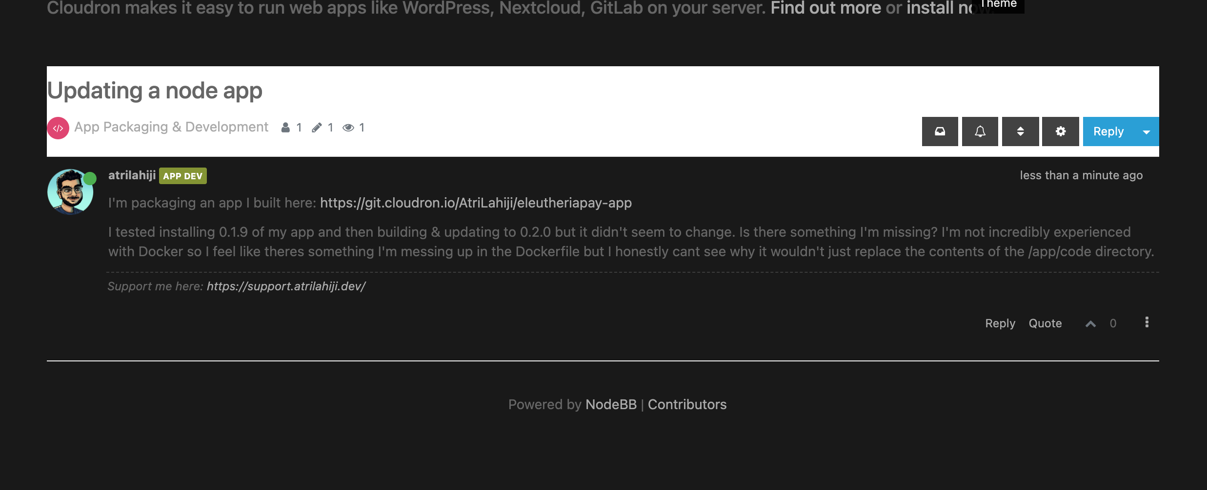
Fun fact, this is the first time this NodeBB has a fav icon at all

For me the fav icon is the Cloudron logo. -
Fun fact, this is the first time this NodeBB has a fav icon at all

For me the fav icon is the Cloudron logo.@brutalbirdie I've had that the whole time I've used this forum, i.e. since January.
-
@girish My main issue is this one:
the reading space has been reduced by roughly 40%.
… on mobile devices, because of the sticky header.
@yusf said in Are you ok NodeBB?:
… on mobile devices, because of the sticky header.
Can you can take this up upstream? They are usually quite responsive in their community forum - https://community.nodebb.org . I think your point about the mobile screen space being drastically reduced is quite valid. You can see same behavior in their forum as well on mobile.
-
@marcusquinn said in Are you ok NodeBB?:
Dammit, was hoping they'd include the cmd-Enter shortcut for Submit?
Make a GitHub issue for that. It’s a good idea! Their team is v responsive.
@lonk cmd-Enter for Mac is fixed now, must have been cached files from before the update that have now cleared.
-
@yusf said in Are you ok NodeBB?:
… on mobile devices, because of the sticky header.
Can you can take this up upstream? They are usually quite responsive in their community forum - https://community.nodebb.org . I think your point about the mobile screen space being drastically reduced is quite valid. You can see same behavior in their forum as well on mobile.
@girish said in Are you ok NodeBB?:
@yusf said in Are you ok NodeBB?:
… on mobile devices, because of the sticky header.
Can you can take this up upstream? They are usually quite responsive in their community forum - https://community.nodebb.org . I think your point about the mobile screen space being drastically reduced is quite valid. You can see same behavior in their forum as well on mobile.
Yeah, I threw some feature requests in their Github (like increasing the size of the upvote button on mobile so you can actually hit it) and I think they already committed code to fix it. So I'm sure they'd do the same for your suggestion, since it's a good user preference to have.
Hello! It looks like you're interested in this conversation, but you don't have an account yet.
Getting fed up of having to scroll through the same posts each visit? When you register for an account, you'll always come back to exactly where you were before, and choose to be notified of new replies (either via email, or push notification). You'll also be able to save bookmarks and upvote posts to show your appreciation to other community members.
With your input, this post could be even better 💗
Register Login

