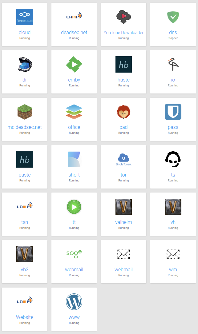
Dashbard UX enhancement suggestions
-
Hello power users, here's a collection of newbie users' experience feedback for the dashboard:
- Confusion about what app to use for what purpose (in the respective organization)
- Confusion about "wrong login credentials"
(Whining at a high level, they are all very happy with Cloudron)
Here's a suggestion to mitigate confusion:
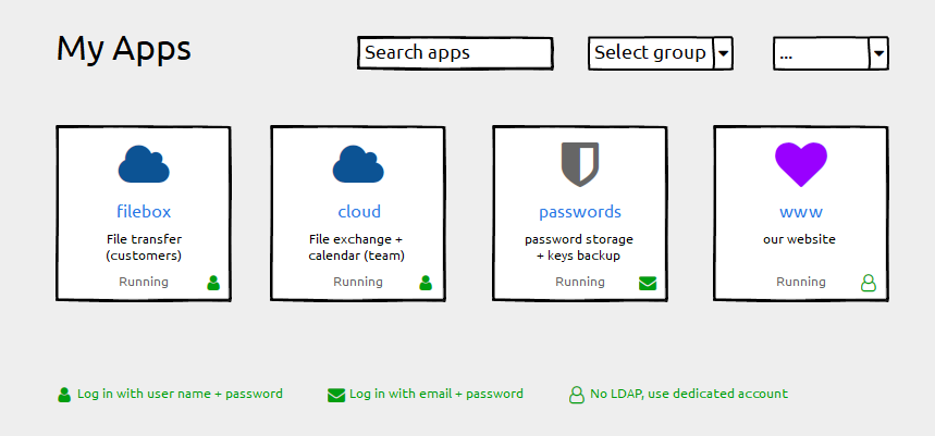
- Keep the label field untouched ("filebox"). Using the subdomain part as a default works well and we do not want any disruption here
- Add a description field for individual information ("File transfer"). This can be empty by default.
- Add login type information (if possible). Depending on the permissions handling of the grid-item-actions layer you could add that icon there, otherwise append it with an :after element to the container. Plus a legend below.
Happy to help with CSS fumbling if that helps getting forward

And Please forgive me for not having digged deeply into possibly related issues. I found #1804 with a "perhaps related".
-
Hello power users, here's a collection of newbie users' experience feedback for the dashboard:
- Confusion about what app to use for what purpose (in the respective organization)
- Confusion about "wrong login credentials"
(Whining at a high level, they are all very happy with Cloudron)
Here's a suggestion to mitigate confusion:

- Keep the label field untouched ("filebox"). Using the subdomain part as a default works well and we do not want any disruption here
- Add a description field for individual information ("File transfer"). This can be empty by default.
- Add login type information (if possible). Depending on the permissions handling of the grid-item-actions layer you could add that icon there, otherwise append it with an :after element to the container. Plus a legend below.
Happy to help with CSS fumbling if that helps getting forward

And Please forgive me for not having digged deeply into possibly related issues. I found #1804 with a "perhaps related".
@hexbin said in Dashbard UX enhancement suggestions:
Add a description field for individual information ("File transfer"). This can be empty by default.
I definitely like this idea in particular for a description, as long as it's empty by default. I can think of one specific use-case in my environment where this would be helpful, as I sometimes make multiple different staging sites for a client's website for different projects for the production site and sometimes I have to log into them all to remember which one I made which changes in if it's been a week or two since I worked on their project and "lost my place". This would definitely save some time in those situations.
-
I kind of like those suggestions. To not clutter the UI on overview, the login-type indicator could also just be shown on hover.
I have to experiment a bit on the "description" aspect, but this should be doable.
-
I kind of like those suggestions. To not clutter the UI on overview, the login-type indicator could also just be shown on hover.
I have to experiment a bit on the "description" aspect, but this should be doable.
@nebulon said in Dashbard UX enhancement suggestions:
just be shown on hover
This is probably totally fine since this likely wouldn't be used too often anyways where people need to check which login type it is, but just a friendly reminder that "hover" doesn't really exist for mobile devices. Ideally whatever is done would be mobile-friendly too. Not all users will use desktops to login quickly to a web app.

-
login indicator is an excellent suggestion! I prefer it to be always shown instead on hover. (I don't like the current settings icon hover either... but that's a separate topic).
@girish but please make sure that it also works on tablets like an iPad Pro because currently it's almost impossible to use the Dashboard on an iPad as the "hover icons" are not visible (and you can't hover on a tough device) and after struggling when you do see them they are much much to small

-
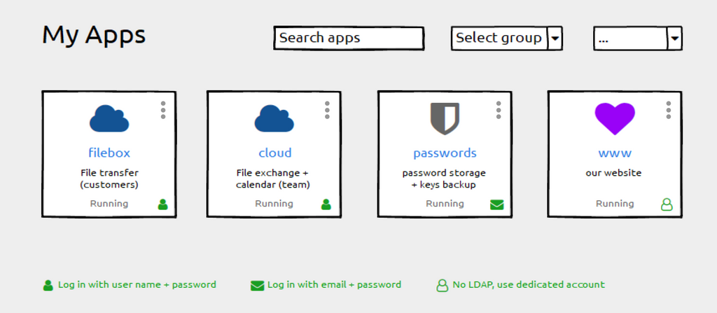
Given that these icons (username/email/auth) are just visual but not clickable, may I suggest a ... icon in the top right that is clickable/tappable as a context menu for config/logs/info/url instead of the rollover icons?
Screenshot from WebCatalog, just as an example of the top-right area idea:

-
Eg:
-
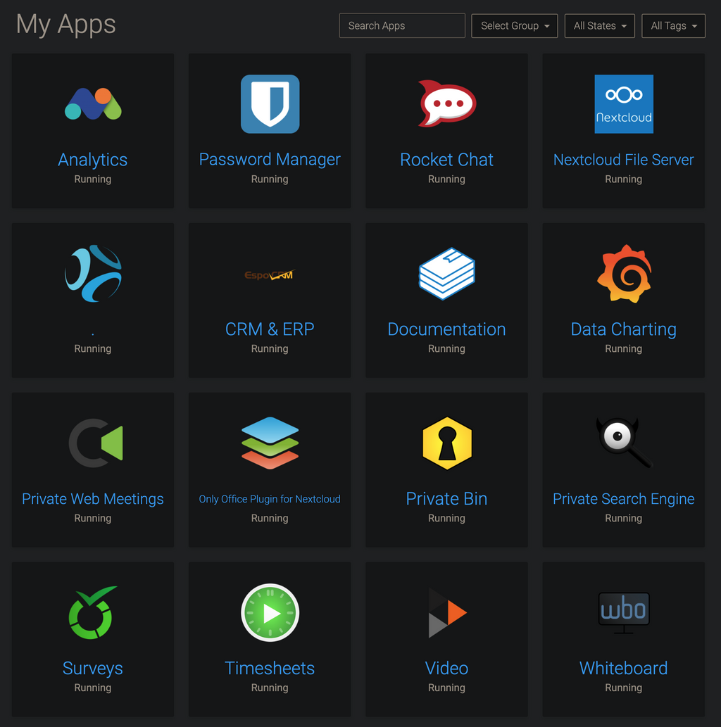
For interest, I name Apps like this, so they are sort of self-explanatory:
-
For interest, I name Apps like this, so they are sort of self-explanatory:

@marcusquinn great, I do something similar and add "My" in front of the name when it is LDAP, so the user know it can login with same credentials (but here is the thing like mentioned before, sometimes with username and sometimes with full email address).
-
For interest, I name Apps like this, so they are sort of self-explanatory:

-
@marcusquinn great, I do something similar and add "My" in front of the name when it is LDAP, so the user know it can login with same credentials (but here is the thing like mentioned before, sometimes with username and sometimes with full email address).
@imc67 Nice. I have been using the Rocket Chat home page as a one-page reference documentation for all other app explanations and things like that.
-
@brutalbirdie Edited for a teeny bit of client privacy. Clever birdie

-
@brutalbirdie Edited for a teeny bit of client privacy. Clever birdie

@marcusquinn Figures


I was just reading the names and then the.struck me.
Love It. -
Hello power users, here's a collection of newbie users' experience feedback for the dashboard:
- Confusion about what app to use for what purpose (in the respective organization)
- Confusion about "wrong login credentials"
(Whining at a high level, they are all very happy with Cloudron)
Here's a suggestion to mitigate confusion:

- Keep the label field untouched ("filebox"). Using the subdomain part as a default works well and we do not want any disruption here
- Add a description field for individual information ("File transfer"). This can be empty by default.
- Add login type information (if possible). Depending on the permissions handling of the grid-item-actions layer you could add that icon there, otherwise append it with an :after element to the container. Plus a legend below.
Happy to help with CSS fumbling if that helps getting forward

And Please forgive me for not having digged deeply into possibly related issues. I found #1804 with a "perhaps related".
@hexbin Any thoughts on icons for those apps with 2FA enabled too perhaps? Maybe a superscript 2? Eg:
 ²
² -
@hexbin Any thoughts on icons for those apps with 2FA enabled too perhaps? Maybe a superscript 2? Eg:
 ²
² -
While we're discussing UI changes. Perhaps a Play/Stop button to start/stop the server and a restart button here?

I do find it counterintuitive that it is buried. I get that doing this avoids mis-clicks but this could be alleviated with a confirmation popup for these actions.
-
While we're discussing UI changes. Perhaps a Play/Stop button to start/stop the server and a restart button here?

I do find it counterintuitive that it is buried. I get that doing this avoids mis-clicks but this could be alleviated with a confirmation popup for these actions.
@atrilahiji said in Dashbard UX enhancement suggestions:
Perhaps a Play/Stop button to start/stop the server and a restart button here?
+1
-
While we're discussing UI changes. Perhaps a Play/Stop button to start/stop the server and a restart button here?

I do find it counterintuitive that it is buried. I get that doing this avoids mis-clicks but this could be alleviated with a confirmation popup for these actions.
@atrilahiji some time back we have thought of this actually, back then though it wasn't quite clear to us if this is a common thing to do or not. I am still not sure about the use-case for starting and stopping apps frequently, but maybe I just don't have that. Adding such a button is easy enough if many users find that useful.
Hello! It looks like you're interested in this conversation, but you don't have an account yet.
Getting fed up of having to scroll through the same posts each visit? When you register for an account, you'll always come back to exactly where you were before, and choose to be notified of new replies (either via email, or push notification). You'll also be able to save bookmarks and upvote posts to show your appreciation to other community members.
With your input, this post could be even better 💗
Register Login

