Dashbard UX enhancement suggestions
-
For interest, I name Apps like this, so they are sort of self-explanatory:
Web Design & Development: https://www.evergreen.je
Technology & Apps: https://www.marcusquinn.com -
For interest, I name Apps like this, so they are sort of self-explanatory:
@marcusquinn great, I do something similar and add "My" in front of the name when it is LDAP, so the user know it can login with same credentials (but here is the thing like mentioned before, sometimes with username and sometimes with full email address).
-
For interest, I name Apps like this, so they are sort of self-explanatory:
-
@marcusquinn great, I do something similar and add "My" in front of the name when it is LDAP, so the user know it can login with same credentials (but here is the thing like mentioned before, sometimes with username and sometimes with full email address).
@imc67 Nice. I have been using the Rocket Chat home page as a one-page reference documentation for all other app explanations and things like that.
-
@brutalbirdie Edited for a teeny bit of client privacy. Clever birdie

Web Design & Development: https://www.evergreen.je
Technology & Apps: https://www.marcusquinn.com -
@brutalbirdie Edited for a teeny bit of client privacy. Clever birdie
@marcusquinn Figures
")

I was just reading the names and then the.struck me.
Love It. -
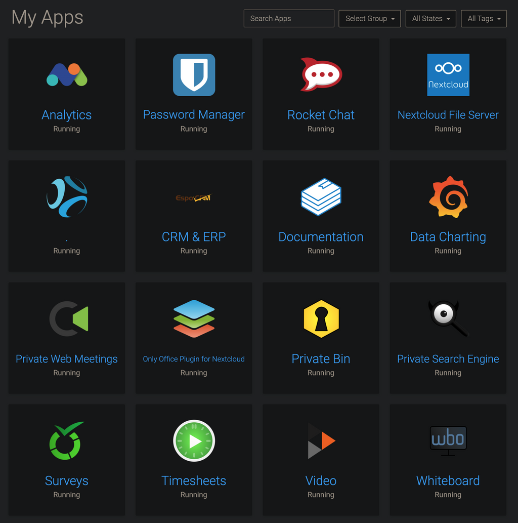
Hello power users, here's a collection of newbie users' experience feedback for the dashboard:
- Confusion about what app to use for what purpose (in the respective organization)
- Confusion about "wrong login credentials"
(Whining at a high level, they are all very happy with Cloudron)
Here's a suggestion to mitigate confusion:
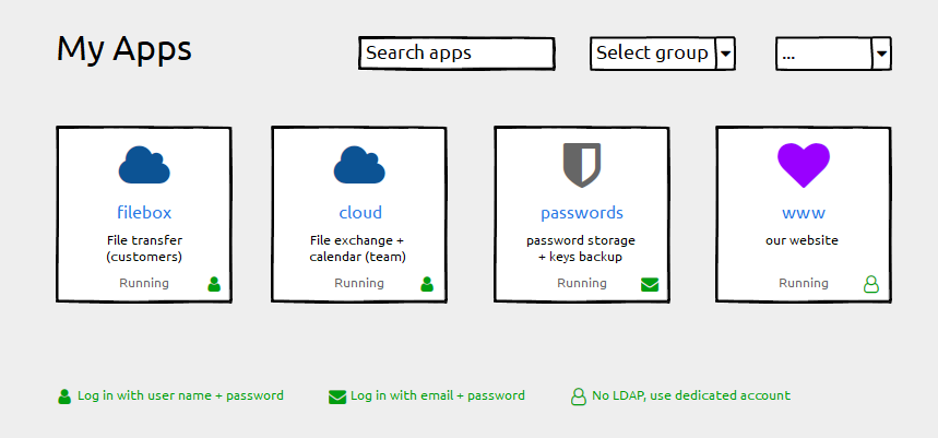
- Keep the label field untouched ("filebox"). Using the subdomain part as a default works well and we do not want any disruption here
- Add a description field for individual information ("File transfer"). This can be empty by default.
- Add login type information (if possible). Depending on the permissions handling of the grid-item-actions layer you could add that icon there, otherwise append it with an :after element to the container. Plus a legend below.
Happy to help with CSS fumbling if that helps getting forward
")
And Please forgive me for not having digged deeply into possibly related issues. I found #1804 with a "perhaps related".
-
@hexbin Any thoughts on icons for those apps with 2FA enabled too perhaps? Maybe a superscript 2? Eg:
 ²
² -
While we're discussing UI changes. Perhaps a Play/Stop button to start/stop the server and a restart button here?

I do find it counterintuitive that it is buried. I get that doing this avoids mis-clicks but this could be alleviated with a confirmation popup for these actions.
-
While we're discussing UI changes. Perhaps a Play/Stop button to start/stop the server and a restart button here?
I do find it counterintuitive that it is buried. I get that doing this avoids mis-clicks but this could be alleviated with a confirmation popup for these actions.
@atrilahiji said in Dashbard UX enhancement suggestions:
Perhaps a Play/Stop button to start/stop the server and a restart button here?
+1
-
While we're discussing UI changes. Perhaps a Play/Stop button to start/stop the server and a restart button here?
I do find it counterintuitive that it is buried. I get that doing this avoids mis-clicks but this could be alleviated with a confirmation popup for these actions.
@atrilahiji some time back we have thought of this actually, back then though it wasn't quite clear to us if this is a common thing to do or not. I am still not sure about the use-case for starting and stopping apps frequently, but maybe I just don't have that. Adding such a button is easy enough if many users find that useful.
-
@atrilahiji some time back we have thought of this actually, back then though it wasn't quite clear to us if this is a common thing to do or not. I am still not sure about the use-case for starting and stopping apps frequently, but maybe I just don't have that. Adding such a button is easy enough if many users find that useful.
@nebulon I can't speak for others but I frequently change config values and restart apps. Not just for EleutheriaPay but a couple other apps require this to pick up config changes. Gitea for example. As for starting and stopping, I have multiple minecraft servers I host but they often don't need to be on all the time, so I turn them off from time to time to save on resources.
-
Oh my, there we've got something

So many good ideas, this community is awesome!I love @marcusquinn's dot menu suggestion. If that is accessible for all roles we can keep the tiles largely free from clutter. If it's only for admins we should list separately what should must find a place on the tile.
As to the 2FA idea, of course we can find an icon to reflect that (I've been using fontawesome icons for the wireframe because the font is already in use - but I cannot find any suitable icon there).
Before we get to that: are there any apps that require 2FA by default? I only know of those with optional settings. Digging that deep would mean that we'd eventually have to pick the icons to display, right?
-
login indicator is an excellent suggestion! I prefer it to be always shown instead on hover. (I don't like the current settings icon hover either... but that's a separate topic).
@girish said in Dashbard UX enhancement suggestions:
(I don't like the current settings icon hover either... but that's a separate topic).
Give me a little more background information on how it's built (or a link to that separate topic), maybe I can help (with expertise in UX, CSS, accessibility).
-
@atrilahiji some time back we have thought of this actually, back then though it wasn't quite clear to us if this is a common thing to do or not. I am still not sure about the use-case for starting and stopping apps frequently, but maybe I just don't have that. Adding such a button is easy enough if many users find that useful.
@nebulon I agree with @atrilahiji's use-case, and is the same for me in most cases too. I may make a change in an app (usually WordPress) in a file that may only get read on boot, therefore for the settings to take effect I need to restart the app so the changes are recognized. Sometimes it's also nice to just have a "clean start" of the app to at least sanity-check / rule out items when troubleshooting (such as caching and other areas depending on the app).
-
Oh my, there we've got something
So many good ideas, this community is awesome!I love @marcusquinn's dot menu suggestion. If that is accessible for all roles we can keep the tiles largely free from clutter. If it's only for admins we should list separately what should must find a place on the tile.
As to the 2FA idea, of course we can find an icon to reflect that (I've been using fontawesome icons for the wireframe because the font is already in use - but I cannot find any suitable icon there).
Before we get to that: are there any apps that require 2FA by default? I only know of those with optional settings. Digging that deep would mean that we'd eventually have to pick the icons to display, right?
@hexbin We've used the Fontawesome badge layering to good effect before: http://alaind-.github.io/font-awesome-badge/
Good point on how to know if the app has 2FA enforced or not.
Thinking further; I think the whole world begrudgingly knows and accepts 2FA as a fact of life now, so wouldn't need to know about it in advance to find that it's necessary on login, and follow the app's own instructions for that. So maybe a moot point, but happy to see a fellow detail obsessor!
-
@nebulon I can't speak for others but I frequently change config values and restart apps. Not just for EleutheriaPay but a couple other apps require this to pick up config changes. Gitea for example. As for starting and stopping, I have multiple minecraft servers I host but they often don't need to be on all the time, so I turn them off from time to time to save on resources.
@atrilahiji hm regarding the config changes and subsequent required restart, both the filemanager and the webterminal have a restart button.
For the other use-case, this is essentially a stop/start not really a restart case. I can see that being useful if apps are paused frequently.
-
@atrilahiji hm regarding the config changes and subsequent required restart, both the filemanager and the webterminal have a restart button.
For the other use-case, this is essentially a stop/start not really a restart case. I can see that being useful if apps are paused frequently.
@nebulon said in Dashbard UX enhancement suggestions:
both the filemanager and the webterminal have a restart button.
I don't think I've noticed that!

I often find myself going into Config -> Repair -> Restart when I probably don't need to.
I do sometimes think it's strange that Restart is hidden away in Repair whereas Stop is hidden away in Uninstall. Until you know that it isn't obvious where to find them.
-
@nebulon said in Dashbard UX enhancement suggestions:
both the filemanager and the webterminal have a restart button.
I don't think I've noticed that!
I often find myself going into Config -> Repair -> Restart when I probably don't need to.
I do sometimes think it's strange that Restart is hidden away in Repair whereas Stop is hidden away in Uninstall. Until you know that it isn't obvious where to find them.
@jdaviescoates said in Dashbard UX enhancement suggestions:
Restart is hidden away in Repair whereas Stop is hidden away in Uninstall
@nebulon - It's great to know that restart is at least also found in the Terminal and File Manager, this makes it just one extra click which is decent. However, @jdaviescoates raises the main point (IMO) that I too find irritating... the Restart button and Stop buttons are not close to each other as I think most users would expect, and perhaps more frustratingly to me - they are located on tabs that are named something unrelated to the action entirely.
Restart is on a tab named Repair (admittedly a very slight relationship on this one). Stop is on a tab named Uninstall (not even closely related at all IMO).
Maybe it's just me, but I think of Repair just for that special recovery container mode when something critical happens so I don't expect to visit it for a simple task. And Uninstall, well... to be visited only to actually uninstall the app, definitely not where I'd look to simply shut it down.
Regardless of the name of the tabs they are found on though, I think most users would naturally expect action items like Stop and Restart to be found in the same area as the other, not completely separate areas. Think of how our operating systems are... shutdown and restart are right next to each other in pretty much every operating system. As a result, users expect to find these actions close together rather than completely different menus. Right now I always feel I need to "hunt" for the action buttons, even if it only takes a few seconds to locate it.
I'd recommend a fifth button added to the existing 4, which is perhaps a drop-down style button which then display both the "Stop" and "Restart" buttons... the parent button maybe named something like "Action" or similar.
Side note: I think maybe part of the problem that lead to these decisions of where they are found currently is that there is a mindset that the Restart action is that it should only ever be used if something goes wrong - in which case it explains why it's found on the Repair tab. But that's not the only reason to restart an app, not everyone restarts it just because something is "wrong".
--
Dustin Dauncey
www.d19.ca -
@jdaviescoates said in Dashbard UX enhancement suggestions:
Restart is hidden away in Repair whereas Stop is hidden away in Uninstall
@nebulon - It's great to know that restart is at least also found in the Terminal and File Manager, this makes it just one extra click which is decent. However, @jdaviescoates raises the main point (IMO) that I too find irritating... the Restart button and Stop buttons are not close to each other as I think most users would expect, and perhaps more frustratingly to me - they are located on tabs that are named something unrelated to the action entirely.
Restart is on a tab named Repair (admittedly a very slight relationship on this one). Stop is on a tab named Uninstall (not even closely related at all IMO).
Maybe it's just me, but I think of Repair just for that special recovery container mode when something critical happens so I don't expect to visit it for a simple task. And Uninstall, well... to be visited only to actually uninstall the app, definitely not where I'd look to simply shut it down.
Regardless of the name of the tabs they are found on though, I think most users would naturally expect action items like Stop and Restart to be found in the same area as the other, not completely separate areas. Think of how our operating systems are... shutdown and restart are right next to each other in pretty much every operating system. As a result, users expect to find these actions close together rather than completely different menus. Right now I always feel I need to "hunt" for the action buttons, even if it only takes a few seconds to locate it.
I'd recommend a fifth button added to the existing 4, which is perhaps a drop-down style button which then display both the "Stop" and "Restart" buttons... the parent button maybe named something like "Action" or similar.
Side note: I think maybe part of the problem that lead to these decisions of where they are found currently is that there is a mindset that the Restart action is that it should only ever be used if something goes wrong - in which case it explains why it's found on the Repair tab. But that's not the only reason to restart an app, not everyone restarts it just because something is "wrong".
@d19dotca what you guessed here was mostly our strain of thought where the buttons end up. For us the restart was mostly useful when the app does not work and it actually needs a restart. I still think this is the case from the point of view of this part of the dashboard. Having to restart an app after config file changes, is why we've put the restart action also into the filemanager and webterminal (although apparently this isn't obvious).
The stop/start action on the other side was put where the uninstall is, as we thought if the system is low on resources and one option is to purge rarely used apps, one could also stop the app instead of uninstalling altogether. I think here our thinking does not align. I will experiment to see if putting a stop/start button on the top is good (I don't think a dropdown with also a restart action is helpful here though, as I still think it is not the right fix having to restart apps frequently)


Hello! It looks like you're interested in this conversation, but you don't have an account yet.
Getting fed up of having to scroll through the same posts each visit? When you register for an account, you'll always come back to exactly where you were before, and choose to be notified of new replies (either via email, or push notification). You'll also be able to save bookmarks and upvote posts to show your appreciation to other community members.
With your input, this post could be even better 💗
Register Login