Solved Dashbard UX enhancement suggestions
-
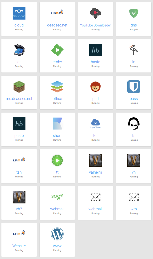
Hello power users, here's a collection of newbie users' experience feedback for the dashboard:
- Confusion about what app to use for what purpose (in the respective organization)
- Confusion about "wrong login credentials"
(Whining at a high level, they are all very happy with Cloudron)
Here's a suggestion to mitigate confusion:
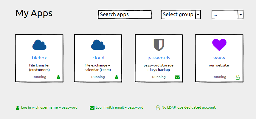
- Keep the label field untouched ("filebox"). Using the subdomain part as a default works well and we do not want any disruption here
- Add a description field for individual information ("File transfer"). This can be empty by default.
- Add login type information (if possible). Depending on the permissions handling of the grid-item-actions layer you could add that icon there, otherwise append it with an :after element to the container. Plus a legend below.
Happy to help with CSS fumbling if that helps getting forward
And Please forgive me for not having digged deeply into possibly related issues. I found #1804 with a "perhaps related".
-
@hexbin said in Dashbard UX enhancement suggestions:
Add a description field for individual information ("File transfer"). This can be empty by default.
I definitely like this idea in particular for a description, as long as it's empty by default. I can think of one specific use-case in my environment where this would be helpful, as I sometimes make multiple different staging sites for a client's website for different projects for the production site and sometimes I have to log into them all to remember which one I made which changes in if it's been a week or two since I worked on their project and "lost my place". This would definitely save some time in those situations.
-
I kind of like those suggestions. To not clutter the UI on overview, the login-type indicator could also just be shown on hover.
I have to experiment a bit on the "description" aspect, but this should be doable.
-
@nebulon Hover for the icon was exactly what I had in mind
While you're at it, could you check why the focus on the tiles (keyboard navigation) has no visual effect?
-
@nebulon said in Dashbard UX enhancement suggestions:
just be shown on hover
This is probably totally fine since this likely wouldn't be used too often anyways where people need to check which login type it is, but just a friendly reminder that "hover" doesn't really exist for mobile devices. Ideally whatever is done would be mobile-friendly too. Not all users will use desktops to login quickly to a web app.
-
login indicator is an excellent suggestion! I prefer it to be always shown instead on hover. (I don't like the current settings icon hover either... but that's a separate topic).
-
@girish but please make sure that it also works on tablets like an iPad Pro because currently it's almost impossible to use the Dashboard on an iPad as the "hover icons" are not visible (and you can't hover on a tough device) and after struggling when you do see them they are much much to small
-
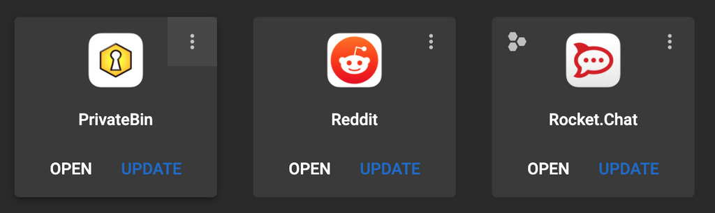
Given that these icons (username/email/auth) are just visual but not clickable, may I suggest a ... icon in the top right that is clickable/tappable as a context menu for config/logs/info/url instead of the rollover icons?
Screenshot from WebCatalog, just as an example of the top-right area idea:
-
Eg:
-
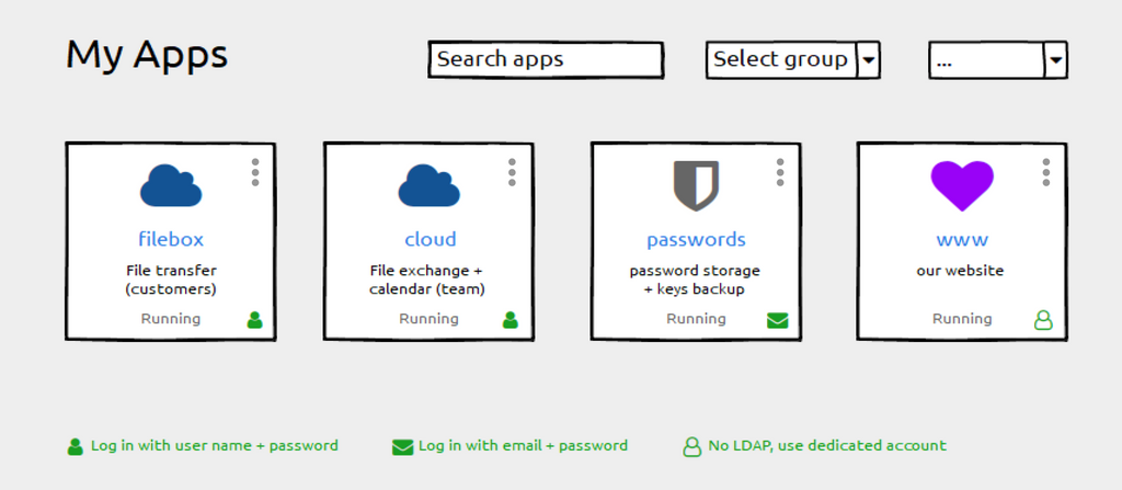
For interest, I name Apps like this, so they are sort of self-explanatory:
-
@marcusquinn great, I do something similar and add "My" in front of the name when it is LDAP, so the user know it can login with same credentials (but here is the thing like mentioned before, sometimes with username and sometimes with full email address).
-
-
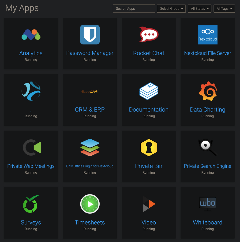
@imc67 Nice. I have been using the Rocket Chat home page as a one-page reference documentation for all other app explanations and things like that.
-
@brutalbirdie Edited for a teeny bit of client privacy. Clever birdie
-
@marcusquinn Figures
I was just reading the names and then the.
struck me.
Love It. -
@hexbin Any thoughts on icons for those apps with 2FA enabled too perhaps? Maybe a superscript 2? Eg:
²
-
I like superscript text generators for these things: ²ᶠᵃ
-
While we're discussing UI changes. Perhaps a Play/Stop button to start/stop the server and a restart button here?
I do find it counterintuitive that it is buried. I get that doing this avoids mis-clicks but this could be alleviated with a confirmation popup for these actions.
-
@atrilahiji said in Dashbard UX enhancement suggestions:
Perhaps a Play/Stop button to start/stop the server and a restart button here?
+1
-
@atrilahiji some time back we have thought of this actually, back then though it wasn't quite clear to us if this is a common thing to do or not. I am still not sure about the use-case for starting and stopping apps frequently, but maybe I just don't have that. Adding such a button is easy enough if many users find that useful.
-
@nebulon I can't speak for others but I frequently change config values and restart apps. Not just for EleutheriaPay but a couple other apps require this to pick up config changes. Gitea for example. As for starting and stopping, I have multiple minecraft servers I host but they often don't need to be on all the time, so I turn them off from time to time to save on resources.
-
Oh my, there we've got something
So many good ideas, this community is awesome!I love @marcusquinn's dot menu suggestion. If that is accessible for all roles we can keep the tiles largely free from clutter. If it's only for admins we should list separately what should must find a place on the tile.
As to the 2FA idea, of course we can find an icon to reflect that (I've been using fontawesome icons for the wireframe because the font is already in use - but I cannot find any suitable icon there).
Before we get to that: are there any apps that require 2FA by default? I only know of those with optional settings. Digging that deep would mean that we'd eventually have to pick the icons to display, right?
-
@girish said in Dashbard UX enhancement suggestions:
[...] (I don't like the current settings icon hover either... but that's a separate topic).
Give me a little more background information on how it's built (or a link to that separate topic), maybe I can help (with expertise in UX, CSS, accessibility).
-
@nebulon I agree with @atrilahiji's use-case, and is the same for me in most cases too. I may make a change in an app (usually WordPress) in a file that may only get read on boot, therefore for the settings to take effect I need to restart the app so the changes are recognized. Sometimes it's also nice to just have a "clean start" of the app to at least sanity-check / rule out items when troubleshooting (such as caching and other areas depending on the app).
-
@hexbin We've used the Fontawesome badge layering to good effect before: http://alaind-.github.io/font-awesome-badge/
Good point on how to know if the app has 2FA enforced or not.
Thinking further; I think the whole world begrudgingly knows and accepts 2FA as a fact of life now, so wouldn't need to know about it in advance to find that it's necessary on login, and follow the app's own instructions for that. So maybe a moot point, but happy to see a fellow detail obsessor!
-
@atrilahiji hm regarding the config changes and subsequent required restart, both the filemanager and the webterminal have a restart button.
For the other use-case, this is essentially a stop/start not really a restart case. I can see that being useful if apps are paused frequently.
-
@nebulon said in Dashbard UX enhancement suggestions:
both the filemanager and the webterminal have a restart button.
I don't think I've noticed that!
I often find myself going into Config -> Repair -> Restart when I probably don't need to.
I do sometimes think it's strange that Restart is hidden away in Repair whereas Stop is hidden away in Uninstall. Until you know that it isn't obvious where to find them.
-
@jdaviescoates said in Dashbard UX enhancement suggestions:
Restart is hidden away in Repair whereas Stop is hidden away in Uninstall
@nebulon - It's great to know that restart is at least also found in the Terminal and File Manager, this makes it just one extra click which is decent. However, @jdaviescoates raises the main point (IMO) that I too find irritating... the Restart button and Stop buttons are not close to each other as I think most users would expect, and perhaps more frustratingly to me - they are located on tabs that are named something unrelated to the action entirely.
Restart is on a tab named Repair (admittedly a very slight relationship on this one). Stop is on a tab named Uninstall (not even closely related at all IMO).
Maybe it's just me, but I think of Repair just for that special recovery container mode when something critical happens so I don't expect to visit it for a simple task. And Uninstall, well... to be visited only to actually uninstall the app, definitely not where I'd look to simply shut it down.
Regardless of the name of the tabs they are found on though, I think most users would naturally expect action items like Stop and Restart to be found in the same area as the other, not completely separate areas. Think of how our operating systems are... shutdown and restart are right next to each other in pretty much every operating system. As a result, users expect to find these actions close together rather than completely different menus. Right now I always feel I need to "hunt" for the action buttons, even if it only takes a few seconds to locate it.
I'd recommend a fifth button added to the existing 4, which is perhaps a drop-down style button which then display both the "Stop" and "Restart" buttons... the parent button maybe named something like "Action" or similar.
Side note: I think maybe part of the problem that lead to these decisions of where they are found currently is that there is a mindset that the Restart action is that it should only ever be used if something goes wrong - in which case it explains why it's found on the Repair tab. But that's not the only reason to restart an app, not everyone restarts it just because something is "wrong".
-
@d19dotca what you guessed here was mostly our strain of thought where the buttons end up. For us the restart was mostly useful when the app does not work and it actually needs a restart. I still think this is the case from the point of view of this part of the dashboard. Having to restart an app after config file changes, is why we've put the restart action also into the filemanager and webterminal (although apparently this isn't obvious).
The stop/start action on the other side was put where the uninstall is, as we thought if the system is low on resources and one option is to purge rarely used apps, one could also stop the app instead of uninstalling altogether. I think here our thinking does not align. I will experiment to see if putting a stop/start button on the top is good (I don't think a dropdown with also a restart action is helpful here though, as I still think it is not the right fix having to restart apps frequently)
-
Since this thread contains a few suggestions by now, lets dive a bit into the other initial ones.
The usermanagement indicator does make sense and we will see how to add that.For the action icons, which currently are shown on hover on desktop, I am also not satisfied with how they are done now, but to better understand what is a good solution, we have to understand what actions are common and useful here.
Currently they show:- app configure
- logviewer
- app info
- (optional) app admin panel
Are those actually the correct actions and are they frequently enough used to warrant a top-level button?
Would we go with one button, as suggested, I am not sure if it is good to add a dropdown menu for those, since it just adds an additional required click and might make things harder on mobile/tablet. So I am not sure if I like that suggestion more than what we currently have.
-
@nebulon If it were me I'd go:
[dot dot dot button always showing]
- Admin (when applicable)
- Info
- Settings
- Logs
Short, sweet and conventional.
Hover is always a nuisance on touch-screens. All other UIs I can think of that have a tile navigation seem to have gravitated to the convention of the 3 dots showing in the top-right.
One tap/click shows, another tap or tap/click away hides. That's the way all OS menus work. When in doubt, I always follow the same conventions that operating systems use.
50% grey is good for visual accessibility contrast.
-
I'd add an update action button so we don't have to do extra clicks to update apps. The popup prompt for backups can still happen.
Especially if the app is stopped. Start it up, update it and stop it.
-
@robi OK, so:
[dot dot dot button always showing, up arrow when available]
Admin (when applicable)
Info
Settings
Update (when applicable)
Logs -
Agree 3-dot menu >>> hover for mobile. Even on desktop I sometimes found myself confused which icon is which and misclicking (e.g. click info for logs, & vv) when I'm only half paying attention; a menu with text label would solve that nicely.
I like the update button idea.
-
@robi said in Dashbard UX enhancement suggestions:
I'd add an update action button so we don't have to do extra clicks to update apps.
+1
I'd still really like to see a filter for apps that have an update available too.
-
While you're at it, could you check why the focus on the tiles (keyboard navigation) has no visual effect?
hm at least in firefox here the a tag element does get the system default focus outline. The tabfocus order is a bit strange though, as it also cycles through the action buttons which are hidden withou hover at the moment.
-
@infogulch said
when I'm only half paying attention
Important point that makes me nervous about stop/restart buttons too easily to be (mis)clicked.
Please do also have in mind that you lovely people here are power users. We should always cross-check ideas with a persona who is a non-frequent administrator.
That is one reason why I tend to find non-disruptive changes. Mapped to the (absolutely valid) requirement to reduce searching for the fuctions (stop / restart) - would it be feasible to have redundant additional links on several tabs?
-
@nebulon said
at least in firefox here the a tag element does get the system default focus outline
Technically correct - but aren't we kinda hard trying to make that invisible?
(Spoiler: it's the chat tile that has the focus)
-
@hexbin said in Dashbard UX enhancement suggestions:
makes me nervous about stop/restart buttons too easily to be (mis)clicked
I think that's a fair concern. That's actually part of why I was suggesting earlier the option of an Actions dropdown menu... it'd do two things: 1) keep the number of buttons down and more importantly 2) prevent mis-clicks since to restart or stop you'd need to make two separate clicks because they'd be covered by a general Actions button that needs a click too.
I guess it may not hurt to also have an "Are you sure?" prompt, but I think 3 clicks (at least how I"m envisioning it) seems maybe a bit much too.
My two cents:
- If we go with a parent Actions button that covers the Stop and Restart buttons from mis-clicks, then it's good as-is at that point.
- If we keep both the Stop and Restart buttons in the top button row though where they can be easily misclicked, then I think we should have an "Are you sure" type of pop-up to prevent those misclicks.
-
@hexbin said in Dashbard UX enhancement suggestions:
Technically correct - but aren't we kinda hard trying to make that invisible?
Ah I see, indeed this is way to sublte here. As such our stylesheet does not configure that, so it appears to be a bad match with the current custom and system style.
-
Ideally we'd rarely have to visit troubleshooting tools and start/stop buttons as the app monitor would handle that more intelligently for us.
Until then, making things more obvious and adding additional distinguishing visual elements such as the triangle pointing right and square box for start and stop respectively.
-
Regarding the fix for the app item action items, which are currently shown on hover, we have done a few tests with the three dots icon and a dropdown. It didn't make too much sense to us and also it kindof looked strange and not very intuitive.
Now the current version is a bit simplified from this. It will show a single button in the top-right corner as suggested here. This is always shown now for admins. Clicking that will bring up the app configure/info view which has an improved toolbar on the top right, containing all the actions.
This change has the same amount of clicks required as the dropdown now and also works better on mobile/tablet.You can see the stop/pause action also being more prominent up there now.
-
Also the grid item focus is now adjusted to look like, but I am not yet sure if I keep it as such
@hexbin the actual system and browser native focus is still untouched and I think given that we haven't done any visual focus handling, you will see similar issues on other products unless you adjust your system settings for the native style. I also think that not interfering with the native one here is correct, as if I adjust my system for example to have a style with high contrast (this is on linux gnome) then the native focus rendering is also adjusted well, which I think is what we want.
-
@nebulon Nice. If it's a button now, rather than a drop-down, that makes more sense to use an icon representing the destination.
Personally, I'd prefer the single-cog icon here and for the Service menus, if you'd consider that?
-
@marcusquinn agreed, using the single cog now
-
@nebulon Awesome improvements!
given that we haven't done any visual focus handling
Unfortunately it's a very widespread bad habit among web designers to unconsciously style only :hover states. By omitting :focus, accessibility is actively reduced. Not blaming anyone. You might want to check if your CSS files serve this finding.
The defaults are not always a good fallback. Not many people actually know that they could adjust their system (not even many among those who rely on assistive technologies). When we avoid touching the way the defaults do the styling (e. g.
outline
) we can still do a lot for accessibility -
Now that we've satisfied some basic power users' needs - mind if I get back to the original motivation (description field, login type)?
At least once a week I have to tell an app-using team member that it's not their fault and to stop blaming themselves (no, you are not "too stupid").
It would be such a blessing to help non-admins help themselves.
-
@hexbin said in Dashbard UX enhancement suggestions:
The defaults are not always a good fallback. Not many people actually know that they could adjust their system (not even many about those who rely on assistive technologies). When we avoid touching the way the defaults do the styling (e. g. outline) we can still do a lot for accessibility
so we are on track here, I've added the darker outline, but the native one is still inset of that. I have not restyled this (not visible in the screenshot, as real focus went to the screenshot tool
)
-
@nebulon That looks so much cleaner! Thanks for your hard work!
-
@nebulon said in Dashbard UX enhancement suggestions:
You can see the stop/pause action also being more prominent up there now.
It's looking like a great improvement, thanks for the hard work and for taking all our feedback into consideration.
Just two quick questions:
-
Is there any intention to add the Restart button too, or is it only a stop button (which I assume then translates to a start button when stopped) for now? I suppose the restart button isn't as necessary now since it's also in the File Viewer area which is generally when we'd need to restart an app anyways after editing a file. Though I still like the idea of sticking to how operating systems UI are done, where the shutdown and restart buttons are next to each other.
-
Is there an "are you sure" pop-up when clicking/tapping the shutdown/pause button to avoid miss clicks?
Bonus question: Should the shutdown/pause button perhaps be the "Power-off" icon instead of the "Pause" icon? I guess it could work either way, just thinking the Power Off one may make a little bit more sense at a glance.
-
-
@hexbin wondering if login-type icon might be better in the top-left now to balance the cog top-right?
-
@marcusquinn Sounds like a good idea. I'm sure we can trust the wonderful Cloudron team with design decisions (and weighing those against technical feasability).
As long as they can make this happen - nag, nag
-
@hexbin ok I did some attempt there and we now show such an icon with a tooltip for non-admins. Admins should know already, as well as they can get that info in the app detail view. Always showing them felt a bit too cluttered.
-
@nebulon Very nice! Can you post the text for each? I like wording things, and context helps
-
@nebulon Aaaawesome! The tooltip solution is closer to where it's needed, good. (But be aware of possible accessibility implications.)
-
@nebulon Any progress with the description field yet?
-
The tooltip text will be finalized in weblate due to translation, will push this in a bit.
For the description, we won't do this right now as it has various text-length issues and we already have tags and the option to give descriptive names, which already indicated in this thread can also be used to clarify to some extent. In the end this would be just the same with the same visual space limitations as the app name field, so I am not sure where the benefit is, besides limiting space even further due to more fields.
-
@nebulon great stuff!
but re:
Admins should know already, as well as they can get that info in the app detail view. Always showing them felt a bit too cluttered.
Personally I'd like to see it as an Admin too (if you've got loads of apps it's hard to remember how each is set-up)
-
@jdaviescoates Agreed. Likely not an issue for a server with only a few apps, but can be a quick time saver for that at-a-glance info when hosting many of them. I'd personally like to see a toggle that allows this for admins so that it's not there for people who don't want to see them. But that can always be second iteration. haha.
-
I love you