
Cloudron makes it easy to run web apps like WordPress, Nextcloud, GitLab on your server. Find out more or install now.


Skip to content
  • Categories
  • Recent
  • Tags
  • Popular
  • Bookmarks
  • Search
Skins
  • Light
  • Brite
  • Cerulean
  • Cosmo
  • Flatly
  • Journal
  • Litera
  • Lumen
  • Lux
  • Materia
  • Minty
  • Morph
  • Pulse
  • Sandstone
  • Simplex
  • Sketchy
  • Spacelab
  • United
  • Yeti
  • Zephyr
  • Dark
  • Cyborg
  • Darkly
  • Quartz
  • Slate
  • Solar
  • Superhero
  • Vapor

  • Default (No Skin)
  • No Skin
Collapse
Brand Logo

Cloudron Forum

Offical apps | Community apps | Demo | Docs | Install
hexbinH

Meike Jung

@hexbin
Unfollow Follow
About
Posts
27
Topics
2
Shares
0
Groups
0
Followers
0
Following
1

Posts

Recent Best Controversial

  • Dashbard UX enhancement suggestions
    hexbinH hexbin
    Feature Requests userinterface

    Hello power users, here's a collection of newbie users' experience feedback for the dashboard:

    • Confusion about what app to use for what purpose (in the respective organization)
    • Confusion about "wrong login credentials"

    (Whining at a high level, they are all very happy with Cloudron)

    Here's a suggestion to mitigate confusion:
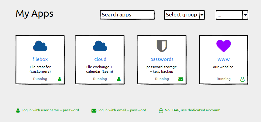
    Cloudron-dashboard-enhancements_210326hxb.png

    • Keep the label field untouched ("filebox"). Using the subdomain part as a default works well and we do not want any disruption here
    • Add a description field for individual information ("File transfer"). This can be empty by default.
    • Add login type information (if possible). Depending on the permissions handling of the grid-item-actions layer you could add that icon there, otherwise append it with an :after element to the container. Plus a legend below.

    Happy to help with CSS fumbling if that helps getting forward 😉

    And Please forgive me for not having digged deeply into possibly related issues. I found #1804 with a "perhaps related".

  • Dashbard UX enhancement suggestions
    hexbinH hexbin
    Feature Requests userinterface

    Now that we've satisfied some basic power users' needs - mind if I get back to the original motivation (description field, login type)?

    At least once a week I have to tell an app-using team member that it's not their fault and to stop blaming themselves (no, you are not "too stupid").

    It would be such a blessing to help non-admins help themselves.


  • DeckDeckGo
    hexbinH hexbin
    App Wishlist

    Screenshot: Bye bye DeckDeckGo ... is now deprecated


  • Dashbard UX enhancement suggestions
    hexbinH hexbin
    Feature Requests userinterface

    @nebulon said

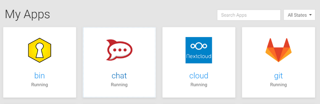
    at least in firefox here the a tag element does get the system default focus outline

    4af0906d-45ab-4fbd-9dd2-45fd5ea055b8-grafik.png

    Technically correct - but aren't we kinda hard trying to make that invisible? 😆

    (Spoiler: it's the chat tile that has the focus)


  • Dashbard UX enhancement suggestions
    hexbinH hexbin
    Feature Requests userinterface

    I love you 💙


  • Jellyfin - the beast eats GB
    hexbinH hexbin
    Jellyfin

    Folks, your private vacation videos are just too large 😄


  • Save the date: Feb. 12. 18:00 (UTC+1) next Cloudron virtual meetup
    hexbinH hexbin
    Announcements

    Kitchen meeting ... will you be cooking? 🙂


  • Cloudron 9.0 (beta) bug reports
    hexbinH hexbin
    Discuss

    @nebulon Some UX-friendly approaches for the several table-related issues:

    • Scrollable table wrappers (check)
    • Consequently (tables can grow infinitely wide) limit column lengths with CSS to a readable size, e. g. max-width: 40ch; word-wrap: break-word;
    • Consequently (rows can then have variable heights) top-align table cells
    • Support orientation in table rows with either alternating backgrounds or subtle horizontal borders (hover bg is already helpful - but only when your device has a hover state)
    • Wrap all concatenated data with markup (like group names in the users table, unlike aliases in the mailbox table) - reserving us the option to set entries inline or stacked. Ideally, use invisible list markup - commas can be added with CSS

  • Dashbard UX enhancement suggestions
    hexbinH hexbin
    Feature Requests userinterface

    @nebulon Hover for the icon was exactly what I had in mind 🙂

    While you're at it, could you check why the focus on the tiles (keyboard navigation) has no visual effect?


  • Customize Dashboard
    hexbinH hexbin
    Discuss dashboard customization

    Obvious constraints, of course. IMHO a "use at your own risk" should do. The concept of custom CSS is known from other tools. Most folks in the target group should already have experienced a breaking CSS concept change or two, e.g. with Nextcloud.

    For mitigation, document the class name changes, ideally in form of before/after.

    I think the Cloudron dashboard could even benefit from users' experiments and hopefully enhancement suggestions.

    How about a toggle to en/disable custom css and include the dis value in testing?


  • Dashbard UX enhancement suggestions
    hexbinH hexbin
    Feature Requests userinterface

    Oh my, there we've got something 😄
    So many good ideas, this community is awesome!

    I love @marcusquinn's dot menu suggestion. If that is accessible for all roles we can keep the tiles largely free from clutter. If it's only for admins we should list separately what should must find a place on the tile.

    As to the 2FA idea, of course we can find an icon to reflect that (I've been using fontawesome icons for the wireframe because the font is already in use - but I cannot find any suitable icon there).

    Before we get to that: are there any apps that require 2FA by default? I only know of those with optional settings. Digging that deep would mean that we'd eventually have to pick the icons to display, right?


  • Customize Dashboard
    hexbinH hexbin
    Discuss dashboard customization

    Additional thought: add class names (instead of changing) and maintain a list of class name deprecations


  • Dashbard UX enhancement suggestions
    hexbinH hexbin
    Feature Requests userinterface

    @girish said in Dashbard UX enhancement suggestions:

    (I don't like the current settings icon hover either... but that's a separate topic).

    Give me a little more background information on how it's built (or a link to that separate topic), maybe I can help (with expertise in UX, CSS, accessibility).


  • Customize Dashboard
    hexbinH hexbin
    Discuss dashboard customization

    Awweesoomeee!


  • Dashbard UX enhancement suggestions
    hexbinH hexbin
    Feature Requests userinterface

    @nebulon Awesome improvements!

    given that we haven't done any visual focus handling

    Unfortunately it's a very widespread bad habit among web designers to unconsciously style only :hover states. By omitting :focus, accessibility is actively reduced. Not blaming anyone. You might want to check if your CSS files serve this finding.

    The defaults are not always a good fallback. Not many people actually know that they could adjust their system (not even many among those who rely on assistive technologies). When we avoid touching the way the defaults do the styling (e. g. outline) we can still do a lot for accessibility 😉


  • Dashbard UX enhancement suggestions
    hexbinH hexbin
    Feature Requests userinterface

    @marcusquinn Sounds like a good idea. I'm sure we can trust the wonderful Cloudron team with design decisions (and weighing those against technical feasability).

    As long as they can make this happen - nag, nag 🙂


  • Compress database dump when configured to use rsync as storage format
    hexbinH hexbin
    Feature Requests

    Makes sense. +1

  • Login

  • Don't have an account? Register

  • Login or register to search.
  • First post
    Last post
0
  • Categories
  • Recent
  • Tags
  • Popular
  • Bookmarks
  • Search